
The ftxui::component module defines the logic that produces interactive components that respond to user events (keyboard, mouse, etc.).
The Example section provides a collection of examples.
A ftxui::ScreenInteractive defines a main loop that renders a component.
A ftxui::Component is a shared pointer to a ftxui::ComponentBase. The latter defines:
ftxui::Element are used to render a single frame.
ftxui::Component are used to render dynamic user interface, producing multiple frame, and updating its state on events.
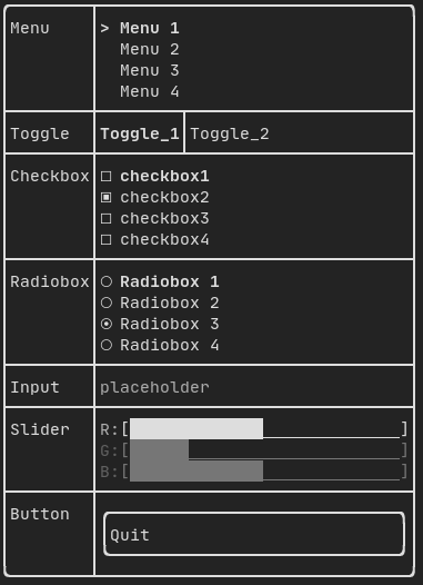
Gallery of multiple components. (demo)
All predefined components are available in "ftxui/dom/component.hpp"
#ifndef FTXUI_COMPONENT_HPP
#define FTXUI_COMPONENT_HPP
#include <functional>
#include <memory>
#include <utility>
struct ButtonOption;
struct CheckboxOption;
struct Event;
struct InputOption;
struct MenuOption;
struct RadioboxOption;
struct MenuEntryOption;
template <class T, class... Args>
std::shared_ptr<T>
Make(Args&&... args) {
return std::make_shared<T>(std::forward<Args>(args)...);
}
}
std::function<void()> on_click,
bool* checked,
StringRef placeholder,
InputOption options = {});
int* selected_,
int* selected_,
RadioboxOption options = {});
template <typename T>
Ref<int> value,
ConstRef<int> min = 0,
ConstRef<int> max = 100,
ConstRef<int> increment = 5);
Ref<float> value,
ConstRef<float> min = 0.f,
ConstRef<float> max = 100.f,
ConstRef<float> increment = 5.f);
Ref<long> value,
ConstRef<long> min = 0L,
ConstRef<long> max = 100L,
ConstRef<long> increment = 5L);
Ref<bool> show = false);
std::function<void()> on_enter,
std::function<void()> on_leave);
std::function<void(bool)> on_change);
std::function<void()> on_leave);
}
#endif
static CheckboxOption Simple()
Option for standard Checkbox.
static ButtonOption Simple()
Create a ButtonOption, inverted when focused.
static MenuOption Vertical()
Standard options for a vertical menu. This can be useful to implement a list of selectable items.
Component Horizontal(Components children)
A list of components, drawn one by one horizontally and navigated horizontally using left/right arrow...
Component Maybe(Component, const bool *show)
Decorate a component |child|. It is shown only when |show| is true.
Component ResizableSplitTop(Component main, Component back, int *main_size)
An vertical split in between two components, configurable using the mouse.
Component Menu(MenuOption options)
A list of text. The focused element is selected.
Component MenuEntry(MenuEntryOption options)
A specific menu entry. They can be put into a Container::Vertical to form a menu.
Component Toggle(ConstStringListRef entries, int *selected)
An horizontal list of elements. The user can navigate through them.
Component Radiobox(RadioboxOption options)
A list of element, where only one can be selected.
Component Button(ButtonOption options)
Draw a button. Execute a function when clicked.
Component Modal(Component main, Component modal, const bool *show_modal)
Component Renderer(Component child, std::function< Element()>)
Return a new Component, similar to |child|, but using |render| as the Component::Render() event.
Component Hoverable(Component component, bool *hover)
Wrap a component. Gives the ability to know if it is hovered by the mouse.
Component Window(WindowOptions option)
A draggeable / resizeable window. To use multiple of them, they must be stacked using Container::Stac...
Component Vertical(Components children)
A list of components, drawn one by one vertically and navigated vertically using up/down arrow key or...
Component Input(InputOption options={})
An input box for editing text.
Component ResizableSplitRight(Component main, Component back, int *main_size)
An horizontal split in between two components, configurable using the mouse.
Component Dropdown(ConstStringListRef entries, int *selected)
A dropdown menu.
Component Stacked(Components children)
A list of components to be stacked on top of each other. Events are propagated to the first component...
Component ResizableSplitBottom(Component main, Component back, int *main_size)
An vertical split in between two components, configurable using the mouse.
Component Checkbox(CheckboxOption options)
Draw checkable element.
Component ResizableSplitLeft(Component main, Component back, int *main_size)
An horizontal split in between two components, configurable using the mouse.
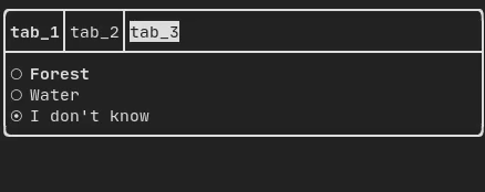
Component Tab(Components children, int *selector)
A list of components, where only one is drawn and interacted with at a time. The |selector| gives the...
The FTXUI ftxui::Container:: namespace.
The FTXUI ftxui:: namespace.
std::shared_ptr< T > Make(Args &&... args)
std::shared_ptr< Node > Element
std::function< Element(Element)> ElementDecorator
std::vector< Component > Components
Component ResizableSplit(ResizableSplitOption options)
A split in between two components.
Component operator|(Component component, ComponentDecorator decorator)
Component Collapsible(ConstStringRef label, Component child, Ref< bool > show=false)
A collapsible component. It displays a checkbox with an arrow. Once activated, the child is displayed...
Component Slider(SliderOption< T > options)
A slider in any direction.
Component & operator|=(Component &component, ComponentDecorator decorator)
std::function< Component(Component)> ComponentDecorator
std::shared_ptr< ComponentBase > Component
Component CatchEvent(Component child, std::function< bool(Event)>)
Input
Example:
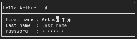
Produced by: ftxui::Input() from "ftxui/component/component.hpp"
Filtered input
One can filter out the characters received by the input component, using ftxui::CatchEvent.
std::string phone_number;
Component input = Input(&phone_number, "phone number");
input |= CatchEvent([&](Event event) {
return event.is_character() && !std::isdigit(event.character()[0]);
});
input |= CatchEvent([&](Event event) {
return event.is_character() && phone_number.size() >= 10;
});
Menu
Defines a menu object. It contains a list of entries, one of them is selected.
Example:
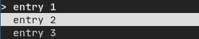
Produced by: ftxui::Menu() from "ftxui/component/component.hpp"
Toggle
A special kind of menu. The entries are displayed horizontally.
Example:
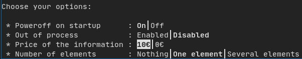
Produced by: ftxui::Toggle() from "ftxui/component/component.hpp"
CheckBox
This component defines a checkbox. It is a single entry that can be turned on/off.
Example:
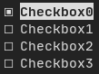
Produced by: ftxui::Checkbox() from "ftxui/component/component.hpp"
RadioBox
A radiobutton component. This is a list of entries, where one can be turned on.
Example:
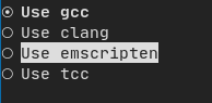
Produced by: ftxui::Radiobox() from "ftxui/component/component.hpp"
Dropdown
A drop-down menu is a component that, when opened, displays a list of elements for the user to select from.
Example:

Produced by: ftxui::Dropdown() from "ftxui/component/component.hpp"
Slider
Represents a slider object that consists of a range with binned intermediate intervals. It can be created by ftxui::Slider().
Example:
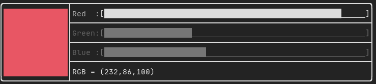
Produced by: ftxui::Slider() from "ftxui/component/component.hpp"
Renderer
Produced by: ftxui::Renderer() from ftxui/component/component.hpp. This component decorate another one by using a different function to render an interface.
Example:
auto inner = [...]
auto renderer = Renderer(inner, [&] {
return inner->Render() | border
});
ftxui::Renderer also supports the component decorator pattern:
auto component = [...]
component = component
| Renderer([](Element e) { return e | border))
| Renderer(bold)
As a short hand, you can also compose a component with an element decorator:
auto component = [...]
component = component | border | bold;
CatchEvent
Produced by: ftxui::CatchEvent() from ftxui/component/component.hpp. This component decorate others, catching events before the underlying component.
Examples:
auto screen = ScreenInteractive::TerminalOutput();
auto renderer = Renderer([] {
return text("My interface");
});
auto component = CatchEvent(renderer, [&](Event event) {
if (event == Event::Character('q')) {
screen.ExitLoopClosure()();
return true;
}
return false;
});
screen.Loop(component);
The ftxui::CatchEvent can also be used as a decorator:
component = component
| CatchEvent(handler_1)
| CatchEvent(handler_2)
| CatchEvent(handler_3)
;
Collapsible
Useful for visual elements whose visibility can be toggled on or off by the user. Essentially, this is the combination of the ftxui::Checkbox() and ftxui::Maybe() components.
auto collapsible = Collapsible("Show more", inner_element);
Maybe
Produced by: ftxui::Maybe() from ftxui/component/component.hpp. This component can be utilized to show/hide any other component via a boolean or a predicate.
Example with a boolean:
bool show = true;
auto component = Renderer([]{ return "Hello World!"; });
auto maybe_component = Maybe(component, &show)
Example with a predicate:
auto component = Renderer([]{ return "Hello World!"; });
auto maybe_component = Maybe(component, [&] { return time > 10; })
As usual, ftxui::Maybe can also be used as a decorator:
component = component
| Maybe(&a_boolean)
| Maybe([&] { return time > 10; })
;
Container
Horizontal
Produced by: ftxui::Container::Horizontal() from "ftxui/component/component.hpp". It displays a list of components horizontally and handles keyboard/mouse navigation.
Vertical
Produced by: ftxui::Container::Vertical() from "ftxui/component/component.hpp". It displays a list of components vertically and handles keyboard/mouse navigation.
Tab
Produced by: ftxui::Container::Tab() from "ftxui/component/component.hpp". It takes a list of components and displays only one of them. This is useful for implementing a tab bar.
Vertical:
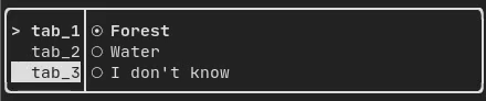
Horizontal:
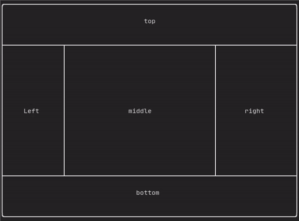
ResizableSplit
It defines a horizontal or vertical separation between two children components. The position of the split is variable and controllable using the mouse. There are four possible splits:
Example:
Force a frame redraw.
Typically, ftxui::ScreenInteractive::Loop() is responsible for drawing a new frame whenever a new group of events (e.g keyboard, mouse, window resize, etc.) has been processed. However, you might want to react to arbitrary events that are unknown to FTXUI. To accomplish this, you must post events using ftxui::ScreenInteractive::PostEvent (this is thread safe) via a thread. You will have to post the event ftxui::Event::Custom.
Example:
screen->PostEvent(Event::Custom);
If you don't need to process a new Event, you can use:
screen->RequestAnimationFrame();
instead.