The list of all elements are included and can be accessed by including the corresponding header file:
#ifndef FTXUI_DOM_ELEMENTS_HPP
#define FTXUI_DOM_ELEMENTS_HPP
#include <functional>
#include <memory>
#include <string_view>
class Node;
using Element = std::shared_ptr<Node>;
};
Color unselected_color,
Color selected_color);
Color unselected_color,
Color selected_color);
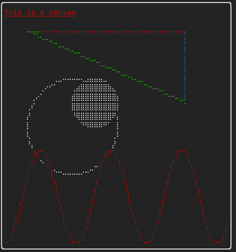
Element canvas(
int width,
int height, std::function<
void(Canvas&)>);
Dimensions
Fit(
Element&,
bool extend_beyond_screen =
false);
}
}
#include "ftxui/dom/take_any_args.hpp"
#endif
Decorator bgcolor(Color)
Decorate using a background color.
Element window(Element title, Element content, BorderStyle border=ROUNDED)
Draw window with a title and a border around the element.
Element borderDouble(Element)
Draw a double border around the element.
Element focusCursorBarBlinking(Element)
Same as focus, but set the cursor shape to be a blinking bar.
Element xflex(Element)
Expand/Minimize if possible/needed on the X axis.
Element gaugeDirection(float progress, Direction direction)
Draw a high definition progress bar progressing in specified direction.
Decorator focusPositionRelative(float x, float y)
Used inside a frame, this force the view to be scrolled toward a a given position....
Element separatorStyled(BorderStyle)
Draw a vertical or horizontal separation in between two other elements.
Element xflex_grow(Element)
Expand if possible on the X axis.
Element underlinedDouble(Element)
Apply a underlinedDouble to text.
Element clear_under(Element element)
Before drawing |child|, clear the pixels below. This is useful in combination with dbox.
Element borderDashed(Element)
Draw a dashed border around the element.
Element separatorEmpty()
Draw a vertical or horizontal separation in between two other elements, using the EMPTY style.
Element vscroll_indicator(Element)
Display a vertical scrollbar on the right. Colors follow the content.
Element nothing(Element element)
A decoration doing absolutely nothing.
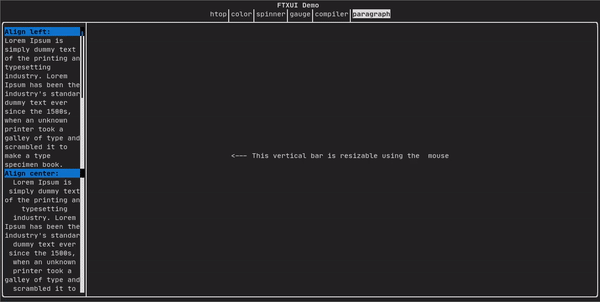
Element paragraphAlignLeft(std::string_view text)
Return an element drawing the paragraph on multiple lines, aligned on the left.
Decorator size(WidthOrHeight, Constraint, int value)
Apply a constraint on the size of an element.
Direction
Direction is an enumeration that represents the four cardinal directions.
Element flex(Element)
Make a child element to expand proportionally to the space left in a container.
Decorator hyperlink(std::string_view link)
Decorate using a hyperlink. The link will be opened when the user clicks on it. This is supported onl...
Element gaugeRight(float progress)
Draw a high definition progress bar progressing from left to right.
Element focusCursorUnderlineBlinking(Element)
Same as focus, but set the cursor shape to be a blinking underline.
Element bold(Element)
Use a bold font, for elements with more emphasis.
Element separatorLight()
Draw a vertical or horizontal separation in between two other elements, using the LIGHT style.
Element spinner(int charset_index, size_t image_index)
Useful to represent the effect of time and/or events. This displays an ASCII art "video".
Element borderRounded(Element)
Draw a rounded border around the element.
Element yflex(Element)
Expand/Minimize if possible/needed on the Y axis.
Element flex_shrink(Element)
Minimize if needed.
Element focusCursorBar(Element)
Same as focus, but set the cursor shape to be a still block.
Element focusCursorBlock(Element)
Same as focus, but set the cursor shape to be a still block.
Element underlined(Element)
Underline the given element.
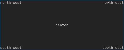
Element center(Element)
Center an element horizontally and vertically.
Element paragraphAlignJustify(std::string_view text)
Return an element drawing the paragraph on multiple lines, aligned using a justified alignment....
Element focusCursorUnderline(Element)
Same as focus, but set the cursor shape to be a still underline.
Element borderHeavy(Element)
Draw a heavy border around the element.
Element inverted(Element)
Add a filter that will invert the foreground and the background colors.
Element gaugeUp(float progress)
Draw a high definition progress bar progressing from bottom to top.
Element align_right(Element)
Align an element on the right side.
Decorator focusPosition(int x, int y)
Used inside a frame, this force the view to be scrolled toward a a given position....
Element yflex_grow(Element)
Expand if possible on the Y axis.
Element hscroll_indicator(Element)
Display a horizontal scrollbar at the bottom. Colors follow the content.
Element flex_grow(Element)
Expand if possible.
Element separatorDashed()
Draw a vertical or horizontal separation in between two other elements, using the DASHED style.
Element notflex(Element)
Make the element not flexible.
Element strikethrough(Element)
Apply a strikethrough to text.
Element italic(Element)
Apply a underlinedDouble to text.
Element dbox(Elements)
Stack several element on top of each other.
Element xflex_shrink(Element)
Minimize if needed on the X axis.
Element gaugeLeft(float progress)
Draw a high definition progress bar progressing from right to left.
Element paragraphAlignCenter(std::string_view text)
Return an element drawing the paragraph on multiple lines, aligned on the center.
Element vtext(std::wstring text)
Display a piece unicode text vertically.
Element borderLight(Element)
Draw a light border around the element.
Element focus(Element)
Set the child to be the one focused among its siblings.
Decorator borderWith(const Pixel &)
Same as border but with a constant Pixel around the element.
Decorator borderStyled(BorderStyle)
Same as border but with different styles.
Element paragraphAlignRight(std::string_view text)
Return an element drawing the paragraph on multiple lines, aligned on the right.
Element separator()
Draw a vertical or horizontal separation in between two other elements.
Element filler()
An element that will take expand proportionally to the space left in a container.
Element dim(Element)
Use a light font, for elements with less emphasis.
Element automerge(Element child)
Enable character to be automatically merged with others nearby.
Element separatorCharacter(std::string_view)
Draw a vertical or horizontal separation in between two other elements.
Element blink(Element)
The text drawn alternates in between visible and hidden.
Element vcenter(Element)
Center an element vertically.
Element separatorDouble()
Draw a vertical or horizontal separation in between two other elements, using the DOUBLE style.
Element focusCursorBlockBlinking(Element)
Same as focus, but set the cursor shape to be a blinking block.
Element border(Element)
Draw a border around the element.
Element separatorHeavy()
Draw a vertical or horizontal separation in between two other elements, using the HEAVY style.
Element borderEmpty(Element)
Draw an empty border around the element.
Element yflex_shrink(Element)
Minimize if needed on the Y axis.
Element hcenter(Element)
Center an element horizontally.
BorderStyle
BorderStyle is an enumeration that represents the different styles of borders that can be applied to ...
Element gaugeDown(float progress)
Draw a high definition progress bar progressing from top to bottom.
The FTXUI ftxui::Dimension:: namespace.
Dimensions Fit(Element &, bool extend_beyond_screen=false)
std::function< Element(Element)> Decorator
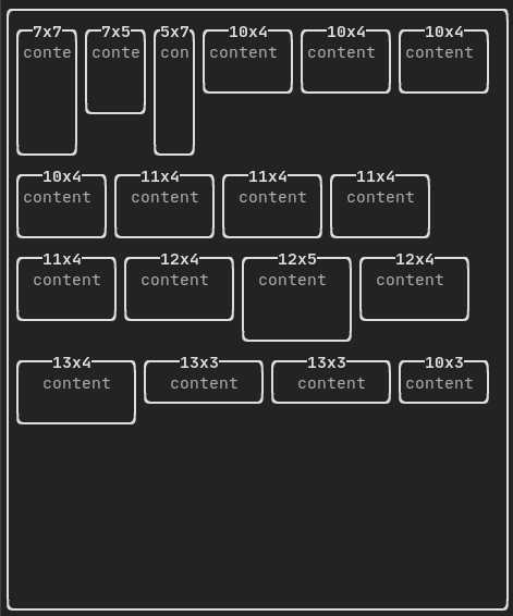
Element flexbox(Elements, FlexboxConfig config=FlexboxConfig())
A container displaying elements on row/columns and capable of wrapping on the next column/row when fu...
Element separatorVSelector(float up, float down, Color unselected_color, Color selected_color)
Draw an vertical bar, with the area in between up/downcolored differently.
std::shared_ptr< Node > Element
Element xframe(Element)
Same as frame, but only on the x-axis.
Element hflow(Elements)
A container displaying elements in rows from left to right. When filled, it starts on a new row below...
Decorator selectionStyle(std::function< void(Pixel &)> style)
Set the style of an element when selected.
Element separatorHSelector(float left, float right, Color unselected_color, Color selected_color)
Draw a horizontal bar, with the area in between left/right colored differently.
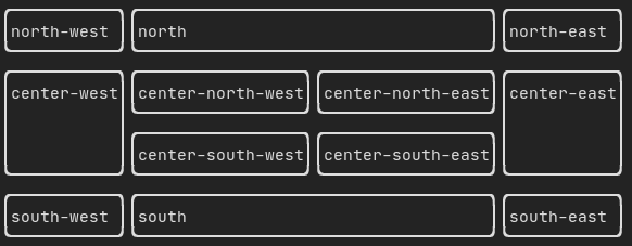
Element hbox(Elements)
A container displaying elements horizontally one by one.
Element canvas(ConstRef< Canvas >)
Produce an element from a Canvas, or a reference to a Canvas.
std::vector< Element > Elements
Decorator selectionForegroundColor(Color foreground)
Set the foreground color of an element when selected. Note that the style is applied on top of the ex...
Component operator|(Component component, ComponentDecorator decorator)
Decorator selectionBackgroundColor(Color foreground)
Set the background color of an element when selected. Note that the style is applied on top of the ex...
Element yframe(Element)
Same as frame, but only on the y-axis.
Decorator selectionColor(Color foreground)
Set the color of an element when selected.
Element select(Element e)
Set the child to be the one focused among its siblings.
Element selectionStyleReset(Element)
Reset the selection style of an element.
Decorator reflect(Box &box)
std::function< std::vector< int >(int, int)> GraphFunction
Element gridbox(std::vector< Elements > lines)
A container displaying a grid of elements.
Elements paragraph(std::wstring text)
Element frame(Element)
Allow an element to be displayed inside a 'virtual' area. It size can be larger than its container....
Component & operator|=(Component &component, ComponentDecorator decorator)
Element vflow(Elements)
A container displaying elements in rows from top to bottom. When filled, it starts on a new columns o...
Element graph(GraphFunction)
Draw a graph using a GraphFunction.
The most simple widget. It displays a text.
Adds a border around an element.
Displays a vertical/horizontal line to visually split the content of a container in two.
This is a visual element that represents a ratio of progress.
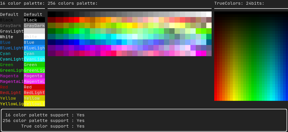
Most terminal consoles can display colored text and colored backgrounds. FTXUI supports every color palette:
On terminal supporting 256 colors.
On terminal supporting trueColor, you can directly use the 24bit RGB color space:
FTXUI supports linear gradient. Either on the foreground or the background.
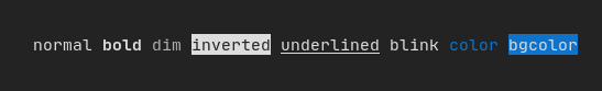
In addition to colored text and colored backgrounds. Many terminals support text effects such as: bold, italic, dim, underlined, inverted, blink.
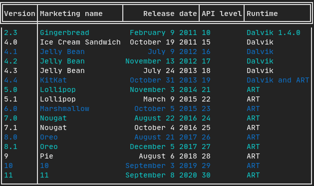
Enables easy formatting of data into a neat table like visual form.