Detailed Description
ftxui/dom` モジュールの チュートリアル をご確認ください。
Classes | |
| struct | Canvas |
| Canvasは、描画操作に関連付けられた描画可能なバッファです。 More... | |
| struct | FlexboxConfig |
| FlexboxConfigは、flexboxコンテナのレイアウトプロパティを定義する構成構造体です。 More... | |
| struct | LinearGradient |
| 線形グラデーションカラー効果の設定を表すクラスです。 More... | |
| class | Node |
| NodeはDOMツリー内のすべての要素の基底クラスです。 More... | |
| struct | Requirement |
| Requirementは、ターミナルユーザーインターフェースにおけるNodeのレイアウト要件を定義する構造体です。 More... | |
| class | Selection |
| ターミナルユーザーインターフェースにおける選択範囲を表します。 More... | |
| class | Table |
| Tableは、テーブルを描画するためのユーティリティです。 More... | |
Enumerations | |
| enum class | Direction { Up = 0 , Down = 1 , Left = 2 , Right = 3 } |
| Directionは、東西南北の4つの基本方向を表す列挙型です。 More... | |
| enum | BorderStyle { LIGHT , DASHED , HEAVY , DOUBLE , ROUNDED , EMPTY } |
| BorderStyleは、ターミナルUIの要素に適用できる様々なボーダースタイルを表す列挙型です。 More... | |
Functions | |
| Element | automerge (Element child) |
| 文字が近くの他の文字と自動的にマージされるようにします。 | |
| Element | blink (Element child) |
| 描画されたテキストは、可視と非可視の間で交互に切り替わります。 | |
| Element | bold (Element child) |
| より強調したい要素に、太字フォントを使用します。 | |
| Element | border (Element child) |
| 要素の周囲にボーダーを描画します。 | |
| Decorator | borderWith (const Pixel &pixel) |
| borderと同じですが、要素の周囲に一定のピクセルを使用します。 | |
| Decorator | borderStyled (BorderStyle style) |
| borderと同じですが、異なるスタイルを使用します。 | |
| Decorator | borderStyled (Color foreground_color) |
| borderと同じですが、前景色を使用します。 | |
| Decorator | borderStyled (BorderStyle style, Color foreground_color) |
| borderと同じですが、前景色と異なるスタイルを使用します | |
| Element | borderDashed (Element child) |
| 要素の周囲に破線のボーダーを描画します。 | |
| Element | borderLight (Element child) |
| 要素の周囲に細いボーダーを描画します。 | |
| Element | borderHeavy (Element child) |
| 要素の周囲に太いボーダーを描画します。 | |
| Element | borderDouble (Element child) |
| 要素の周囲に二重線のボーダーを描画します。 | |
| Element | borderRounded (Element child) |
| 要素の周囲に角の丸いボーダーを描画します。 | |
| Element | borderEmpty (Element child) |
| 要素の周囲に空のボーダーを描画します。 | |
| Element | window (Element title, Element content, BorderStyle border) |
| 要素の周囲にタイトルとボーダーを持つウィンドウを描画します。 | |
| Element | clear_under (Element element) |
| |child|を描画する前に、下にあるピクセルをクリアします。これは、 dboxと組み合わせて使用すると便利です。 | |
| Element | color (Color color, Element child) |
| 要素の前景色を設定します。 | |
| Element | bgcolor (Color color, Element child) |
| 要素の背景色を設定します。 | |
| Decorator | color (Color c) |
| 前景色を使用して装飾します。 | |
| Decorator | bgcolor (Color color) |
| 背景色を使用して装飾します。 | |
| Element | hcenter (Element child) |
| 要素を水平方向に中央揃えします。 | |
| Element | vcenter (Element child) |
| 要素を垂直方向に中央揃えします。 | |
| Element | center (Element child) |
| 要素を水平方向および垂直方向に中央揃えします。 | |
| Element | align_right (Element child) |
| 要素を右側に揃えます。 | |
| Element | dbox (Elements children_) |
| 複数の要素を重ねて表示します。 | |
| Element | dim (Element child) |
| 強調を抑えたい要素に、明るいフォントを使用します。 | |
| Element | filler () |
| コンテナに残されたスペースに比例して拡大する要素。 | |
| Element | flex (Element child) |
| 子要素をコンテナに残されたスペースに比例して拡大させます。 | |
| Element | xflex (Element child) |
| 必要に応じてX軸上で拡大・縮小します。 | |
| Element | yflex (Element child) |
| 必要に応じてY軸上で拡大・縮小します。 | |
| Element | flex_grow (Element child) |
| 可能であれば拡大します。 | |
| Element | xflex_grow (Element child) |
| 可能であればX軸上で拡大します。 | |
| Element | yflex_grow (Element child) |
| 可能であればY軸上で拡大します。 | |
| Element | flex_shrink (Element child) |
| 必要であれば最小化します。 | |
| Element | xflex_shrink (Element child) |
| 必要であればX軸上で最小化します。 | |
| Element | yflex_shrink (Element child) |
| 必要であればY軸上で最小化します。 | |
| Element | notflex (Element child) |
| 要素を柔軟にしないようにします。 | |
| Decorator | focusPositionRelative (float x, float y) |
frame内で使用され、ビューを特定の位置にスクロールさせます。位置は要求されたサイズの割合で表されます。 | |
| Decorator | focusPosition (int x, int y) |
frame内で使用され、ビューを特定の位置にスクロールさせます。位置はセル数で表されます。 | |
| Element | focus (Element child) |
| 子要素を兄弟要素の中でフォーカスされたものとして設定します。 | |
| Element | focusCursorBlock (Element child) |
focus と同じですが、カーソル形状を静止ブロックに設定します。 | |
| Element | focusCursorBlockBlinking (Element child) |
focus と同じですが、カーソル形状を点滅ブロックに設定します。 | |
| Element | focusCursorBar (Element child) |
focus と同じですが、カーソル形状を静止ブロックに設定します。 | |
| Element | focusCursorBarBlinking (Element child) |
focus と同じですが、カーソル形状を点滅バーに設定します。 | |
| Element | focusCursorUnderline (Element child) |
focus と同じですが、カーソル形状を静止下線に設定します。 | |
| Element | focusCursorUnderlineBlinking (Element child) |
focus と同じですが、カーソル形状を点滅下線に設定します。 | |
| Element | gaugeDirection (float progress, Direction direction) |
| 指定された方向に進行する高精細プログレスバーを描画します。 | |
| Element | gaugeRight (float progress) |
| 左から右へ進行する高精細プログレスバーを描画します。 | |
| Element | gaugeLeft (float progress) |
| 右から左へ進行する高精細プログレスバーを描画します。 | |
| Element | gaugeUp (float progress) |
| 下から上へ進行する高精細プログレスバーを描画します。 | |
| Element | gaugeDown (float progress) |
| 上から下へ進行する高精細プログレスバーを描画します。 | |
| Element | gauge (float progress) |
| 高精細プログレスバーを描画します。 | |
| Element | hyperlink (std::string link, Element child) |
| ウェブブラウザを使用してレンダリングされた領域をクリック可能にします。 ユーザーがクリックするとリンクが開きます。 これは、限られたターミナルエミュレータでのみサポートされています。 リスト: https://github.com/Alhadis/OSC8-Adoption/ | |
| Decorator | hyperlink (std::string link) |
| ハイパーリンクを使用して装飾します。 ユーザーがクリックするとリンクが開きます。 これは、限られたターミナルエミュレータでのみサポートされています。 リスト: https://github.com/Alhadis/OSC8-Adoption/ | |
| Element | inverted (Element child) |
| 前景色と背景色を反転させるフィルターを追加します。 | |
| Element | italic (Element child) |
| テキストに斜体を適用します。 | |
| Element | color (const LinearGradient &gradient, Element child) |
| 線形グラデーション効果を持つ要素のフォアグラウンドカラーを設定します。 | |
| Element | bgcolor (const LinearGradient &gradient, Element child) |
| 線形グラデーション効果を持つ要素の背景色を設定します。 | |
| Decorator | color (const LinearGradient &gradient) |
| フォアグラウンドカラーに線形グラデーション効果を使用して装飾します。 | |
| Decorator | bgcolor (const LinearGradient &gradient) |
| 背景色に線形グラデーション効果を使用して装飾します。 | |
| void | Render (Screen &screen, const Element &element) |
| 要素をftxui::Screenに表示します。 | |
| void | Render (Screen &screen, Node *node) |
| 要素をftxui::Screenに表示します。 | |
| Element | paragraph (const std::string &the_text) |
| 段落を複数行で描画する要素を返します。 | |
| Element | paragraphAlignLeft (const std::string &the_text) |
| 段落を複数行にわたって左揃えで描画する要素を返します。 | |
| Element | paragraphAlignRight (const std::string &the_text) |
| 段落を複数行にわたって右揃えで描画する要素を返します。 | |
| Element | paragraphAlignCenter (const std::string &the_text) |
| 段落を複数行にわたって中央揃えで描画する要素を返します。 | |
| Element | paragraphAlignJustify (const std::string &the_text) |
| 段落を複数行にわたって両端揃えで描画する要素を返します。 中央に。 | |
| Element | vscroll_indicator (Element child) |
| 右側に垂直スクロールバーを表示します。 色はコンテンツに従います。 | |
| Element | hscroll_indicator (Element child) |
| 下部に水平スクロールバーを表示します。 色はコンテンツに従います。 | |
| Element | separatorStyled (BorderStyle style) |
| 他の2つの要素の間に垂直または水平の区切り線を描画します。 | |
| Element | separatorDashed () |
| 他の2つの要素の間にLIGHTスタイルで垂直または水平の区切り線を描画します。 | |
| Element | separatorDouble () |
| 他の2つの要素の間にHEAVYスタイルで垂直または水平の区切り線を描画します。 | |
| Element | separatorEmpty () |
| 他の2つの要素の間にEMPTYスタイルで垂直または水平の区切り線を描画します。 | |
| Decorator | size (WidthOrHeight direction, Constraint constraint, int value) |
| 要素のサイズに制約を適用します。 | |
| Element | spinner (int charset_index, size_t image_index) |
| 時間やイベントの効果を表現するのに便利です。これはアスキーアートの「ビデオ」を表示します。 | |
| Element | strikethrough (Element child) |
| テキストに打ち消し線を適用します。 | |
| Element | text (std::string text) |
| UTF8エンコードされたユニコードテキストを表示します。 | |
| Element | text (std::wstring text) |
| ユニコードテキストを表示します。 | |
| Element | vtext (std::string text) |
| ユニコードテキストを垂直に表示します。 | |
| Element | vtext (std::wstring text) |
| ユニコードテキストを垂直に表示します。 | |
| Element | underlined (Element child) |
| 指定された要素に下線を追加します。 | |
| Element | underlinedDouble (Element child) |
| テキストに二重下線を適用します。 | |
| Element | nothing (Element element) |
| 何も行わないデコレーションです。 | |
| Decorator | operator| (Decorator a, Decorator b) |
| 2つのデコレーターを1つに合成します。 | |
| Elements | operator| (Elements elements, Decorator decorator) |
| 要素のセットから、すべての要素にデコレーターを適用します。 | |
| Element | operator| (Element element, Decorator decorator) |
| 要素にデコレーターを適用します。 | |
| Element & | operator|= (Element &e, Decorator d) |
| 要素にデコレーターを適用します。 | |
| Element | emptyElement () |
| Element | vbox (Elements children) |
| 要素を縦に一つずつ表示するコンテナ。 | |
| void | SetColorSupport (Color color) |
| 自動検出が失敗した場合にターミナルの色サポートを上書きします | |
Class Documentation
◆ ftxui::Canvas
| struct ftxui::Canvas |
Canvasは、描画操作に関連付けられた描画可能なバッファです。
Canvasは、複雑なグラフィックを作成するために使用できる描画領域です。 点、線、円、楕円、テキスト、および画像を点字、ブロック、または通常の文字を使用して描画する ことができます。
注: ターミナルにはセルが含まれています。セルは以下の単位です。
- 2x4点字文字 (1x1ピクセル)
- 2x2ブロック文字 (2x2ピクセル)
- 2x4通常文字 (2x4ピクセル)
ターミナルで正しい位置を取得するには、x座標を2倍し、y座標を4倍する必要があります。
Definition at line 36 of file canvas.hpp.
Public Types | |
| using | Stylizer = std::function<void(Pixel&)> |
Public Member Functions | |
| Canvas ()=default | |
| Canvas (int width, int height) | |
| コンストラクタ。 | |
| int | width () const |
| int | height () const |
| Pixel | GetPixel (int x, int y) const |
| セルの内容を取得します。 | |
| void | DrawPointOn (int x, int y) |
| 点字ドットを描画します。 | |
| void | DrawPointOff (int x, int y) |
| 点字ドットを消去します。 | |
| void | DrawPointToggle (int x, int y) |
| 点字ドットを切り替えます。塗りつぶされたものは消去され、それ以外は描画されます。 | |
| void | DrawPoint (int x, int y, bool value) |
| 点字ドットを描画します。 | |
| void | DrawPoint (int x, int y, bool value, const Stylizer &s) |
| 点字ドットを描画します。 | |
| void | DrawPoint (int x, int y, bool value, const Color &color) |
| 点字ドットを描画します。 | |
| void | DrawPointLine (int x1, int y1, int x2, int y2) |
| 点字ドットで線を描画します。 | |
| void | DrawPointLine (int x1, int y1, int x2, int y2, const Stylizer &s) |
| 点字ドットで線を描画します。 | |
| void | DrawPointLine (int x1, int y1, int x2, int y2, const Color &color) |
| 点字ドットで線を描画します。 | |
| void | DrawPointCircle (int x, int y, int radius) |
| 点字ドットで円を描画します。 | |
| void | DrawPointCircle (int x, int y, int radius, const Stylizer &s) |
| 点字ドットで円を描画します。 | |
| void | DrawPointCircle (int x, int y, int radius, const Color &color) |
| 点字ドットで円を描画します。 | |
| void | DrawPointCircleFilled (int x, int y, int radius) |
| 点字ドットで塗りつぶされた円を描画します。 | |
| void | DrawPointCircleFilled (int x, int y, int radius, const Stylizer &s) |
| 点字ドットで塗りつぶされた円を描画します。 | |
| void | DrawPointCircleFilled (int x, int y, int radius, const Color &color) |
| 点字ドットで塗りつぶされた円を描画します。 | |
| void | DrawPointEllipse (int x, int y, int r1, int r2) |
| 点字ドットで楕円を描画します。 | |
| void | DrawPointEllipse (int x, int y, int r1, int r2, const Color &color) |
| 点字ドットで楕円を描画します。 | |
| void | DrawPointEllipse (int x, int y, int r1, int r2, const Stylizer &s) |
| 点字ドットで楕円を描画します。 | |
| void | DrawPointEllipseFilled (int x, int y, int r1, int r2) |
| 点字ドットで塗りつぶされた楕円を描画します。 | |
| void | DrawPointEllipseFilled (int x, int y, int r1, int r2, const Color &color) |
| 点字ドットで塗りつぶされた楕円を描画します。 | |
| void | DrawPointEllipseFilled (int x, int y, int r1, int r2, const Stylizer &s) |
| 点字ドットで塗りつぶされた楕円を描画します。 | |
| void | DrawBlockOff (int x, int y) |
| ブロックを消去します。 | |
| void | DrawBlockToggle (int x, int y) |
| ブロックを切り替えます。塗りつぶされている場合は消去され、空の場合は塗りつぶされます。 | |
| void | DrawBlock (int x, int y, bool value) |
| ブロックを描画します。 | |
| void | DrawBlock (int x, int y, bool value, const Stylizer &s) |
| ブロックを描画します。 | |
| void | DrawBlock (int x, int y, bool value, const Color &color) |
| ブロックを描画します。 | |
| void | DrawBlockLine (int x1, int y1, int x2, int y2) |
| ブロック文字で線を描画します。 | |
| void | DrawBlockLine (int x1, int y1, int x2, int y2, const Stylizer &s) |
| ブロック文字で線を描画します。 | |
| void | DrawBlockLine (int x1, int y1, int x2, int y2, const Color &color) |
| ブロック文字で線を描画します。 | |
| void | DrawBlockCircle (int x1, int y1, int radius) |
| ブロック文字で円を描画します。 | |
| void | DrawBlockCircle (int x1, int y1, int radius, const Stylizer &s) |
| ブロック文字で円を描画します。 | |
| void | DrawBlockCircle (int x1, int y1, int radius, const Color &color) |
| ブロック文字で円を描画します。 | |
| void | DrawBlockCircleFilled (int x1, int y1, int radius) |
| ブロック文字で塗りつぶされた円を描画します。 | |
| void | DrawBlockCircleFilled (int x1, int y1, int radius, const Stylizer &s) |
| ブロック文字で塗りつぶされた円を描画します。 | |
| void | DrawBlockCircleFilled (int x1, int y1, int radius, const Color &color) |
| ブロック文字で塗りつぶされた円を描画します。 | |
| void | DrawBlockEllipse (int x1, int y1, int r1, int r2) |
| ブロック文字で楕円を描画します。 | |
| void | DrawBlockEllipse (int x1, int y1, int r1, int r2, const Stylizer &s) |
| ブロック文字で楕円を描画します。 | |
| void | DrawBlockEllipse (int x1, int y1, int r1, int r2, const Color &color) |
| ブロック文字で楕円を描画します。 | |
| void | DrawBlockEllipseFilled (int x1, int y1, int r1, int r2) |
| ブロック文字で塗りつぶされた楕円を描画します。 | |
| void | DrawBlockEllipseFilled (int x1, int y1, int r1, int r2, const Stylizer &s) |
| ブロック文字で塗りつぶされた楕円を描画します。 | |
| void | DrawBlockEllipseFilled (int x1, int y1, int r1, int r2, const Color &color) |
| ブロック文字で塗りつぶされた楕円を描画します。 | |
| void | DrawText (int x, int y, const std::string &value, const Color &color) |
| テキストを描画します。 | |
| void | DrawText (int x, int y, const std::string &value, const Stylizer &style) |
| テキストを描画します。 | |
| void | DrawImage (int x, int y, const Image &) |
| 定義済み画像を、指定された座標を左上隅として描画します 負の座標を指定して画像を自由に配置できます。 表示される部分のみが描画されます。 | |
Member Typedef Documentation
◆ Stylizer
Definition at line 46 of file canvas.hpp.
Constructor & Destructor Documentation
◆ Canvas() [1/2]
|
default |
◆ Canvas() [2/2]
| Canvas | ( | int | width, |
| int | height ) |
コンストラクタ。
- Parameters
-
width キャンバスの幅。セルは2x4の点字ドットです。 height キャンバスの高さ。セルは2x4の点字ドットです。
Definition at line 90 of file src/ftxui/dom/canvas.cpp.
Member Function Documentation
◆ width()
|
inline |
Definition at line 42 of file canvas.hpp.
◆ height()
|
inline |
Definition at line 43 of file canvas.hpp.
◆ GetPixel()
| Pixel GetPixel | ( | int | x, |
| int | y ) const |
◆ DrawPointOn()
| void DrawPointOn | ( | int | x, |
| int | y ) |
点字ドットを描画します。
- Parameters
-
x ドットのx座標。 y ドットのy座標。
Definition at line 137 of file src/ftxui/dom/canvas.cpp.
◆ DrawPointOff()
| void DrawPointOff | ( | int | x, |
| int | y ) |
点字ドットを消去します。
- Parameters
-
x ドットのx座標。 y ドットのy座標。
Definition at line 154 of file src/ftxui/dom/canvas.cpp.
◆ DrawPointToggle()
| void DrawPointToggle | ( | int | x, |
| int | y ) |
点字ドットを切り替えます。塗りつぶされたものは消去され、それ以外は描画されます。
- Parameters
-
x ドットのx座標。 y ドットのy座標。
Definition at line 171 of file src/ftxui/dom/canvas.cpp.
◆ DrawPoint() [1/3]
| void DrawPoint | ( | int | x, |
| int | y, | ||
| bool | value ) |
点字ドットを描画します。
- Parameters
-
x ドットのx座標。 y ドットのy座標。 value ドットが塗りつぶされているかどうか。
Definition at line 107 of file src/ftxui/dom/canvas.cpp.
◆ DrawPoint() [2/3]
| void DrawPoint | ( | int | x, |
| int | y, | ||
| bool | value, | ||
| const Stylizer & | style ) |
点字ドットを描画します。
- Parameters
-
x ドットのx座標。 y ドットのy座標。 value ドットが塗りつぶされているかどうか。 style セルのスタイル。
Definition at line 125 of file src/ftxui/dom/canvas.cpp.
◆ DrawPoint() [3/3]
| void DrawPoint | ( | int | x, |
| int | y, | ||
| bool | value, | ||
| const Color & | color ) |
点字ドットを描画します。
- Parameters
-
x ドットのx座標。 y ドットのy座標。 value ドットが塗りつぶされているかどうか。 color ドットの色。
Definition at line 116 of file src/ftxui/dom/canvas.cpp.
◆ DrawPointLine() [1/3]
| void DrawPointLine | ( | int | x1, |
| int | y1, | ||
| int | x2, | ||
| int | y2 ) |
点字ドットで線を描画します。
- Parameters
-
x1 最初のドットのx座標。 y1 最初のドットのy座標。 x2 2番目のドットのx座標。 y2 2番目のドットのy座標。
Definition at line 190 of file src/ftxui/dom/canvas.cpp.
◆ DrawPointLine() [2/3]
| void DrawPointLine | ( | int | x1, |
| int | y1, | ||
| int | x2, | ||
| int | y2, | ||
| const Stylizer & | style ) |
点字ドットで線を描画します。
- Parameters
-
x1 最初のドットのx座標。 y1 最初のドットのy座標。 x2 2番目のドットのx座標。 y2 2番目のドットのy座標。 style 線のスタイル。
Definition at line 211 of file src/ftxui/dom/canvas.cpp.
◆ DrawPointLine() [3/3]
| void DrawPointLine | ( | int | x1, |
| int | y1, | ||
| int | x2, | ||
| int | y2, | ||
| const Color & | color ) |
点字ドットで線を描画します。
- Parameters
-
x1 最初のドットのx座標。 y1 最初のドットのy座標。 x2 2番目のドットのx座標。 y2 2番目のドットのy座標。 color 線の色。
Definition at line 200 of file src/ftxui/dom/canvas.cpp.
◆ DrawPointCircle() [1/3]
| void DrawPointCircle | ( | int | x, |
| int | y, | ||
| int | radius ) |
点字ドットで円を描画します。
- Parameters
-
x 円の中心のx座標。 y 円の中心のy座標。 radius 円の半径。
Definition at line 248 of file src/ftxui/dom/canvas.cpp.
◆ DrawPointCircle() [2/3]
| void DrawPointCircle | ( | int | x, |
| int | y, | ||
| int | radius, | ||
| const Stylizer & | style ) |
点字ドットで円を描画します。
- Parameters
-
x 円の中心のx座標。 y 円の中心のy座標。 radius 円の半径。 style 円のスタイル。
Definition at line 267 of file src/ftxui/dom/canvas.cpp.
◆ DrawPointCircle() [3/3]
| void DrawPointCircle | ( | int | x, |
| int | y, | ||
| int | radius, | ||
| const Color & | color ) |
点字ドットで円を描画します。
- Parameters
-
x 円の中心のx座標。 y 円の中心のy座標。 radius 円の半径。 color 円の色。
Definition at line 257 of file src/ftxui/dom/canvas.cpp.
◆ DrawPointCircleFilled() [1/3]
| void DrawPointCircleFilled | ( | int | x, |
| int | y, | ||
| int | radius ) |
点字ドットで塗りつぶされた円を描画します。
- Parameters
-
x 円の中心のx座標。 y 円の中心のy座標。 radius 円の半径。
Definition at line 275 of file src/ftxui/dom/canvas.cpp.
◆ DrawPointCircleFilled() [2/3]
| void DrawPointCircleFilled | ( | int | x, |
| int | y, | ||
| int | radius, | ||
| const Stylizer & | style ) |
点字ドットで塗りつぶされた円を描画します。
- Parameters
-
x 円の中心のx座標。 y 円の中心のy座標。 radius 円の半径。 style 円のスタイル。
Definition at line 297 of file src/ftxui/dom/canvas.cpp.
◆ DrawPointCircleFilled() [3/3]
| void DrawPointCircleFilled | ( | int | x, |
| int | y, | ||
| int | radius, | ||
| const Color & | color ) |
点字ドットで塗りつぶされた円を描画します。
- Parameters
-
x 円の中心のx座標。 y 円の中心のy座標。 radius 円の半径。 color 円の色。
Definition at line 284 of file src/ftxui/dom/canvas.cpp.
◆ DrawPointEllipse() [1/3]
| void DrawPointEllipse | ( | int | x, |
| int | y, | ||
| int | r1, | ||
| int | r2 ) |
点字ドットで楕円を描画します。
- Parameters
-
x 楕円の中心のx座標。 y 楕円の中心のy座標。 r1 x軸に沿った楕円の半径。 r2 y軸に沿った楕円の半径。
Definition at line 309 of file src/ftxui/dom/canvas.cpp.
◆ DrawPointEllipse() [2/3]
| void DrawPointEllipse | ( | int | x, |
| int | y, | ||
| int | r1, | ||
| int | r2, | ||
| const Color & | color ) |
点字ドットで楕円を描画します。
- Parameters
-
x 楕円の中心のx座標。 y 楕円の中心のy座標。 r1 x軸に沿った楕円の半径。 r2 y軸に沿った楕円の半径。 color 楕円の色。
Definition at line 319 of file src/ftxui/dom/canvas.cpp.
◆ DrawPointEllipse() [3/3]
| void DrawPointEllipse | ( | int | x1, |
| int | y1, | ||
| int | r1, | ||
| int | r2, | ||
| const Stylizer & | s ) |
点字ドットで楕円を描画します。
- Parameters
-
x1 楕円の中心のx座標。 y1 楕円の中心のy座標。 r1 x軸に沿った楕円の半径。 r2 y軸に沿った楕円の半径。 s 楕円のスタイル。
Definition at line 334 of file src/ftxui/dom/canvas.cpp.
◆ DrawPointEllipseFilled() [1/3]
| void DrawPointEllipseFilled | ( | int | x1, |
| int | y1, | ||
| int | r1, | ||
| int | r2 ) |
点字ドットで塗りつぶされた楕円を描画します。
- Parameters
-
x1 楕円の中心のx座標。 y1 楕円の中心のy座標。 r1 x軸に沿った楕円の半径。 r2 y軸に沿った楕円の半径。
Definition at line 373 of file src/ftxui/dom/canvas.cpp.
◆ DrawPointEllipseFilled() [2/3]
| void DrawPointEllipseFilled | ( | int | x1, |
| int | y1, | ||
| int | r1, | ||
| int | r2, | ||
| const Color & | color ) |
点字ドットで塗りつぶされた楕円を描画します。
- Parameters
-
x1 楕円の中心のx座標。 y1 楕円の中心のy座標。 r1 x軸に沿った楕円の半径。 r2 y軸に沿った楕円の半径。 color 楕円の色。
Definition at line 383 of file src/ftxui/dom/canvas.cpp.
◆ DrawPointEllipseFilled() [3/3]
| void DrawPointEllipseFilled | ( | int | x1, |
| int | y1, | ||
| int | r1, | ||
| int | r2, | ||
| const Stylizer & | s ) |
点字ドットで塗りつぶされた楕円を描画します。
- Parameters
-
x1 楕円の中心のx座標。 y1 楕円の中心のy座標。 r1 x軸に沿った楕円の半径。 r2 y軸に沿った楕円の半径。 s 楕円のスタイル。
Definition at line 398 of file src/ftxui/dom/canvas.cpp.
◆ DrawBlockOff()
| void DrawBlockOff | ( | int | x, |
| int | y ) |
ブロックを消去します。
- Parameters
-
x ブロックのx座標。 y ブロックのy座標。
Definition at line 487 of file src/ftxui/dom/canvas.cpp.
◆ DrawBlockToggle()
| void DrawBlockToggle | ( | int | x, |
| int | y ) |
ブロックを切り替えます。塗りつぶされている場合は消去され、空の場合は塗りつぶされます。
- Parameters
-
x ブロックのx座標。 y ブロックのy座標。
Definition at line 507 of file src/ftxui/dom/canvas.cpp.
◆ DrawBlock() [1/3]
| void DrawBlock | ( | int | x, |
| int | y, | ||
| bool | value ) |
ブロックを描画します。
- Parameters
-
x ブロックのx座標。 y ブロックのy座標。 value ブロックが塗りつぶされているかどうか。
Definition at line 437 of file src/ftxui/dom/canvas.cpp.
◆ DrawBlock() [2/3]
| void DrawBlock | ( | int | x, |
| int | y, | ||
| bool | value, | ||
| const Stylizer & | style ) |
ブロックを描画します。
- Parameters
-
x ブロックのx座標。 y ブロックのy座標。 value ブロックが塗りつぶされているかどうか。 style ブロックのスタイル。
Definition at line 455 of file src/ftxui/dom/canvas.cpp.
◆ DrawBlock() [3/3]
| void DrawBlock | ( | int | x, |
| int | y, | ||
| bool | value, | ||
| const Color & | color ) |
ブロックを描画します。
- Parameters
-
x ブロックのx座標。 y ブロックのy座標。 value ブロックが塗りつぶされているかどうか。 color ブロックの色。
Definition at line 446 of file src/ftxui/dom/canvas.cpp.
◆ DrawBlockLine() [1/3]
| void DrawBlockLine | ( | int | x1, |
| int | y1, | ||
| int | x2, | ||
| int | y2 ) |
ブロック文字で線を描画します。
- Parameters
-
x1 線の最初の点のx座標。 y1 線の最初の点のy座標。 x2 線の2番目の点のx座標。 y2 線の2番目の点のy座標。
Definition at line 529 of file src/ftxui/dom/canvas.cpp.
◆ DrawBlockLine() [2/3]
| void DrawBlockLine | ( | int | x1, |
| int | y1, | ||
| int | x2, | ||
| int | y2, | ||
| const Stylizer & | style ) |
ブロック文字で線を描画します。
- Parameters
-
x1 線の最初の点のx座標。 y1 線の最初の点のy座標。 x2 線の2番目の点のx座標。 y2 線の2番目の点のy座標。 style 線のスタイル。
Definition at line 550 of file src/ftxui/dom/canvas.cpp.
◆ DrawBlockLine() [3/3]
| void DrawBlockLine | ( | int | x1, |
| int | y1, | ||
| int | x2, | ||
| int | y2, | ||
| const Color & | color ) |
ブロック文字で線を描画します。
- Parameters
-
x1 線の最初の点のx座標。 y1 線の最初の点のy座標。 x2 線の2番目の点のx座標。 y2 線の2番目の点のy座標。 color 線の色。
Definition at line 539 of file src/ftxui/dom/canvas.cpp.
◆ DrawBlockCircle() [1/3]
| void DrawBlockCircle | ( | int | x, |
| int | y, | ||
| int | radius ) |
ブロック文字で円を描画します。
- Parameters
-
x 円の中心のx座標。 y 円の中心のy座標。 radius 円の半径。
Definition at line 590 of file src/ftxui/dom/canvas.cpp.
◆ DrawBlockCircle() [2/3]
| void DrawBlockCircle | ( | int | x, |
| int | y, | ||
| int | radius, | ||
| const Stylizer & | style ) |
ブロック文字で円を描画します。
- Parameters
-
x 円の中心のx座標。 y 円の中心のy座標。 radius 円の半径。 style 円のスタイル。
Definition at line 609 of file src/ftxui/dom/canvas.cpp.
◆ DrawBlockCircle() [3/3]
| void DrawBlockCircle | ( | int | x, |
| int | y, | ||
| int | radius, | ||
| const Color & | color ) |
ブロック文字で円を描画します。
- Parameters
-
x 円の中心のx座標。 y 円の中心のy座標。 radius 円の半径。 color 円の色。
Definition at line 599 of file src/ftxui/dom/canvas.cpp.
◆ DrawBlockCircleFilled() [1/3]
| void DrawBlockCircleFilled | ( | int | x, |
| int | y, | ||
| int | radius ) |
ブロック文字で塗りつぶされた円を描画します。
- Parameters
-
x 円の中心のx座標。 y 円の中心のy座標。 radius 円の半径。
Definition at line 617 of file src/ftxui/dom/canvas.cpp.
◆ DrawBlockCircleFilled() [2/3]
| void DrawBlockCircleFilled | ( | int | x, |
| int | y, | ||
| int | radius, | ||
| const Stylizer & | s ) |
ブロック文字で塗りつぶされた円を描画します。
- Parameters
-
x 円の中心のx座標。 y 円の中心のy座標。 radius 円の半径。 s 円のスタイル。
Definition at line 639 of file src/ftxui/dom/canvas.cpp.
◆ DrawBlockCircleFilled() [3/3]
| void DrawBlockCircleFilled | ( | int | x, |
| int | y, | ||
| int | radius, | ||
| const Color & | color ) |
ブロック文字で塗りつぶされた円を描画します。
- Parameters
-
x 円の中心のx座標。 y 円の中心のy座標。 radius 円の半径。 color 円の色。
Definition at line 626 of file src/ftxui/dom/canvas.cpp.
◆ DrawBlockEllipse() [1/3]
| void DrawBlockEllipse | ( | int | x, |
| int | y, | ||
| int | r1, | ||
| int | r2 ) |
ブロック文字で楕円を描画します。
- Parameters
-
x 楕円の中心のx座標。 y 楕円の中心のy座標。 r1 x軸に沿った楕円の半径。 r2 y軸に沿った楕円の半径。
Definition at line 651 of file src/ftxui/dom/canvas.cpp.
◆ DrawBlockEllipse() [2/3]
| void DrawBlockEllipse | ( | int | x1, |
| int | y1, | ||
| int | r1, | ||
| int | r2, | ||
| const Stylizer & | s ) |
ブロック文字で楕円を描画します。
- Parameters
-
x1 楕円の中心のx座標。 y1 楕円の中心のy座標。 r1 x軸に沿った楕円の半径。 r2 y軸に沿った楕円の半径。 s 楕円のスタイル。
Definition at line 676 of file src/ftxui/dom/canvas.cpp.
◆ DrawBlockEllipse() [3/3]
| void DrawBlockEllipse | ( | int | x, |
| int | y, | ||
| int | r1, | ||
| int | r2, | ||
| const Color & | color ) |
ブロック文字で楕円を描画します。
- Parameters
-
x 楕円の中心のx座標。 y 楕円の中心のy座標。 r1 x軸に沿った楕円の半径。 r2 y軸に沿った楕円の半径。 color 楕円の色。
Definition at line 661 of file src/ftxui/dom/canvas.cpp.
◆ DrawBlockEllipseFilled() [1/3]
| void DrawBlockEllipseFilled | ( | int | x, |
| int | y, | ||
| int | r1, | ||
| int | r2 ) |
ブロック文字で塗りつぶされた楕円を描画します。
- Parameters
-
x 楕円の中心のx座標。 y 楕円の中心のy座標。 r1 x軸に沿った楕円の半径。 r2 y軸に沿った楕円の半径。
Definition at line 717 of file src/ftxui/dom/canvas.cpp.
◆ DrawBlockEllipseFilled() [2/3]
| void DrawBlockEllipseFilled | ( | int | x1, |
| int | y1, | ||
| int | r1, | ||
| int | r2, | ||
| const Stylizer & | s ) |
ブロック文字で塗りつぶされた楕円を描画します。
- Parameters
-
x1 楕円の中心のx座標。 y1 楕円の中心のy座標。 r1 x軸に沿った楕円の半径。 r2 y軸に沿った楕円の半径。 s 楕円のスタイル。
Definition at line 742 of file src/ftxui/dom/canvas.cpp.
◆ DrawBlockEllipseFilled() [3/3]
| void DrawBlockEllipseFilled | ( | int | x, |
| int | y, | ||
| int | r1, | ||
| int | r2, | ||
| const Color & | color ) |
ブロック文字で塗りつぶされた楕円を描画します。
- Parameters
-
x 楕円の中心のx座標。 y 楕円の中心のy座標。 r1 x軸に沿った楕円の半径。 r2 y軸に沿った楕円の半径。 color 楕円の色。
Definition at line 727 of file src/ftxui/dom/canvas.cpp.
◆ DrawText() [1/2]
| void DrawText | ( | int | x, |
| int | y, | ||
| const std::string & | value, | ||
| const Color & | color ) |
テキストを描画します。
- Parameters
-
x テキストのx座標。 y テキストのy座標。 value 描画するテキスト。 color テキストの色。
Definition at line 792 of file src/ftxui/dom/canvas.cpp.
◆ DrawText() [2/2]
| void DrawText | ( | int | x, |
| int | y, | ||
| const std::string & | value, | ||
| const Stylizer & | style ) |
テキストを描画します。
- Parameters
-
x テキストのx座標。 y テキストのy座標。 value 描画するテキスト。 style テキストのスタイル。
Definition at line 804 of file src/ftxui/dom/canvas.cpp.
◆ DrawImage()
| void DrawImage | ( | int | x, |
| int | y, | ||
| const Image & | image ) |
定義済み画像を、指定された座標を左上隅として描画します 負の座標を指定して画像を自由に配置できます。 表示される部分のみが描画されます。
- Parameters
-
x 画像の左上隅に対応するx座標。 y 画像の左上隅に対応するy座標。 image 描画する画像。
Definition at line 837 of file src/ftxui/dom/canvas.cpp.
◆ ftxui::FlexboxConfig
| struct ftxui::FlexboxConfig |
FlexboxConfigは、flexboxコンテナのレイアウトプロパティを定義する構成構造体です。
これにより、フレックスアイテムの方向、折り返し、主軸に沿った整列方法、 および交差軸に沿った整列方法を指定できます。 また、主軸と交差軸の両方におけるフレックスアイテム間のギャップのプロパティも含まれます。 この構造体は、ターミナルユーザーインターフェースにおけるflexboxコンテナのレイアウト動作を 設定するために使用されます。
Definition at line 24 of file flexbox_config.hpp.
Member Enumeration Documentation
◆ Direction
|
strong |
これは主軸を確立し、フレックスアイテムがフレックスコンテナ内に配置される方向を定義します。 Flexboxは(折り返しを除けば)単一方向のレイアウト概念です。 フレックスアイテムが主に水平な行または垂直な列に配置されると考えてください。
| Enumerator | |
|---|---|
| Row | フレックスアイテムは行に配置されます。 |
| RowInversed | フレックスアイテムは行に配置されますが、逆順になります。 |
| Column | フレックスアイテムは列に配置されます。 |
| ColumnInversed | フレックスアイテムは列に配置されますが、逆順になります。 order. |
Definition at line 28 of file flexbox_config.hpp.
◆ Wrap
|
strong |
デフォルトでは、フレックスアイテムはすべて1行に収まろうとします。このプロパティを使用すると、 必要に応じてアイテムを折り返すことができます。
| Enumerator | |
|---|---|
| NoWrap | フレックスアイテムはすべて1行に収まろうとします。 |
| Wrap | フレックスアイテムは複数行に折り返されます。 |
| WrapInversed | フレックスアイテムは複数行に折り返されますが、逆順になります。 order. |
Definition at line 39 of file flexbox_config.hpp.
◆ JustifyContent
|
strong |
これは主軸に沿った配置を定義します。 これは、行内のすべてのフレックスアイテムが柔軟でない場合、または柔軟であっても最大サイズに達した場合に 余分な空きスペースをどのように分配するかを決定します。 また、アイテムが一行に収まらない場合の配置にも影響を与えます。
Definition at line 51 of file flexbox_config.hpp.
◆ AlignItems
|
strong |
これは、現在の行の交差軸に沿ってフレックスアイテムがどのように配置されるかのデフォルトの動作を定義します。 主軸に垂直な交差軸に対するjustify-contentバージョンと考えてください。
| Enumerator | |
|---|---|
| FlexStart | アイテムは交差軸の開始位置に配置されます。 |
| FlexEnd | アイテムは交差軸の終了位置に配置されます。 |
| Center | アイテムは交差軸の中央に配置されます。 |
| Stretch | アイテムは交差軸を埋めるように引き伸ばされます。 |
Definition at line 74 of file flexbox_config.hpp.
◆ AlignContent
|
strong |
Definition at line 84 of file flexbox_config.hpp.
Member Function Documentation
◆ Set() [1/5]
| FlexboxConfig & Set | ( | FlexboxConfig::Direction | d | ) |
フレックスボックスの方向を設定します。
Definition at line 8 of file flexbox_config.cpp.
◆ Set() [2/5]
| FlexboxConfig & Set | ( | FlexboxConfig::Wrap | w | ) |
フレックスボックスの折り返しを設定します。
Definition at line 14 of file flexbox_config.cpp.
◆ Set() [3/5]
| FlexboxConfig & Set | ( | FlexboxConfig::JustifyContent | j | ) |
フレックスボックスの justify content を設定します。
Definition at line 20 of file flexbox_config.cpp.
◆ Set() [4/5]
| FlexboxConfig & Set | ( | FlexboxConfig::AlignItems | a | ) |
フレックスボックスの align items を設定します。
Definition at line 26 of file flexbox_config.cpp.
◆ Set() [5/5]
| FlexboxConfig & Set | ( | FlexboxConfig::AlignContent | a | ) |
フレックスボックスの align content を設定します。
Definition at line 32 of file flexbox_config.cpp.
◆ SetGap()
| FlexboxConfig & SetGap | ( | int | gap_x, |
| int | gap_y ) |
フレックスボックスのギャップを設定します。
- Examples
- examples/component/homescreen.cpp.
Definition at line 38 of file flexbox_config.cpp.
Member Data Documentation
◆ direction
| Direction direction = Direction::Row |
Definition at line 35 of file flexbox_config.hpp.
◆ wrap
| Wrap wrap = Wrap::Wrap |
Definition at line 45 of file flexbox_config.hpp.
◆ justify_content
| JustifyContent justify_content = JustifyContent::FlexStart |
Definition at line 70 of file flexbox_config.hpp.
◆ align_items
| AlignItems align_items = AlignItems::FlexStart |
Definition at line 80 of file flexbox_config.hpp.
◆ align_content
| AlignContent align_content = AlignContent::FlexStart |
Definition at line 95 of file flexbox_config.hpp.
◆ gap_x
| int gap_x = 0 |
Definition at line 97 of file flexbox_config.hpp.
◆ gap_y
| int gap_y = 0 |
Definition at line 98 of file flexbox_config.hpp.
◆ ftxui::LinearGradient
| struct ftxui::LinearGradient |
線形グラデーションカラー効果の設定を表すクラスです。
例:
短縮コンストラクタもあります:
- Examples
- examples/component/input_style.cpp, examples/component/linear_gradient_gallery.cpp, examples/dom/linear_gradient.cpp, and examples/dom/style_color.cpp.
Definition at line 31 of file linear_gradient.hpp.
Public Member Functions | |
| LinearGradient () | |
| 「空の」グラデーションを構築します。これはしばしば LinearGradient::Angle() および LinearGradient::Stop() の呼び出しが続きます。 例: | |
| LinearGradient (Color begin, Color end) | |
| 2色でグラデーションを構築します。 | |
| LinearGradient (float angle, Color begin, Color end) | |
| 2色と角度でグラデーションを構築します。 | |
| LinearGradient & | Angle (float angle) |
| グラデーションの角度を設定します。 | |
| LinearGradient & | Stop (Color color, float position) |
| グラデーションにカラーストップを追加します。 | |
| LinearGradient & | Stop (Color color) |
| グラデーションにカラーストップを追加します。 | |
Public Attributes | |
| float | angle = 0.f |
| std::vector< Stop > | stops |
Constructor & Destructor Documentation
◆ LinearGradient() [1/3]
|
default |
「空の」グラデーションを構築します。これはしばしば LinearGradient::Angle() および LinearGradient::Stop() の呼び出しが続きます。 例:
◆ LinearGradient() [2/3]
| LinearGradient | ( | Color | begin, |
| Color | end ) |
2色でグラデーションを構築します。
- Parameters
-
begin グラデーションの開始色。 end グラデーションの終了色。
Definition at line 196 of file src/ftxui/dom/linear_gradient.cpp.
◆ LinearGradient() [3/3]
| LinearGradient | ( | float | a, |
| Color | begin, | ||
| Color | end ) |
2色と角度でグラデーションを構築します。
- Parameters
-
a グラデーションの角度。 begin グラデーションの開始色。 end グラデーションの終了色。
Definition at line 203 of file src/ftxui/dom/linear_gradient.cpp.
Member Function Documentation
◆ Angle()
| LinearGradient & Angle | ( | float | a | ) |
グラデーションの角度を設定します。
- Parameters
-
a グラデーションの角度。
- Returns
- グラデーション。
Definition at line 211 of file src/ftxui/dom/linear_gradient.cpp.
◆ Stop() [1/2]
| LinearGradient & Stop | ( | Color | c, |
| float | p ) |
グラデーションにカラーストップを追加します。
- Parameters
-
c ストップの色。 p ストップの位置。
Definition at line 219 of file src/ftxui/dom/linear_gradient.cpp.
◆ Stop() [2/2]
| LinearGradient & Stop | ( | Color | c | ) |
グラデーションにカラーストップを追加します。
- Parameters
-
c ストップの色。
- Returns
- グラデーション。
- Note
- ストップの位置は近くのストップから補間されます。
Definition at line 228 of file src/ftxui/dom/linear_gradient.cpp.
Member Data Documentation
◆ angle
| float angle = 0.f |
Definition at line 32 of file linear_gradient.hpp.
◆ stops
| std::vector<Stop> stops |
Definition at line 42 of file linear_gradient.hpp.
◆ ftxui::Node
| class ftxui::Node |
NodeはDOMツリー内のすべての要素の基底クラスです。
DOM(Document Object Model)内の単一のノードを表し、レイアウトとレンダリングのための 基本的な構造を提供します。 レイアウト要件の計算、ボックスの寸法の設定、コンテンツの選択、画面へのレンダリング、 およびレイアウトステータスの確認のためのメソッドが含まれています。 通常、子要素もNodeのインスタンスです。
ユーザーはカスタム要素を作成するためにこのクラスから派生することが期待されます。
組み込み要素のリストは elements.hpp ファイルにあります。
 Inheritance diagram for Node:
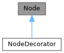
Public Member Functions | |
| Node () | |
| Node (Elements children) | |
| Node (const Node &)=delete | |
| Node (const Node &&)=delete | |
| Node & | operator= (const Node &)=delete |
| Node & | operator= (const Node &&)=delete |
| virtual | ~Node () |
| virtual void | ComputeRequirement () |
| 要素が必要とするスペースを計算します。 | |
| Requirement | requirement () |
| virtual void | SetBox (Box box) |
| 描画のために要素に位置と次元を割り当てます。 | |
| virtual void | Select (Selection &selection) |
| 要素の選択を計算します。 | |
| virtual void | Render (Screen &screen) |
| 要素をftxui::Screenに表示します。 | |
| virtual std::string | GetSelectedContent (Selection &selection) |
| virtual void | Check (Status *status) |
Protected Attributes | |
| Elements | children_ |
| Requirement | requirement_ |
| Box | box_ |
Constructor & Destructor Documentation
◆ Node() [1/4]
|
default |
◆ Node() [2/4]
◆ Node() [3/4]
◆ Node() [4/4]
◆ ~Node()
|
virtualdefault |
Member Function Documentation
◆ operator=() [1/2]
◆ operator=() [2/2]
◆ ComputeRequirement()
|
virtual |
◆ requirement()
|
inline |
◆ SetBox()
|
virtual |
◆ Select()
◆ Render()
|
virtual |
◆ GetSelectedContent()
|
virtual |
◆ Check()
Member Data Documentation
◆ children_
◆ requirement_
|
protected |
◆ box_
◆ ftxui::Requirement
| struct ftxui::Requirement |
Requirementは、ターミナルユーザーインターフェースにおけるNodeのレイアウト要件を定義する構造体です。
要素を完全に描画するために必要な最小サイズを指定します。
Definition at line 17 of file requirement.hpp.
Public Attributes | |
| int | min_x = 0 |
| int | min_y = 0 |
| int | flex_grow_x = 0 |
| int | flex_grow_y = 0 |
| int | flex_shrink_x = 0 |
| int | flex_shrink_y = 0 |
| Focused | focused |
Member Data Documentation
◆ min_x
| int min_x = 0 |
Definition at line 19 of file requirement.hpp.
◆ min_y
| int min_y = 0 |
Definition at line 20 of file requirement.hpp.
◆ flex_grow_x
| int flex_grow_x = 0 |
Definition at line 23 of file requirement.hpp.
◆ flex_grow_y
| int flex_grow_y = 0 |
Definition at line 24 of file requirement.hpp.
◆ flex_shrink_x
| int flex_shrink_x = 0 |
Definition at line 25 of file requirement.hpp.
◆ flex_shrink_y
| int flex_shrink_y = 0 |
Definition at line 26 of file requirement.hpp.
◆ focused
| Focused focused |
Definition at line 50 of file requirement.hpp.
◆ ftxui::Selection
| class ftxui::Selection |
ターミナルユーザーインターフェースにおける選択範囲を表します。
Selectionは、ターミナルユーザーインターフェースにおける選択範囲の2つのエンドポイントを表すクラスです。
Definition at line 20 of file selection.hpp.
Public Member Functions | |
| Selection () | |
| 空の選択を作成します。 | |
| Selection (int start_x, int start_y, int end_x, int end_y) | |
| 選択を作成します。 | |
| const Box & | GetBox () const |
| 選択範囲のボックスを取得します。 | |
| Selection | SaturateHorizontal (Box box) |
選択範囲をボックス内に収めます。 これはhboxによって、選択範囲をその子に伝播するために呼び出されます。 | |
| Selection | SaturateVertical (Box box) |
選択範囲をボックス内に収めます。 これはvboxによって、選択範囲をその子に伝播するために呼び出されます。 | |
| bool | IsEmpty () const |
| void | AddPart (const std::string &part, int y, int left, int right) |
| std::string | GetParts () |
Constructor & Destructor Documentation
◆ Selection() [1/2]
|
default |
空の選択を作成します。
◆ Selection() [2/2]
| Selection | ( | int | start_x, |
| int | start_y, | ||
| int | end_x, | ||
| int | end_y ) |
選択を作成します。
- Parameters
-
start_x 選択範囲の開始X座標。 start_y 選択範囲の開始Y座標。 end_x 選択範囲の終了X座標。 end_y 選択範囲の終了Y座標。
Definition at line 34 of file src/ftxui/dom/selection.cpp.
Member Function Documentation
◆ GetBox()
| const Box & GetBox | ( | ) | const |
◆ SaturateHorizontal()
選択範囲をボックス内に収めます。 これはhboxによって、選択範囲をその子に伝播するために呼び出されます。
- Parameters
-
box 選択範囲を収めるボックス。
- Returns
- 収められた選択範囲。
Definition at line 75 of file src/ftxui/dom/selection.cpp.
◆ SaturateVertical()
選択範囲をボックス内に収めます。 これはvboxによって、選択範囲をその子に伝播するために呼び出されます。
- Parameters
-
box 選択範囲を収めるボックス。
- Returns
- 収められた選択範囲。
Definition at line 113 of file src/ftxui/dom/selection.cpp.
◆ IsEmpty()
|
inline |
Definition at line 29 of file selection.hpp.
◆ AddPart()
| void AddPart | ( | const std::string & | part, |
| int | y, | ||
| int | left, | ||
| int | right ) |
Definition at line 146 of file src/ftxui/dom/selection.cpp.
◆ GetParts()
|
inline |
Definition at line 32 of file selection.hpp.
◆ ftxui::Table
| class ftxui::Table |
Tableは、テーブルを描画するためのユーティリティです。
例
- Examples
- examples/dom/table.cpp.
Public Member Functions | |
| Table () | |
| 空のテーブルを作成します。 | |
| Table (std::vector< std::vector< std::string > >) | |
| 文字列のベクターのベクターからテーブルを作成します。 | |
| Table (std::vector< std::vector< Element > >) | |
| Element のベクターのベクターからテーブルを作成します。 | |
| Table (std::initializer_list< std::vector< std::string > > init) | |
| TableSelection | SelectAll () |
| テーブル全体を選択します。 | |
| TableSelection | SelectCell (int column, int row) |
| テーブルのセルを選択します。 | |
| TableSelection | SelectRow (int row_index) |
| テーブルの行を選択します。 | |
| TableSelection | SelectRows (int row_min, int row_max) |
| テーブルの行の範囲を選択します。 | |
| TableSelection | SelectColumn (int column_index) |
| テーブルの列を選択します。 | |
| TableSelection | SelectColumns (int column_min, int column_max) |
| テーブルの列の範囲を選択します。 | |
| TableSelection | SelectRectangle (int column_min, int column_max, int row_min, int row_max) |
| テーブルの矩形を選択します。 | |
| Element | Render () |
| テーブルをレンダリングします。 | |
Constructor & Destructor Documentation
◆ Table() [1/4]
| Table | ( | ) |
空のテーブルを作成します。
Definition at line 46 of file src/ftxui/dom/table.cpp.
◆ Table() [2/4]
|
explicit |
文字列のベクターのベクターからテーブルを作成します。
- Parameters
-
input 入力データ。
Definition at line 52 of file src/ftxui/dom/table.cpp.
◆ Table() [3/4]
Element のベクターのベクターからテーブルを作成します。
- Parameters
-
input 入力要素。
Definition at line 68 of file src/ftxui/dom/table.cpp.
◆ Table() [4/4]
| Table | ( | std::initializer_list< std::vector< std::string > > | init | ) |
Definition at line 74 of file src/ftxui/dom/table.cpp.
Member Function Documentation
◆ SelectAll()
| TableSelection SelectAll | ( | ) |
テーブル全体を選択します。
- Examples
- examples/dom/table.cpp.
Definition at line 199 of file src/ftxui/dom/table.cpp.
◆ SelectCell()
| TableSelection SelectCell | ( | int | column, |
| int | row ) |
テーブルのセルを選択します。
- Parameters
-
column 選択するセルの列。 row 選択するセルの行。
- Note
- 負のインデックスを使用して末尾から選択できます。
Definition at line 168 of file src/ftxui/dom/table.cpp.
◆ SelectRow()
| TableSelection SelectRow | ( | int | index | ) |
テーブルの行を選択します。
- Parameters
-
index 選択する行のインデックス。
- Note
- 負のインデックスを使用して末尾から選択できます。
Definition at line 137 of file src/ftxui/dom/table.cpp.
◆ SelectRows()
| TableSelection SelectRows | ( | int | row_min, |
| int | row_max ) |
テーブルの行の範囲を選択します。
- Parameters
-
row_min 選択する最初の行。 row_max 選択する最後の行。
- Note
- 負のインデックスを使用して末尾から選択できます。
Definition at line 145 of file src/ftxui/dom/table.cpp.
◆ SelectColumn()
| TableSelection SelectColumn | ( | int | index | ) |
テーブルの列を選択します。
- Parameters
-
index 選択する列のインデックス。
- Note
- 負のインデックスを使用して末尾から選択できます。
Definition at line 152 of file src/ftxui/dom/table.cpp.
◆ SelectColumns()
| TableSelection SelectColumns | ( | int | column_min, |
| int | column_max ) |
テーブルの列の範囲を選択します。
- Parameters
-
column_min 選択する最初の列。 column_max 選択する最後の列。
- Note
- 負のインデックスを使用して末尾から選択できます。
Definition at line 160 of file src/ftxui/dom/table.cpp.
◆ SelectRectangle()
| TableSelection SelectRectangle | ( | int | column_min, |
| int | column_max, | ||
| int | row_min, | ||
| int | row_max ) |
テーブルの矩形を選択します。
- Parameters
-
column_min 選択する最初の列。 column_max 選択する最後の列。 row_min 選択する最初の行。 row_max 選択する最後の行。
- Note
- 負のインデックスを使用して末尾から選択できます。
Definition at line 178 of file src/ftxui/dom/table.cpp.
◆ Render()
| Element Render | ( | ) |
テーブルをレンダリングします。
- Returns
- レンダリングされたテーブル。これは描画できる要素です。
Definition at line 211 of file src/ftxui/dom/table.cpp.
Enumeration Type Documentation
◆ Direction
|
strong |
Directionは、東西南北の4つの基本方向を表す列挙型です。
| Enumerator | |
|---|---|
| Up | |
| Down | |
| Left | |
| Right | |
Definition at line 11 of file direction.hpp.
◆ BorderStyle
| enum BorderStyle |
BorderStyleは、ターミナルUIの要素に適用できる様々なボーダースタイルを表す列挙型です。
BorderStyleは、ターミナルUIの要素に適用できる様々なボーダースタイルを表す列挙型です。 ウィンドウ、フレーム、セパレータなどの要素の周囲の境界線の視覚的な外観を定義するために使用されます。
| Enumerator | |
|---|---|
| LIGHT | |
| DASHED | |
| HEAVY | |
| DOUBLE | |
| ROUNDED | |
| EMPTY | |
Definition at line 31 of file elements.hpp.
Function Documentation
◆ automerge()
文字が近くの他の文字と自動的にマージされるようにします。
Definition at line 16 of file automerge.cpp.
◆ blink()
◆ bold()
◆ border()
| Element border | ( | Element | child | ) |
要素の周囲にボーダーを描画します。
- See also
- border
- borderLight
- borderDashed
- borderDouble
- borderHeavy
- borderEmpty
- borderRounded
- borderStyled
- borderWith
要素の周囲にボーダーを追加します
例
出力
- Examples
- examples/component/checkbox_in_frame.cpp, examples/component/flexbox_gallery.cpp, examples/component/gallery.cpp, examples/component/input_style.cpp, examples/component/menu_in_frame.cpp, examples/component/menu_style.cpp, examples/component/modal_dialog.cpp, examples/component/print_key_press.cpp, examples/component/radiobox_in_frame.cpp, examples/component/renderer.cpp, examples/component/resizable_split.cpp, examples/dom/canvas.cpp, examples/dom/graph.cpp, examples/dom/gridbox.cpp, examples/dom/html_like.cpp, and examples/dom/spinner.cpp.
Definition at line 225 of file src/ftxui/dom/border.cpp.
◆ borderWith()
| Decorator borderWith | ( | const Pixel & | pixel | ) |
borderと同じですが、要素の周囲に一定のピクセルを使用します。
- See also
- border
Definition at line 232 of file src/ftxui/dom/border.cpp.
◆ borderStyled() [1/3]
| Decorator borderStyled | ( | BorderStyle | style | ) |
borderと同じですが、異なるスタイルを使用します。
- See also
- border
- Examples
- examples/dom/border_colored.cpp.
Definition at line 241 of file src/ftxui/dom/border.cpp.
◆ borderStyled() [2/3]
| Decorator borderStyled | ( | Color | foreground_color | ) |
◆ borderStyled() [3/3]
| Decorator borderStyled | ( | BorderStyle | style, |
| Color | foreground_color ) |
borderと同じですが、前景色と異なるスタイルを使用します
- See also
- border
Definition at line 260 of file src/ftxui/dom/border.cpp.
◆ borderDashed()
| Element borderDashed | ( | Element | child | ) |
要素の周囲に破線のボーダーを描画します。
- See also
- border
- borderLight
- borderDashed
- borderDouble
- borderHeavy
- borderRounded
- borderEmpty
- borderStyled
- borderWith
要素の周囲にボーダーを追加します
例
出力
- Examples
- examples/dom/border_style.cpp.
Definition at line 298 of file src/ftxui/dom/border.cpp.
◆ borderLight()
| Element borderLight | ( | Element | child | ) |
要素の周囲に細いボーダーを描画します。
- See also
- border
- borderLight
- borderDashed
- borderDouble
- borderHeavy
- borderRounded
- borderEmpty
- borderStyled
- borderWith
要素の周囲にボーダーを追加します
例
出力
- Examples
- examples/dom/border_style.cpp.
Definition at line 333 of file src/ftxui/dom/border.cpp.
◆ borderHeavy()
| Element borderHeavy | ( | Element | child | ) |
要素の周囲に太いボーダーを描画します。
- See also
- border
- borderLight
- borderDashed
- borderDouble
- borderHeavy
- borderRounded
- borderEmpty
- borderStyled
- borderWith
要素の周囲にボーダーを追加します
例
出力
- Examples
- examples/dom/border_style.cpp.
Definition at line 368 of file src/ftxui/dom/border.cpp.
◆ borderDouble()
| Element borderDouble | ( | Element | child | ) |
要素の周囲に二重線のボーダーを描画します。
- See also
- border
- borderLight
- borderDashed
- borderDouble
- borderHeavy
- borderRounded
- borderEmpty
- borderStyled
- borderWith
要素の周囲にボーダーを追加します
例
出力
- Examples
- examples/component/input_style.cpp, examples/component/menu_style.cpp, and examples/dom/border_style.cpp.
Definition at line 403 of file src/ftxui/dom/border.cpp.
◆ borderRounded()
| Element borderRounded | ( | Element | child | ) |
要素の周囲に角の丸いボーダーを描画します。
- See also
- border
- borderLight
- borderDashed
- borderDouble
- borderHeavy
- borderRounded
- borderEmpty
- borderStyled
- borderWith
要素の周囲にボーダーを追加します
例
出力
Definition at line 438 of file src/ftxui/dom/border.cpp.
◆ borderEmpty()
| Element borderEmpty | ( | Element | child | ) |
要素の周囲に空のボーダーを描画します。
- See also
- border
- borderLight
- borderDashed
- borderDouble
- borderHeavy
- borderRounded
- borderEmpty
- borderStyled
- borderWith
要素の周囲にボーダーを追加します
例
出力
- Examples
- examples/component/dropdown_custom.cpp, examples/component/input_style.cpp, examples/component/menu_underline_animated_gallery.cpp, and examples/component/with_restored_io.cpp.
Definition at line 473 of file src/ftxui/dom/border.cpp.
◆ window()
| Element window | ( | Element | title, |
| Element | content, | ||
| BorderStyle | border ) |
要素の周囲にタイトルとボーダーを持つウィンドウを描画します。
- Parameters
-
title ウィンドウのタイトル。 content ラップする要素。 border ボーダーのスタイル。デフォルトはROUNDEDです。
- See also
- border
例
出力
- Examples
- examples/component/flexbox_gallery.cpp, examples/component/homescreen.cpp, examples/component/menu_multiple.cpp, examples/component/resizable_split_clamp.cpp, examples/component/selection.cpp, examples/dom/color_truecolor_RGB.cpp, examples/dom/hflow.cpp, examples/dom/package_manager.cpp, examples/dom/size.cpp, and examples/dom/vflow.cpp.
Definition at line 505 of file src/ftxui/dom/border.cpp.
◆ clear_under()
|child|を描画する前に、下にあるピクセルをクリアします。これは、 dboxと組み合わせて使用すると便利です。
- See also
- ftxui::dbox
Definition at line 38 of file clear_under.cpp.
◆ color() [1/4]
要素の前景色を設定します。
- Parameters
-
color 出力要素の色。 child 入力要素。
- Returns
- 色付けされた出力要素。
例
Definition at line 81 of file dom/color.cpp.
◆ bgcolor() [1/4]
要素の背景色を設定します。
- Parameters
-
color 出力要素の色。 child 入力要素。
- Returns
- 色付けされた出力要素。
例
Definition at line 96 of file dom/color.cpp.
◆ color() [2/4]
前景色を使用して装飾します。
- Parameters
-
c 適用する前景色。
- Returns
- 色を適用するデコレータ。
例
Definition at line 110 of file dom/color.cpp.
◆ bgcolor() [2/4]
背景色を使用して装飾します。
- Parameters
-
color 適用する背景色。
- Returns
- 色を適用するデコレータ。
例
Definition at line 124 of file dom/color.cpp.
◆ hcenter()
要素を水平方向に中央揃えします。
- Parameters
-
child 装飾される要素。
- Returns
- 中央揃えされた要素。
Definition at line 15 of file composite_decorator.cpp.
◆ vcenter()
要素を垂直方向に中央揃えします。
- Parameters
-
child 装飾される要素。
- Returns
- 中央揃えされた要素。
Definition at line 23 of file composite_decorator.cpp.
◆ center()
要素を水平方向および垂直方向に中央揃えします。
- Parameters
-
child 装飾される要素。
- Returns
- 中央揃えされた要素。
Definition at line 31 of file composite_decorator.cpp.
◆ align_right()
要素を右側に揃えます。
- Parameters
-
child 装飾される要素。
- Returns
- 右揃えされた要素。
Definition at line 39 of file composite_decorator.cpp.
◆ dbox()
複数の要素を重ねて表示します。
- Parameters
-
children_ 入力要素。
- Returns
- 右寄せされた要素。
Definition at line 55 of file src/ftxui/dom/dbox.cpp.
◆ dim()
◆ filler()
◆ flex()
◆ xflex()
◆ yflex()
◆ flex_grow()
◆ xflex_grow()
◆ yflex_grow()
◆ flex_shrink()
◆ xflex_shrink()
◆ yflex_shrink()
◆ notflex()
◆ focusPositionRelative()
| Decorator focusPositionRelative | ( | float | x, |
| float | y ) |
frame内で使用され、ビューを特定の位置にスクロールさせます。位置は要求されたサイズの割合で表されます。
例えば:
- (0, 0) は、ビューが左上隅にスクロールされることを意味します。
- (1, 0) は、ビューが右上隅にスクロールされることを意味します。
- (0, 1) は、ビューが左下隅にスクロールされることを意味します。
Example
Definition at line 28 of file src/ftxui/dom/focus.cpp.
◆ focusPosition()
| Decorator focusPosition | ( | int | x, |
| int | y ) |
frame内で使用され、ビューを特定の位置にスクロールさせます。位置はセル数で表されます。
Example
Definition at line 65 of file src/ftxui/dom/focus.cpp.
◆ focus()
◆ focusCursorBlock()
◆ focusCursorBlockBlinking()
◆ focusCursorBar()
◆ focusCursorBarBlinking()
◆ focusCursorUnderline()
◆ focusCursorUnderlineBlinking()
◆ gaugeDirection()
指定された方向に進行する高精細プログレスバーを描画します。
- Parameters
-
progress 塗りつぶされる領域の割合。[0,1]に属します。 direction プログレスバーの進行方向。
Definition at line 173 of file src/ftxui/dom/gauge.cpp.
◆ gaugeRight()
| Element gaugeRight | ( | float | progress | ) |
左から右へ進行する高精細プログレスバーを描画します。
- Parameters
-
progress 塗りつぶされる領域の割合。[0,1]に属します。
Example
ゲージ。プログレスバーとして使用できます。
Output
Definition at line 195 of file src/ftxui/dom/gauge.cpp.
◆ gaugeLeft()
| Element gaugeLeft | ( | float | progress | ) |
右から左へ進行する高精細プログレスバーを描画します。
- Parameters
-
progress 塗りつぶされる領域の割合。[0,1]に属します。
Example
ゲージ。プログレスバーとして使用できます。
Output
Definition at line 217 of file src/ftxui/dom/gauge.cpp.
◆ gaugeUp()
| Element gaugeUp | ( | float | progress | ) |
下から上へ進行する高精細プログレスバーを描画します。
- Parameters
-
progress 塗りつぶされる領域の割合。[0,1]に属します。
Example
ゲージ。プログレスバーとして使用できます。
Output
Definition at line 246 of file src/ftxui/dom/gauge.cpp.
◆ gaugeDown()
| Element gaugeDown | ( | float | progress | ) |
上から下へ進行する高精細プログレスバーを描画します。
- Parameters
-
progress 塗りつぶされる領域の割合。[0,1]に属します。
Example
ゲージ。プログレスバーとして使用できます。
Output
Definition at line 275 of file src/ftxui/dom/gauge.cpp.
◆ gauge()
| Element gauge | ( | float | progress | ) |
高精細プログレスバーを描画します。
- Parameters
-
progress 塗りつぶされる領域の割合。[0,1]に属します。
Example
ゲージ。プログレスバーとして使用できます。
Output
Definition at line 297 of file src/ftxui/dom/gauge.cpp.
◆ hyperlink() [1/2]
ウェブブラウザを使用してレンダリングされた領域をクリック可能にします。 ユーザーがクリックするとリンクが開きます。 これは、限られたターミナルエミュレータでのみサポートされています。 リスト: https://github.com/Alhadis/OSC8-Adoption/
- Parameters
-
link リンク child 入力要素。
- Returns
- リンクを持つ出力要素。
例
Definition at line 50 of file hyperlink.cpp.
◆ hyperlink() [2/2]
| Decorator hyperlink | ( | std::string | link | ) |
ハイパーリンクを使用して装飾します。 ユーザーがクリックするとリンクが開きます。 これは、限られたターミナルエミュレータでのみサポートされています。 リスト: https://github.com/Alhadis/OSC8-Adoption/
- Parameters
-
link ユーザーをリダイレクトするリンク。
- Returns
- ハイパーリンクを適用するデコレータ。
例
Definition at line 69 of file hyperlink.cpp.
◆ inverted()
前景色と背景色を反転させるフィルターを追加します。
Definition at line 32 of file inverted.cpp.
◆ italic()
テキストに斜体を適用します。
Definition at line 16 of file italic.cpp.
◆ color() [3/4]
| Element color | ( | const LinearGradient & | gradient, |
| Element | child ) |
線形グラデーション効果を持つ要素のフォアグラウンドカラーを設定します。
- Parameters
-
gradient 出力要素に適用されるグラデーション効果。 child 入力要素。
- Returns
- 色付けされた出力要素。
例
Definition at line 244 of file src/ftxui/dom/linear_gradient.cpp.
◆ bgcolor() [3/4]
| Element bgcolor | ( | const LinearGradient & | gradient, |
| Element | child ) |
線形グラデーション効果を持つ要素の背景色を設定します。
- Parameters
-
gradient 出力要素に適用されるグラデーション効果。 child 入力要素。
- Returns
- 色付けされた出力要素。
例
Definition at line 260 of file src/ftxui/dom/linear_gradient.cpp.
◆ color() [4/4]
| Decorator color | ( | const LinearGradient & | gradient | ) |
フォアグラウンドカラーに線形グラデーション効果を使用して装飾します。
- Parameters
-
gradient 出力要素に適用されるグラデーション効果。
- Returns
- 色を適用するデコレーター。
例
Definition at line 275 of file src/ftxui/dom/linear_gradient.cpp.
◆ bgcolor() [4/4]
| Decorator bgcolor | ( | const LinearGradient & | gradient | ) |
背景色に線形グラデーション効果を使用して装飾します。
- Parameters
-
gradient 出力要素に適用されるグラデーション効果。
- Returns
- 色を適用するデコレーター。
例
Definition at line 290 of file src/ftxui/dom/linear_gradient.cpp.
◆ Render() [1/2]
◆ Render() [2/2]
◆ paragraph()
| Element paragraph | ( | const std::string & | the_text | ) |
◆ paragraphAlignLeft()
| Element paragraphAlignLeft | ( | const std::string & | the_text | ) |
段落を複数行にわたって左揃えで描画する要素を返します。
- See also
- flexbox.
Definition at line 47 of file src/ftxui/dom/paragraph.cpp.
◆ paragraphAlignRight()
| Element paragraphAlignRight | ( | const std::string & | the_text | ) |
段落を複数行にわたって右揃えで描画する要素を返します。
- See also
- flexbox.
Definition at line 57 of file src/ftxui/dom/paragraph.cpp.
◆ paragraphAlignCenter()
| Element paragraphAlignCenter | ( | const std::string & | the_text | ) |
段落を複数行にわたって中央揃えで描画する要素を返します。
- See also
- flexbox.
Definition at line 68 of file src/ftxui/dom/paragraph.cpp.
◆ paragraphAlignJustify()
| Element paragraphAlignJustify | ( | const std::string & | the_text | ) |
段落を複数行にわたって両端揃えで描画する要素を返します。 中央に。
- See also
- flexbox.
Definition at line 80 of file src/ftxui/dom/paragraph.cpp.
◆ vscroll_indicator()
右側に垂直スクロールバーを表示します。 色はコンテンツに従います。
Definition at line 20 of file scroll_indicator.cpp.
◆ hscroll_indicator()
下部に水平スクロールバーを表示します。 色はコンテンツに従います。
Definition at line 75 of file scroll_indicator.cpp.
◆ separatorStyled()
| Element separatorStyled | ( | BorderStyle | style | ) |
他の2つの要素の間に垂直または水平の区切り線を描画します。
- See also
- separator
- separatorLight
- separatorDashed
- separatorDouble
- separatorHeavy
- separatorEmpty
- separatorRounded
- separatorStyled
- separatorCharacter
2つの要素間に視覚的な区切りを追加します。
Example
cpp // 関数として \'border\' を使用... Element document = vbox({ text("up"), separatorStyled(DOUBLE), text("down"), });
Definition at line 152 of file src/ftxui/dom/separator.cpp.
◆ separatorDashed()
| Element separatorDashed | ( | ) |
他の2つの要素の間にLIGHTスタイルで垂直または水平の区切り線を描画します。
- See also
- separator
- separatorLight
- separatorDashed
- separatorDouble
- separatorHeavy
- separatorEmpty
- separatorRounded
- separatorStyled
- separatorCharacter
2つの要素間に視覚的な区切りを追加します。
Example
cpp // 関数として \'border\' を使用... Element document = vbox({ text("up"), separatorDashed(), text("down"), });
Definition at line 206 of file src/ftxui/dom/separator.cpp.
◆ separatorDouble()
| Element separatorDouble | ( | ) |
他の2つの要素の間にHEAVYスタイルで垂直または水平の区切り線を描画します。
- See also
- separator
- separatorLight
- separatorDashed
- separatorDouble
- separatorHeavy
- separatorEmpty
- separatorRounded
- separatorStyled
- separatorCharacter
2つの要素間に視覚的な区切りを追加します。
Example
cpp // 関数として \'border\' を使用... Element document = vbox({ text("up"), separatorDouble(), text("down"), });
Definition at line 260 of file src/ftxui/dom/separator.cpp.
◆ separatorEmpty()
| Element separatorEmpty | ( | ) |
他の2つの要素の間にEMPTYスタイルで垂直または水平の区切り線を描画します。
- See also
- separator
- separatorLight
- separatorDashed
- separatorDouble
- separatorHeavy
- separatorEmpty
- separatorRounded
- separatorStyled
- separatorCharacter
2つの要素間に視覚的な区切りを追加します。
Example
Output
Definition at line 296 of file src/ftxui/dom/separator.cpp.
◆ size()
| Decorator size | ( | WidthOrHeight | direction, |
| Constraint | constraint, | ||
| int | value ) |
要素のサイズに制約を適用します。
- Parameters
-
direction 要素のWIDTHまたはHEIGHTを制約するかどうか。 constraint 制約のタイプ。 value 値。
Definition at line 88 of file src/ftxui/dom/size.cpp.
◆ spinner()
| Element spinner | ( | int | charset_index, |
| size_t | image_index ) |
時間やイベントの効果を表現するのに便利です。これはアスキーアートの「ビデオ」を表示します。
- Parameters
-
charset_index 「ビデオ」の種類。 image_index ビデオの「フレーム」。これは「ステップ」ごとに増やす必要があります。
Definition at line 280 of file src/ftxui/dom/spinner.cpp.
◆ strikethrough()
テキストに打ち消し線を適用します。
Definition at line 16 of file strikethrough.cpp.
◆ text() [1/2]
| Element text | ( | std::string | text | ) |
◆ text() [2/2]
| Element text | ( | std::wstring | text | ) |
◆ vtext() [1/2]
| Element vtext | ( | std::string | text | ) |
◆ vtext() [2/2]
| Element vtext | ( | std::wstring | text | ) |
◆ underlined()
指定された要素に下線を追加します。
Definition at line 32 of file underlined.cpp.
◆ underlinedDouble()
テキストに二重下線を適用します。
Definition at line 16 of file underlined_double.cpp.
◆ nothing()
何も行わないデコレーションです。
Definition at line 28 of file dom/util.cpp.
◆ operator|() [1/3]
◆ operator|() [2/3]
◆ operator|() [3/3]
◆ operator|=()
◆ emptyElement()
| Element emptyElement | ( | ) |
何も描画しない0x0サイズの要素。
Definition at line 140 of file dom/util.cpp.
◆ vbox()
◆ SetColorSupport()
| void SetColorSupport | ( | Color | color | ) |
自動検出が失敗した場合にターミナルの色サポートを上書きします
Definition at line 130 of file terminal.cpp.