ftxui::component モジュールは、ユーザーイベント (キーボード、マウスなど) に応答するインタラクティブなコンポーネントを生成するロジックを定義します。
Example セクションには、例のコレクションが記載されています。
ftxui::ScreenInteractive は、コンポーネントをレンダリングするメインループを定義します。
ftxui::Component は ftxui::ComponentBase への共有ポインタです。後者は以下を定義します。
ftxui::Element は単一のフレームをレンダリングするために使用されます。
ftxui::Component は、動的なユーザーインターフェースをレンダリングし、複数のフレームを生成し、イベントに応じてその状態を更新するために使用されます。
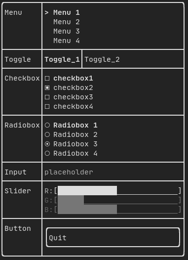
複数のコンポーネントのギャラリー。(デモ)
すべての事前定義されたコンポーネントは "ftxui/dom/component.hpp" で利用可能です。
#ifndef FTXUI_COMPONENT_HPP
#define FTXUI_COMPONENT_HPP
#include <functional>
#include <memory>
#include <utility>
struct ButtonOption;
struct CheckboxOption;
struct Event;
struct InputOption;
struct MenuOption;
struct RadioboxOption;
struct MenuEntryOption;
template <class T, class... Args>
std::shared_ptr<T>
Make(Args&&... args) {
return std::make_shared<T>(std::forward<Args>(args)...);
}
}
std::function<void()> on_click,
bool* checked,
StringRef placeholder,
InputOption options = {});
int* selected_,
int* selected_,
RadioboxOption options = {});
template <typename T>
Ref<int> value,
ConstRef<int> min = 0,
ConstRef<int> max = 100,
ConstRef<int> increment = 5);
Ref<float> value,
ConstRef<float> min = 0.f,
ConstRef<float> max = 100.f,
ConstRef<float> increment = 5.f);
Ref<long> value,
ConstRef<long> min = 0L,
ConstRef<long> max = 100L,
ConstRef<long> increment = 5L);
ComponentDecorator
Renderer(ElementDecorator);
ComponentDecorator
CatchEvent(std::function<
bool(Event)> on_event);
ComponentDecorator
Maybe(
const bool* show);
ComponentDecorator
Maybe(std::function<
bool()>);
Ref<bool> show = false);
std::function<void()> on_enter,
std::function<void()> on_leave);
std::function<void(bool)> on_change);
ComponentDecorator
Hoverable(std::function<
void()> on_enter,
std::function<void()> on_leave);
ComponentDecorator
Hoverable(std::function<
void(
bool)> on_change);
}
#endif
static CheckboxOption Simple()
標準チェックボックスのオプション。
static ButtonOption Simple()
フォーカス時に反転するButtonOptionを作成します。
static MenuOption Vertical()
垂直メニューの標準オプション。 これは選択可能なアイテムのリストを実装するのに役立ちます。
Component Horizontal(Components children)
コンポーネントのリスト。水平方向に1つずつ描画され、左右の矢印キーまたは'h'/'l'キーを使用して水平方向にナビゲートされます。
Component Maybe(Component, const bool *show)
コンポーネント|child|を装飾します。|show|がtrueの場合にのみ表示されます。
Component ResizableSplitTop(Component main, Component back, int *main_size)
2つのコンポーネント間の垂直分割。マウスで設定可能。
Component Menu(MenuOption options)
テキストのリスト。フォーカスされた要素が選択されます。
Component MenuEntry(MenuEntryOption options)
特定のメニューエントリ。これらはContainer::Verticalに入れてメニューを形成できます。
Component Toggle(ConstStringListRef entries, int *selected)
要素の水平リスト。ユーザーはこれらを操作できます。
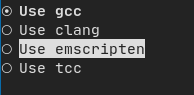
Component Radiobox(RadioboxOption options)
1つだけ選択できる要素のリスト。
Component Button(ButtonOption options)
Draw a button. Execute a function when clicked. (ja: ボタンを描画します。クリックされたときに機能を実行します。)
Component Modal(Component main, Component modal, const bool *show_modal)
Component Renderer(Component child, std::function< Element()>)
|child|に似ていますが、|render|をComponentRender()イベントとして使用する新しいコンポーネントを返します。
Component Hoverable(Component component, bool *hover)
コンポーネントをラップします。マウスでホバーされているかどうかを知る機能を提供します。
Component Window(WindowOptions option)
ドラッグ可能/サイズ変更可能なウィンドウ。複数のウィンドウを使用するには、それらを Container::Stacked({...})コンポーネントを使用してスタックする必要があります。
Component Vertical(Components children)
コンポーネントのリスト。垂直方向に1つずつ描画され、上下の矢印キーまたは'j'/'k'キーを使用して垂直方向にナビゲートされます。
Component ResizableSplitRight(Component main, Component back, int *main_size)
2つのコンポーネント間の水平分割。マウスで設定可能。
Component Dropdown(ConstStringListRef entries, int *selected)
ドロップダウンメニュー。
Component Stacked(Components children)
互いの上にスタックされるコンポーネントのリスト。 イベントは、最初のコンポーネントに伝播され、処理されない場合は2番目のコンポーネントに伝播されます。 コンポーネントは与えられた順序とは逆の順序で描画さ...
Component ResizableSplitBottom(Component main, Component back, int *main_size)
2つのコンポーネント間の垂直分割。マウスで設定可能。
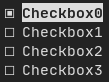
Component Checkbox(CheckboxOption options)
チェック可能な要素を描画します。
Component ResizableSplitLeft(Component main, Component back, int *main_size)
2つのコンポーネント間の水平分割。マウスで設定可能。
Component Tab(Components children, int *selector)
コンポーネントのリスト。一度に1つだけ描画され、操作されます。|selector|は選択されたコンポーネントのインデックスを提供します。これはタブを実装するのに便利です。
FTXUIのftxui::Container::名前空間
std::shared_ptr< T > Make(Args &&... args)
std::shared_ptr< Node > Element
std::vector< Component > Components
Component ResizableSplit(ResizableSplitOption options)
2つのコンポーネント間の分割。
Component Collapsible(ConstStringRef label, Component child, Ref< bool > show=false)
折りたたみ可能なコンポーネント。矢印付きのチェックボックスを表示します。アクティブ化されると、子が 表示されます。
Component Input(InputOption options={})
Component operator|(Component component, ElementDecorator decorator)
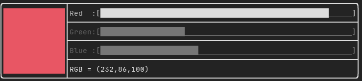
Component Slider(SliderOption< T > options)
どの方向にも対応するスライダー。
Component & operator|=(Component &component, ComponentDecorator decorator)
std::shared_ptr< ComponentBase > Component
Component CatchEvent(Component child, std::function< bool(Event)>)
Input
例:
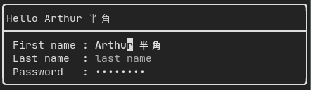
によって生成されます: "ftxui/component/component.hpp" の ftxui::Input()
Filtered input
ftxui::CatchEvent を使用して、入力コンポーネントによって受信される文字をフィルタリングできます。
std::string phone_number;
Component input = Input(&phone_number, "phone number");
input |= CatchEvent([&](Event event) {
return event.is_character() && !std::isdigit(event.character()[0]);
});
input |= CatchEvent([&](Event event) {
return event.is_character() && phone_number.size() >= 10;
});
Menu
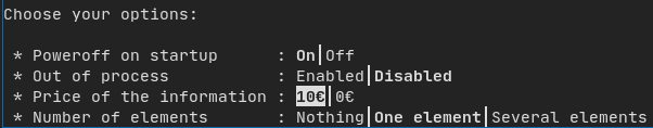
メニューオブジェクトを定義します。エントリのリストが含まれており、そのうちの1つが選択されています。
例:
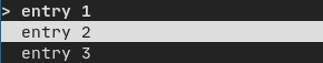
によって生成されます: "ftxui/component/component.hpp" の ftxui::Menu()
Toggle
特別な種類のメニュー。エントリは水平に表示されます。
例:
によって生成されます: "ftxui/component/component.hpp" の ftxui::Toggle()
CheckBox
このコンポーネントはチェックボックスを定義します。これはオン/オフを切り替えることができる単一のエントリです。
例:
によって生成されます: "ftxui/component/component.hpp" の ftxui::Checkbox()
RadioBox
ラジオボタンコンポーネント。これはエントリのリストであり、そのうちの1つをオンにすることができます。
例:
によって生成されます: "ftxui/component/component.hpp" の ftxui::Radiobox()
Dropdown
ドロップダウンメニューは、開くとユーザーが選択できる要素のリストを表示するコンポーネントです。
例:

によって生成されます: "ftxui/component/component.hpp" の ftxui::Dropdown()
Slider
区切られた中間間隔を持つ範囲で構成されるスライダーオブジェクトを表します。ftxui::Slider() によって作成できます。
例:
によって生成されます: "ftxui/component/component.hpp" の ftxui::Slider()
Renderer
ftxui::Renderer() によって生成されます (ftxui/component/component.hpp から)。このコンポーネントは、インターフェースをレンダリングするために別の関数を使用することで、別のコンポーネントを装飾します。
例:
auto inner = [...]
auto renderer = Renderer(inner, [&] {
return inner->Render() | border
});
ftxui::Renderer はコンポーネントデコレーターパターンもサポートしています。
auto component = [...]
component = component
| Renderer([](Element e) {
return e |
border))
| Renderer(bold)
Element border(Element child)
要素の周囲にボーダーを描画します。
短縮形として、コンポーネントを要素デコレーターと組み合わせることもできます。
auto component = [...]
component = component | border | bold;
CatchEvent
ftxui::CatchEvent() によって生成されます (ftxui/component/component.hpp から)。このコンポーネントは、基になるコンポーネントの前にイベントをキャッチして、他のコンポーネントを装飾します。
例:
auto screen = ScreenInteractive::TerminalOutput();
auto renderer = Renderer([] {
return text("My interface");
});
auto component = CatchEvent(renderer, [&](Event event) {
if (event == Event::Character('q')) {
screen.ExitLoopClosure()();
return true;
}
return false;
});
screen.Loop(component);
ftxui::CatchEvent はデコレーターとしても使用できます。
component = component
| CatchEvent(handler_1)
| CatchEvent(handler_2)
| CatchEvent(handler_3)
;
Collapsible
ユーザーが可視性をオン/オフに切り替えることができる視覚要素に役立ちます。本質的に、これは ftxui::Checkbox() と ftxui::Maybe() コンポーネントの組み合わせです。
auto collapsible = Collapsible("Show more", inner_element);
Maybe
ftxui::Maybe() によって生成されます (ftxui/component/component.hpp から)。このコンポーネントは、ブール値または述語を介して他のコンポーネントを表示/非表示するために利用できます。
ブール値の例:
bool show = true;
auto component = Renderer([]{ return "Hello World!"; });
auto maybe_component = Maybe(component, &show)
述語の例:
auto component = Renderer([]{ return "Hello World!"; });
auto maybe_component = Maybe(component, [&] { return time > 10; })
通常どおり、ftxui::Maybe はデコレーターとしても使用できます。
component = component
| Maybe(&a_boolean)
| Maybe([&] { return time > 10; })
;
Container
Horizontal
"ftxui/component/component.hpp" の ftxui::Container::Horizontal() によって生成されます。コンポーネントのリストを水平に表示し、キーボード/マウスナビゲーションを処理します。
Vertical
"ftxui/component/component.hpp" の ftxui::Container::Vertical() によって生成されます。コンポーネントのリストを垂直に表示し、キーボード/マウスナビゲーションを処理します。
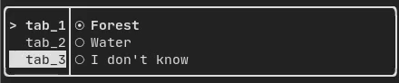
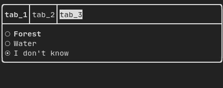
Tab
"ftxui/component/component.hpp" の ftxui::Container::Tab() によって生成されます。コンポーネントのリストを受け取り、そのうちの1つだけを表示します。これはタブバーを実装するのに役立ちます。
垂直:
水平:
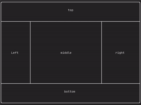
ResizableSplit
2つの子コンポーネント間の水平または垂直の分離を定義します。分割の位置は可変で、マウスで制御できます。 4つの可能な分割があります。
例:
Force a frame redraw.
通常、ftxui::ScreenInteractive::Loop() は、新しいイベントグループ (キーボード、マウス、ウィンドウのリサイズなど) が処理されるたびに新しいフレームを描画する役割を担います。ただし、FTXUI に認識されない任意のイベントに反応したい場合があります。これを達成するには、スレッドを介して ftxui::ScreenInteractive::PostEvent (これはスレッドセーフです) を使用してイベントをポストする必要があります。イベント ftxui::Event::Custom をポストする必要があります。
例:
screen->PostEvent(Event::Custom);
新しいイベントを処理する必要がない場合は、代わりに以下を使用できます。
screen->RequestAnimationFrame();
instead.