该模块定义了一组分层的 ftxui::Element。元素管理布局,并且可以响应终端尺寸变化。请注意以下示例,其中此模块用于创建具有多个运算符的简单布局:
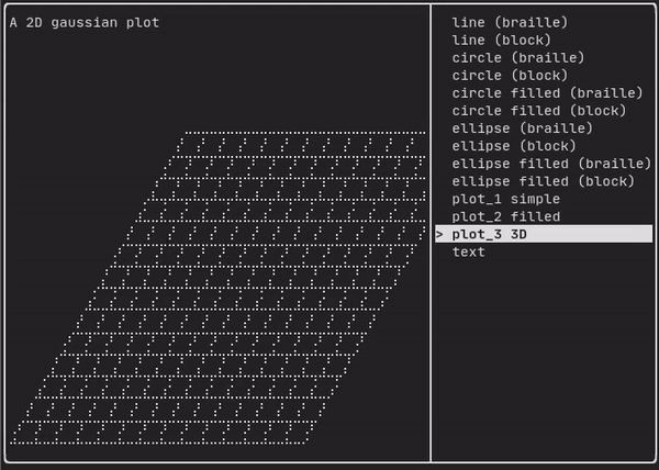
Example 部分提供了一个示例集合。
示例:
...
Element document =
vbox({
text("The footer")
});
document = border(document);
document = document | border.
document |= border
...
}
Element text(std::wstring text)
显示一段Unicode文本。
Decorator color(Color)
使用前景色进行装饰。
Element vbox(Elements)
垂直一个接一个显示元素的容器。
#include "ftxui/component/component_base.hpp" // 用于 ComponentBase
Element gauge(float progress)
绘制一个高清进度条。
元素列表
所有元素都已包含在内,可以通过包含相应的头文件来访问:
#ifndef FTXUI_DOM_ELEMENTS_HPP
#define FTXUI_DOM_ELEMENTS_HPP
#include <functional>
#include <memory>
class Node;
using Element = std::shared_ptr<Node>;
};
Color unselected_color,
Color selected_color);
Color unselected_color,
Color selected_color);
Element canvas(
int width,
int height, std::function<
void(Canvas&)>);
Dimensions
Fit(
Element&,
bool extend_beyond_screen =
false);
}
}
#include "ftxui/dom/take_any_args.hpp"
#endif
Decorator bgcolor(Color)
使用背景色进行装饰。
Element xflex(Element)
在 X 轴上尽可能地扩展/收缩。
Element gaugeDirection(float progress, Direction direction)
绘制一个向指定方向推进的高清进度条。
Decorator focusPositionRelative(float x, float y)
在 frame 内部使用,这会强制视图滚动到给定位置。位置以请求大小的比例表示。
Element separatorStyled(BorderStyle)
在两个其他元素之间绘制垂直或水平分隔线。
Element xflex_grow(Element)
如果可能,在 X 轴上进行扩展。
Element underlinedDouble(Element)
对文本应用双下划线。
Element clear_under(Element element)
在绘制 |child| 之前,清除下方的像素。这与 dbox 结合使用很有用。
Element separatorEmpty()
使用 EMPTY 样式在两个其他元素之间绘制垂直或水平分隔线。
Element vscroll_indicator(Element)
在右侧显示一个垂直滚动条。 颜色跟随内容。
Element nothing(Element element)
一个什么都不做的装饰器。
Decorator size(WidthOrHeight, Constraint, int value)
对元素大小应用约束。
Direction
Direction 是一个枚举,表示四个基本方向。
Element flex(Element)
使子元素按比例扩展以填充容器中剩余的空间。
Element paragraphAlignRight(const std::string &text)
返回一个在多行上绘制段落并右对齐的元素。
Element bold(Element)
使用粗体字体,用于强调元素。
Element separatorLight()
使用 LIGHT 样式在两个其他元素之间绘制垂直或水平分隔线。
Element spinner(int charset_index, size_t image_index)
用于表示时间或事件的效果。这显示了一个 ASCII 艺术“视频”。
Element yflex(Element)
在 Y 轴上尽可能地扩展/收缩。
Element flex_shrink(Element)
如果需要,进行收缩。
Element underlined(Element)
给定元素加下划线。
Element center(Element)
水平并垂直居中一个元素。
Element inverted(Element)
添加一个过滤器,用于反转前景色和背景色。
Element paragraphAlignCenter(const std::string &text)
返回一个在多行上绘制段落并居中对齐的元素。
Element align_right(Element)
将元素右对齐。
Decorator focusPosition(int x, int y)
在 frame 内部使用,这会强制视图滚动到给定位置。位置以单元格数量表示。
Element yflex_grow(Element)
如果可能,在 Y 轴上进行扩展。
Element hscroll_indicator(Element)
在底部显示一个水平滚动条。 颜色跟随内容。
Element flex_grow(Element)
如果可能,进行扩展。
Element separatorDashed()
使用 DASHED 样式在两个其他元素之间绘制垂直或水平分隔线。
Element notflex(Element)
使元素不可伸缩。
Element strikethrough(Element)
对文本应用删除线。
Element italic(Element)
对文本应用双下划线。
Element dbox(Elements)
将多个元素堆叠在一起。
Element xflex_shrink(Element)
如果需要,在 X 轴上进行收缩。
Element separatorCharacter(std::string)
在两个其他元素之间绘制垂直或水平分隔线。
Element vtext(std::wstring text)
垂直显示一段Unicode文本。
Element focus(Element)
将 child 设置为其同级元素中获得焦点的元素。
Element paragraphAlignLeft(const std::string &text)
返回一个在多行上绘制段落并左对齐的元素。
Element separator()
在两个其他元素之间绘制垂直或水平分隔线。
Element filler()
一个元素,它将按比例扩展以填充容器中剩余的空间。
Element dim(Element)
使用浅色字体,用于不那么重要的元素。
Element automerge(Element child)
启用字符自动与附近的其它字符合并。
Decorator hyperlink(std::string link)
使用超链接进行装饰。 当用户点击时,链接将被打开。 这仅在有限的终端模拟器中受支持。 列表:https://github.com/Alhadis/OSC8-Adoption/
Element blink(Element)
绘制的文本在可见和隐藏之间交替。
Element vcenter(Element)
垂直居中一个元素。
Element separatorDouble()
使用 DOUBLE 样式在两个其他元素之间绘制垂直或水平分隔线。
Element paragraphAlignJustify(const std::string &text)
返回一个在多行上绘制段落并使用两端对齐方式的元素。 居中对齐。
Element separatorHeavy()
使用 HEAVY 样式在两个其他元素之间绘制垂直或水平分隔线。
Element yflex_shrink(Element)
如果需要,在 Y 轴上进行收缩。
Element hcenter(Element)
水平居中一个元素。
BorderStyle
BorderStyle 是一个枚举,表示可应用于终端 UI 中元素的不同边框样式。
FTXUI ftxui::Dimension:: 命名空间
Dimensions Fit(Element &, bool extend_beyond_screen=false)
std::function< Element(Element)> Decorator
Element flexbox(Elements, FlexboxConfig config=FlexboxConfig())
一个容器,用于在行/列中显示元素,并且在填满时能够换行到下一列/行。
Element separatorVSelector(float up, float down, Color unselected_color, Color selected_color)
绘制一个垂直条,上下区域颜色不同。
std::shared_ptr< Node > Element
Element xframe(Element)
与 frame 相同,但仅限于 x 轴。
Element gaugeRight(float progress)
绘制一个从左到右推进的高清进度条。
Element hflow(Elements)
一个容器,用于从左到右在行中显示元素。当填满时,它会在下方开始新的一行。
Decorator selectionStyle(std::function< void(Pixel &)> style)
设置元素选中时的样式。
Element borderEmpty(Element)
Element focusCursorBlock(Element)
Element focusCursorUnderlineBlinking(Element)
Element separatorHSelector(float left, float right, Color unselected_color, Color selected_color)
绘制一个水平条,左右区域颜色不同。
Element focusCursorBar(Element)
Element hbox(Elements)
一个按水平顺序逐一显示元素的容器。
Element canvas(ConstRef< Canvas >)
从 Canvas 或 Canvas 引用生成元素。
std::vector< Element > Elements
Decorator selectionForegroundColor(Color foreground)
设置元素选中时的前景色。 请注意,此样式是在现有样式之上应用的。
Component operator|(Component component, ComponentDecorator decorator)
Decorator selectionBackgroundColor(Color foreground)
设置元素选中时的背景颜色。 请注意,此样式是在现有样式之上应用的。
Element borderHeavy(Element)
Element gaugeUp(float progress)
绘制一个从下到上推进的高清进度条。
Element focusCursorBlockBlinking(Element)
Element borderRounded(Element)
Element yframe(Element)
与 frame 相同,但仅限于 y 轴。
Element window(Element title, Element content, BorderStyle border=ROUNDED)
Decorator selectionColor(Color foreground)
设置元素选中时的颜色。
Decorator borderStyled(BorderStyle)
Element gaugeLeft(float progress)
绘制一个从右到左推进的高清进度条。
Element select(Element e)
将 child 设置为其同级元素中获得焦点的元素。
Element borderDashed(Element)
Element selectionStyleReset(Element)
重置元素的选中样式。
Element borderDouble(Element)
Decorator reflect(Box &box)
std::function< std::vector< int >(int, int)> GraphFunction
Element gridbox(std::vector< Elements > lines)
一个显示元素网格的容器。
Element focusCursorUnderline(Element)
Decorator borderWith(const Pixel &)
Elements paragraph(std::wstring text)
Element frame(Element)
允许元素显示在“虚拟”区域内。其大小可以 大于其容器。在这种情况下,只显示较小的部分。 视图是可滚动的,以使获得焦点的元素可见。
Component & operator|=(Component &component, ComponentDecorator decorator)
Element vflow(Elements)
一个容器,用于从上到下在行中显示元素。当填满时,它会在右侧开始新的一列。
Element graph(GraphFunction)
使用 GraphFunction 绘制图表。
Element borderLight(Element)
Element focusCursorBarBlinking(Element)
Element gaugeDown(float progress)
绘制一个从上到下推进的高清进度条。
text
最简单的组件。它显示一段文本。
text("I am a piece of text");
vtext
与 ftxui::text 相同,但垂直显示。
代码:
bash H E L L O
# paragraph {#dom-paragraph}
类似于 `ftxui::text`,但单个单词会根据其容器的宽度在多行上换行。
示例代码:
cpp paragraph("A very long text")
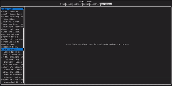
有关更详细的示例,请参阅[详细示例](https://arthursonzogni.github.io/FTXUI/examples_2dom_2paragraph_8cpp-example.html)。Paragraph 还包括许多其他变体,如下所示:
cpp namespace ftxui { Element paragraph(std::string text); Element paragraphAlignLeft(std::string text); Element paragraphAlignRight(std::string text); Element paragraphAlignCenter(std::string text); Element paragraphAlignJustify(std::string text); }
# border {#dom-border}
在元素周围添加边框。
代码:
cpp 终端输出:```bash ┌───────────┐ │The element│ └───────────┘
> [!note]
> 你可以使用管道操作符实现相同的行为。
>
> 代码:
>
cpp
text("The element") | border ```
Border 还有多种样式,如下所示:
window
window
ftxui::window 是一个 ftxui::border,但带有一个额外的标题。要在一个元素周围添加一个窗口,请将其包装并指定一个字符串作为标题。 代码:
window(
"The window", text(
"The element"))
Element window(Element title, Element content, BorderStyle border)
绘制带有标题和边框的窗口。
Terminal output:
┌The window─┐
│The element│
└───────────┘
separator
显示垂直/水平线以在视觉上将容器的内容分成两部分。
代码:
hbox({
text("Left"),
separator(),
text("Right")
终端输出:
Element border(Element child)
在元素周围绘制边框。
bash ┌────┬─────┐ │left│right│ └────┴─────┘
cpp namespace ftxui { Element separator(void); Element separatorLight(); Element separatorHeavy(); Element separatorDouble(); Element separatorEmpty(); Element separatorStyled(BorderStyle); Element separator(Pixel); Element separatorCharacter(std::string); Element separatorHSelector(float left,
float right,
Color background,
Color foreground); Element separatorVSelector(float up,
float down,
Color background,
Color foreground); }
# gauge {#dom-gauge}
这是一个表示进度比率的视觉元素。
代码:
cpp 终端输出:
┌────────────────────────────────────────────────────────────────────────────┐
│██████████████████████████████████████ │
└────────────────────────────────────────────────────────────────────────────┘
量规可以多种方向显示,如下所示:
namespace {
Element gauge(float ratio);
Element gaugeLeft(float ratio);
Element gaugeRight(float ratio);
Element gaugeUp(float ratio);
Element gaugeDown(float ratio);
Element gaugeDirection(float ratio, GaugeDirection);
}
graph
参见:
Element graph(GraphFunction);
Colors
大多数终端控制台可以显示彩色文本和彩色背景。FTXUI 支持所有调色板:
颜色[画廊]: 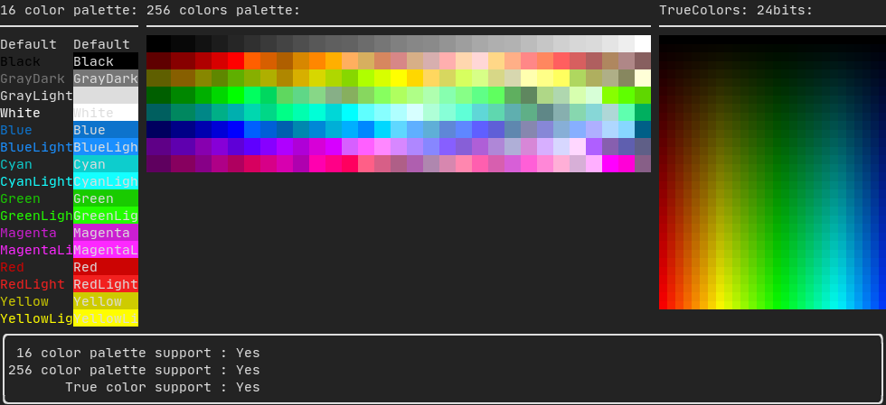
Palette16
在大多数终端上支持以下颜色:
- 默认
- 黑色
- 深灰色
- 浅灰色
- 白色
- 蓝色
- 浅蓝色
- 青色
- 浅青色
- 绿色
- 浅绿色
- 品红色
- 浅品红色
- 红色
- 浅红色
- 黄色
- 浅黄色
使用管道操作符使用上述颜色的示例:
text(
"Blue foreground") |
color(Color::Blue);
text(
"Blue background") |
bgcolor(Color::Blue);
text(
"Black on white") |
color(Color::Black) |
bgcolor(Color::White);
Element color(const LinearGradient &gradient, Element child)
使用线性渐变效果设置元素的前景色。
Element bgcolor(const LinearGradient &gradient, Element child)
使用线性渐变效果设置元素的背景色。
Palette256
在支持 256 色的终端上。
text(
"HotPink") |
color(Color::HotPink);
TrueColor
在支持 TrueColor 的终端上,你可以直接使用 24 位 RGB 颜色空间:
使用以下构造函数指定颜色的 RGB 或 HSV 值:
有两个构造函数:
static Color HSV(uint8_t hue, uint8_t saturation, uint8_t value)
从其 HSV 表示构建一个颜色。 https://en.wikipedia.org/wiki/HSL_and_HSV
static Color RGB(uint8_t red, uint8_t green, uint8_t blue)
从其 RGB 表示构建一个颜色。 https://en.wikipedia.org/wiki/RGB_color_model
LinearGradient
FTXUI 支持线性渐变。可以在前景或背景上实现。
ftxui::LinearGradient 由一个角度(度)和颜色停止列表定义。
你还可以使用简化的构造函数:
参见 演示。
Style
除了彩色文本和彩色背景。许多终端支持文本效果,例如:bold、italic、dim、underlined、inverted、blink。
示例
要使用这些效果,只需用所需的效果包装你的元素:
underlined(bold(text("This text is bold and underlined")))
或者,使用管道操作符将其链接到你的元素上:
text("This text is bold") | bold | underlined
Layout
使元素能够以以下方式排列:
- **水平**使用
ftxui::hbox
- **垂直**使用
ftxui::vbox
- **在网格内**使用
ftxui::gridbox
- **沿一个方向换行**使用
ftxui::flexbox。
示例使用 ftxui::hbox、ftxui::vbox 和 ftxui::filler。
示例使用 ftxui::gridbox:
示例使用 flexbox:
查看此示例和相关的演示。
元素也可以使用 ftxui::flex 装饰器变得灵活。
Code:
hbox({
text("middle") | border | flex,
终端输出:
bash ┌────┐┌─────────────────────────────────────────────────────┐┌─────┐ │left││middle ││right│ └────┘└─────────────────────────────────────────────────────┘└─────┘
cpp hbox({ text("left") | border , text("middle") | border | flex, 终端输出:
┌────┐┌───────────────────────────────┐┌───────────────────────────────┐
│left││middle ││right │
└────┘└───────────────────────────────┘└───────────────────────────────┘
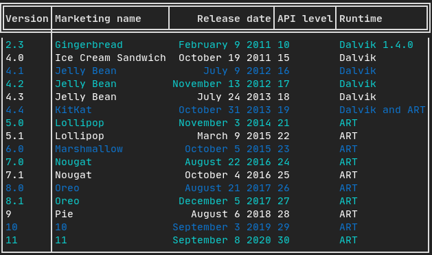
Table
使数据能够轻松格式化为整洁的表格状视觉形式。
代码示例:
Canvas
请参阅 API <ftxui/dom/canvas.hpp>
绘图可以在 ftxui::Canvas 上执行,使用盲文、块或简单字符:
简单示例:
复杂示例: