Detailed Description
請查看 ftxui/dom 模組的 教學。
Classes | |
| struct | Canvas |
| 畫布是與繪圖操作相關聯的可繪製緩衝區。 More... | |
| struct | FlexboxConfig |
| FlexboxConfig 是一個配置結構,用於定義彈性盒容器的佈局屬性。 More... | |
| struct | LinearGradient |
| 表示線性漸變顏色效果設定的類別。 More... | |
| class | Node |
| 節點是DOM樹中所有元素的基底類別。 More... | |
| struct | Requirement |
| Requirement 是一個結構,定義了終端使用者介面中節點的佈局要求。 More... | |
| class | Selection |
| 表示終端機使用者介面中的選取範圍。 More... | |
| class | Table |
| Table 是一個用於繪製表格的工具。 More... | |
Enumerations | |
| enum class | Direction { Up = 0 , Down = 1 , Left = 2 , Right = 3 } |
| Direction 是一個列舉,表示四個主要方向。 More... | |
| enum | BorderStyle { LIGHT , DASHED , HEAVY , DOUBLE , ROUNDED , EMPTY } |
| BorderStyle 是一個列舉,表示可以應用於終端機 UI 元素的不同邊框樣式。 More... | |
Functions | |
| Element | automerge (Element child) |
| 啟用字符自動與附近其他字符合併。 | |
| Element | blink (Element child) |
| 繪製的文字在可見和隱藏之間交替。 | |
| Element | bold (Element child) |
| 使用粗體字型,用於需要更多強調的元素。 | |
| Element | border (Element child) |
| 在元素周圍繪製邊框。 | |
| Decorator | borderWith (const Pixel &pixel) |
| 與 border 相同,但在元素周圍使用恆定的像素。 | |
| Decorator | borderStyled (BorderStyle style) |
| 與 border 相同,但具有不同的樣式。 | |
| Decorator | borderStyled (Color foreground_color) |
| 與 border 相同,但具有前景色。 | |
| Decorator | borderStyled (BorderStyle style, Color foreground_color) |
| 與 border 相同,但具有前景色和不同的樣式。 | |
| Element | borderDashed (Element child) |
| 在元素周圍繪製虛線邊框。 | |
| Element | borderLight (Element child) |
| 在元素周圍繪製細邊框。 | |
| Element | borderHeavy (Element child) |
| 在元素周圍繪製粗邊框。 | |
| Element | borderDouble (Element child) |
| 在元素周圍繪製雙線邊框。 | |
| Element | borderRounded (Element child) |
| 在元素周圍繪製圓角邊框。 | |
| Element | borderEmpty (Element child) |
| 在元素周圍繪製空邊框。 | |
| Element | window (Element title, Element content, BorderStyle border) |
| 繪製帶有標題和邊框的視窗。 | |
| Element | clear_under (Element element) |
| 在繪製 |child| 之前,清除下方的像素。這在與 dbox 結合使用時非常有用。 | |
| Element | color (Color color, Element child) |
| 設定元素的前景顏色。 | |
| Element | bgcolor (Color color, Element child) |
| 設定元素的背景顏色。 | |
| Decorator | color (Color c) |
| 使用前景顏色進行裝飾。 | |
| Decorator | bgcolor (Color color) |
| 使用背景顏色進行裝飾。 | |
| Element | hcenter (Element child) |
| 水平置中一個元素。 | |
| Element | vcenter (Element child) |
| 垂直置中一個元素。 | |
| Element | center (Element child) |
| 水平與垂直置中一個元素。 | |
| Element | align_right (Element child) |
| 將元素靠右對齊。 | |
| Element | dbox (Elements children_) |
| 將多個元素堆疊在一起。 | |
| Element | dim (Element child) |
| 使用淺色字體,適用於不那麼強調的元素。 | |
| Element | filler () |
| 一個元素,它會按比例擴展以佔據容器中剩餘的空間。 | |
| Element | flex (Element child) |
| 使子元素按比例擴展以佔據容器中剩餘的空間。 | |
| Element | xflex (Element child) |
| 在 X 軸上盡可能擴展/在需要時最小化。 | |
| Element | yflex (Element child) |
| 在 Y 軸上盡可能擴展/在需要時最小化。 | |
| Element | flex_grow (Element child) |
| 盡可能擴展。 | |
| Element | xflex_grow (Element child) |
| 在 X 軸上盡可能擴展。 | |
| Element | yflex_grow (Element child) |
| 在 Y 軸上盡可能擴展。 | |
| Element | flex_shrink (Element child) |
| 在需要時最小化。 | |
| Element | xflex_shrink (Element child) |
| 在 X 軸上在需要時最小化。 | |
| Element | yflex_shrink (Element child) |
| 在 Y 軸上在需要時最小化。 | |
| Element | notflex (Element child) |
| 使元素不可伸縮。 | |
| Decorator | focusPositionRelative (float x, float y) |
在 frame 內部使用,這會強制視圖滾動到給定位置。該位置以請求大小的比例表示。 | |
| Decorator | focusPosition (int x, int y) |
在 frame 內部使用,這會強制視圖滾動到給定位置。該位置以單元格數表示。 | |
| Element | focus (Element child) |
將 child 設置為其同級元素中被聚焦的元素。 | |
| Element | focusCursorBlock (Element child) |
與 focus 相同,但將游標形狀設置為靜止方塊。 | |
| Element | focusCursorBlockBlinking (Element child) |
與 focus 相同,但將游標形狀設置為閃爍方塊。 | |
| Element | focusCursorBar (Element child) |
與 focus 相同,但將游標形狀設置為靜止條狀。 | |
| Element | focusCursorBarBlinking (Element child) |
與 focus 相同,但將游標形狀設置為閃爍條狀。 | |
| Element | focusCursorUnderline (Element child) |
與 focus 相同,但將游標形狀設置為靜止底線。 | |
| Element | focusCursorUnderlineBlinking (Element child) |
與 focus 相同,但將游標形狀設置為閃爍底線。 | |
| Element | gaugeDirection (float progress, Direction direction) |
| 繪製一個指定方向的高解析度進度條。 | |
| Element | gaugeRight (float progress) |
| 繪製一個從左到右進展的高解析度進度條。 | |
| Element | gaugeLeft (float progress) |
| 繪製一個從右到左進展的高解析度進度條。 | |
| Element | gaugeUp (float progress) |
| 繪製一個從下到上進展的高解析度進度條。 | |
| Element | gaugeDown (float progress) |
| 繪製一個從上到下進展的高解析度進度條。 | |
| Element | gauge (float progress) |
| 繪製一個高解析度進度條。 | |
| Element | hyperlink (std::string link, Element child) |
| 使渲染區域可點擊並使用網路瀏覽器開啟。 當用戶點擊時,連結將被開啟。 此功能僅在有限的終端模擬器中受支援。 List: https://github.com/Alhadis/OSC8-Adoption/ | |
| Decorator | hyperlink (std::string link) |
| 使用超連結裝飾。 當用戶點擊時,連結將被開啟。 此功能僅在有限的終端模擬器中受支援。 List: https://github.com/Alhadis/OSC8-Adoption/ | |
| Element | inverted (Element child) |
| 添加一個濾鏡,它將反轉前景和背景 顏色。 | |
| Element | italic (Element child) |
| 將文字套用斜體。 | |
| Element | color (const LinearGradient &gradient, Element child) |
| 使用線性漸變效果設定元素的前景色。 | |
| Element | bgcolor (const LinearGradient &gradient, Element child) |
| 使用線性漸變效果設定元素的背景顏色。 | |
| Decorator | color (const LinearGradient &gradient) |
| 使用線性漸變效果裝飾前景色。 | |
| Decorator | bgcolor (const LinearGradient &gradient) |
| 使用線性漸變效果裝飾背景顏色。 | |
| void | Render (Screen &screen, const Element &element) |
| 在 ftxui::Screen 上顯示元素。 | |
| void | Render (Screen &screen, Node *node) |
| 在 ftxui::Screen 上顯示元素。 | |
| Element | paragraph (const std::string &the_text) |
| 回傳一個在多行上繪製段落的元素。 | |
| Element | paragraphAlignLeft (const std::string &the_text) |
| 回傳一個在多行上繪製段落並靠左對齊的元素。 | |
| Element | paragraphAlignRight (const std::string &the_text) |
| 回傳一個在多行上繪製段落並靠右對齊的元素。 | |
| Element | paragraphAlignCenter (const std::string &the_text) |
| 回傳一個在多行上繪製段落並置中對齊的元素。 | |
| Element | paragraphAlignJustify (const std::string &the_text) |
| 回傳一個在多行上繪製段落並使用左右對齊的元素。 | |
| Element | vscroll_indicator (Element child) |
| 在右側顯示一個垂直捲軸。 顏色與內容一致。 | |
| Element | hscroll_indicator (Element child) |
| 在底部顯示一個水平捲軸。 顏色與內容一致。 | |
| Element | separator () |
| 在兩個元素之間繪製垂直或水平分隔線。 | |
| Element | separatorStyled (BorderStyle style) |
| 在兩個元素之間繪製垂直或水平分隔線。 | |
| Element | separatorLight () |
| 使用 LIGHT 樣式在兩個元素之間繪製垂直或水平分隔線。 | |
| Element | separatorDashed () |
| 使用 DASHED 樣式在兩個元素之間繪製垂直或水平分隔線。 | |
| Element | separatorHeavy () |
| 使用 HEAVY 樣式在兩個元素之間繪製垂直或水平分隔線。 | |
| Element | separatorDouble () |
| 使用 DOUBLE 樣式在兩個元素之間繪製垂直或水平分隔線。 | |
| Element | separatorEmpty () |
| 使用 EMPTY 樣式在兩個元素之間繪製垂直或水平分隔線。 | |
| Element | separatorCharacter (std::string value) |
| 在兩個元素之間繪製垂直或水平分隔線。 | |
| Element | separator (Pixel pixel) |
| 在兩個元素之間繪製一個由給定像素填充的分隔線。 | |
| Decorator | size (WidthOrHeight direction, Constraint constraint, int value) |
| 限制元素的大小。 | |
| Element | spinner (int charset_index, size_t image_index) |
| 用於表示時間和/或事件的效果。這將顯示 一個 ASCII 藝術「影片」。 | |
| Element | strikethrough (Element child) |
| 對文字應用刪除線。 | |
| Element | text (std::string text) |
| 顯示一段 UTF8 編碼的 Unicode 文字。 | |
| Element | text (std::wstring text) |
| 顯示一段 Unicode 文字。 | |
| Element | vtext (std::string text) |
| 垂直顯示一段 Unicode 文字。 | |
| Element | vtext (std::wstring text) |
| 垂直顯示一段 Unicode 文字。 | |
| Element | underlined (Element child) |
| 為給定元素加上底線。 | |
| Element | underlinedDouble (Element child) |
| 對文字應用雙底線。 | |
| Element | nothing (Element element) |
| 一個什麼都不做的裝飾器。 | |
| Decorator | operator| (Decorator a, Decorator b) |
| 將兩個裝飾器組合為一個。 | |
| Elements | operator| (Elements elements, Decorator decorator) |
| 從一組元素中,對每個元素應用一個裝飾器。 | |
| Element | operator| (Element element, Decorator decorator) |
| 從一個元素中,應用一個裝飾器。 | |
| Element & | operator|= (Element &e, Decorator d) |
| 對元素應用一個裝飾器。 | |
| Element | emptyElement () |
| Element | vbox (Elements children) |
| 一個垂直一個接一個顯示元素的容器。 | |
| void | SetColorSupport (Color color) |
| 在自動偵測失敗時覆寫終端機顏色支援 | |
Class Documentation
◆ ftxui::Canvas
| struct ftxui::Canvas |
畫布是與繪圖操作相關聯的可繪製緩衝區。
畫布是一個可繪製區域,可用於創建複雜的圖形。它支援使用 盲文、塊狀或普通字符繪製點、線條、圓形、橢圓、文本和圖像。
注意:終端包含單元格。一個單元格的單位是:
- 2x4 盲文字符 (1x1 像素)
- 2x2 塊狀字符 (2x2 像素)
- 2x4 普通字符 (2x4 像素)
您需要將 x 座標乘以 2,將 y 座標乘以 4,才能在終端中獲得正確的位置。
Definition at line 35 of file canvas.hpp.
Public Types | |
| using | Stylizer = std::function<void(Pixel&)> |
Public Member Functions | |
| Canvas ()=default | |
| Canvas (int width, int height) | |
| 建構函式。 | |
| int | width () const |
| int | height () const |
| Pixel | GetPixel (int x, int y) const |
| 取得單元格的內容。 | |
| void | DrawPointOn (int x, int y) |
| 繪製一個盲文點。 | |
| void | DrawPointOff (int x, int y) |
| 擦除一個盲文點。 | |
| void | DrawPointToggle (int x, int y) |
| 切換一個盲文點。如果它已填滿,將被擦除;如果為空,則繪製它。 | |
| void | DrawPoint (int x, int y, bool value) |
| 繪製一個盲文點。 | |
| void | DrawPoint (int x, int y, bool value, const Stylizer &s) |
| 繪製一個盲文點。 | |
| void | DrawPoint (int x, int y, bool value, const Color &color) |
| 繪製一個盲文點。 | |
| void | DrawPointLine (int x1, int y1, int x2, int y2) |
| 繪製一條由盲文點組成的線條。 | |
| void | DrawPointLine (int x1, int y1, int x2, int y2, const Stylizer &s) |
| 繪製一條由盲文點組成的線條。 | |
| void | DrawPointLine (int x1, int y1, int x2, int y2, const Color &color) |
| 繪製一條由盲文點組成的線條。 | |
| void | DrawPointCircle (int x, int y, int radius) |
| 繪製一個由盲文點組成的圓形。 | |
| void | DrawPointCircle (int x, int y, int radius, const Stylizer &s) |
| 繪製一個由盲文點組成的圓形。 | |
| void | DrawPointCircle (int x, int y, int radius, const Color &color) |
| 繪製一個由盲文點組成的圓形。 | |
| void | DrawPointCircleFilled (int x, int y, int radius) |
| void | DrawPointCircleFilled (int x, int y, int radius, const Stylizer &s) |
| void | DrawPointCircleFilled (int x, int y, int radius, const Color &color) |
| 繪製一個由盲文點組成的實心圓形。 | |
| void | DrawPointEllipse (int x, int y, int r1, int r2) |
| 繪製一個由盲文點組成的橢圓。 | |
| void | DrawPointEllipse (int x, int y, int r1, int r2, const Color &color) |
| 繪製一個由盲文點組成的橢圓。 | |
| void | DrawPointEllipse (int x, int y, int r1, int r2, const Stylizer &s) |
| void | DrawPointEllipseFilled (int x, int y, int r1, int r2) |
| void | DrawPointEllipseFilled (int x, int y, int r1, int r2, const Color &color) |
| void | DrawPointEllipseFilled (int x, int y, int r1, int r2, const Stylizer &s) |
| void | DrawBlockOff (int x, int y) |
| 擦除一個區塊。 | |
| void | DrawBlockToggle (int x, int y) |
| 切換一個區塊。如果它已填滿,將被擦除;如果為空,將被填滿。 | |
| void | DrawBlock (int x, int y, bool value) |
| 繪製一個區塊。 | |
| void | DrawBlock (int x, int y, bool value, const Stylizer &s) |
| void | DrawBlock (int x, int y, bool value, const Color &color) |
| 繪製一個區塊。 | |
| void | DrawBlockLine (int x1, int y1, int x2, int y2) |
| 繪製一條由區塊字元組成的線條。 | |
| void | DrawBlockLine (int x1, int y1, int x2, int y2, const Stylizer &s) |
| void | DrawBlockLine (int x1, int y1, int x2, int y2, const Color &color) |
| 繪製一條由區塊字元組成的線條。 | |
| void | DrawBlockCircle (int x1, int y1, int radius) |
| void | DrawBlockCircle (int x1, int y1, int radius, const Stylizer &s) |
| void | DrawBlockCircle (int x1, int y1, int radius, const Color &color) |
| void | DrawBlockCircleFilled (int x1, int y1, int radius) |
| void | DrawBlockCircleFilled (int x1, int y1, int radius, const Stylizer &s) |
| void | DrawBlockCircleFilled (int x1, int y1, int radius, const Color &color) |
| void | DrawBlockEllipse (int x1, int y1, int r1, int r2) |
| void | DrawBlockEllipse (int x1, int y1, int r1, int r2, const Stylizer &s) |
| 繪製一個由區塊字元組成的橢圓。 | |
| void | DrawBlockEllipse (int x1, int y1, int r1, int r2, const Color &color) |
| void | DrawBlockEllipseFilled (int x1, int y1, int r1, int r2) |
| void | DrawBlockEllipseFilled (int x1, int y1, int r1, int r2, const Stylizer &s) |
| 繪製一個由區塊字元組成的實心橢圓。 | |
| void | DrawBlockEllipseFilled (int x1, int y1, int r1, int r2, const Color &color) |
| void | DrawText (int x, int y, const std::string &value, const Color &color) |
| 繪製一段文字。 | |
| void | DrawText (int x, int y, const std::string &value, const Stylizer &style) |
| 繪製一段文字。 | |
| void | DrawImage (int x, int y, const Image &) |
| 繪製一個預定義的圖像,左上角位於給定座標。 您可以提供負座標來隨意對齊圖像 - 只會繪製「可見」部分。 | |
Member Typedef Documentation
◆ Stylizer
Definition at line 45 of file canvas.hpp.
Constructor & Destructor Documentation
◆ Canvas() [1/2]
|
default |
◆ Canvas() [2/2]
| Canvas | ( | int | width, |
| int | height ) |
建構函式。
- Parameters
-
width 畫布的寬度。一個單元格是 2x4 的盲文點。 height 畫布的高度。一個單元格是 2x4 的盲文點。
Definition at line 89 of file src/ftxui/dom/canvas.cpp.
Member Function Documentation
◆ width()
|
inline |
Definition at line 41 of file canvas.hpp.
◆ height()
|
inline |
Definition at line 42 of file canvas.hpp.
◆ GetPixel()
| Pixel GetPixel | ( | int | x, |
| int | y ) const |
取得單元格的內容。
- Parameters
-
x 單元格的 x 座標。 y 單元格的 y 座標。
Definition at line 97 of file src/ftxui/dom/canvas.cpp.
◆ DrawPointOn()
| void DrawPointOn | ( | int | x, |
| int | y ) |
◆ DrawPointOff()
| void DrawPointOff | ( | int | x, |
| int | y ) |
◆ DrawPointToggle()
| void DrawPointToggle | ( | int | x, |
| int | y ) |
切換一個盲文點。如果它已填滿,將被擦除;如果為空,則繪製它。
- Parameters
-
x 點的 x 座標。 y 點的 y 座標。
Definition at line 170 of file src/ftxui/dom/canvas.cpp.
◆ DrawPoint() [1/3]
| void DrawPoint | ( | int | x, |
| int | y, | ||
| bool | value ) |
繪製一個盲文點。
- Parameters
-
x 點的 x 座標。 y 點的 y 座標。 value 點是否填滿。
Definition at line 106 of file src/ftxui/dom/canvas.cpp.
◆ DrawPoint() [2/3]
| void DrawPoint | ( | int | x, |
| int | y, | ||
| bool | value, | ||
| const Stylizer & | style ) |
繪製一個盲文點。
- Parameters
-
x 點的 x 座標。 y 點的 y 座標。 value 點是否填滿。 style 單元格的樣式。
Definition at line 124 of file src/ftxui/dom/canvas.cpp.
◆ DrawPoint() [3/3]
| void DrawPoint | ( | int | x, |
| int | y, | ||
| bool | value, | ||
| const Color & | color ) |
繪製一個盲文點。
- Parameters
-
x 點的 x 座標。 y 點的 y 座標。 value 點是否填滿。 color 點的顏色。
Definition at line 115 of file src/ftxui/dom/canvas.cpp.
◆ DrawPointLine() [1/3]
| void DrawPointLine | ( | int | x1, |
| int | y1, | ||
| int | x2, | ||
| int | y2 ) |
繪製一條由盲文點組成的線條。
- Parameters
-
x1 第一個點的 x 座標。 y1 第一個點的 y 座標。 x2 第二個點的 x 座標。 y2 第二個點的 y 座標。
Definition at line 189 of file src/ftxui/dom/canvas.cpp.
◆ DrawPointLine() [2/3]
| void DrawPointLine | ( | int | x1, |
| int | y1, | ||
| int | x2, | ||
| int | y2, | ||
| const Stylizer & | style ) |
繪製一條由盲文點組成的線條。
- Parameters
-
x1 第一個點的 x 座標。 y1 第一個點的 y 座標。 x2 第二個點的 x 座標。 y2 第二個點的 y 座標。 style 線條的樣式。
Definition at line 210 of file src/ftxui/dom/canvas.cpp.
◆ DrawPointLine() [3/3]
| void DrawPointLine | ( | int | x1, |
| int | y1, | ||
| int | x2, | ||
| int | y2, | ||
| const Color & | color ) |
繪製一條由盲文點組成的線條。
- Parameters
-
x1 第一個點的 x 座標。 y1 第一個點的 y 座標。 x2 第二個點的 x 座標。 y2 第二個點的 y 座標。 color 線條的顏色。
Definition at line 199 of file src/ftxui/dom/canvas.cpp.
◆ DrawPointCircle() [1/3]
| void DrawPointCircle | ( | int | x, |
| int | y, | ||
| int | radius ) |
繪製一個由盲文點組成的圓形。
- Parameters
-
x 圓心點的 x 座標。 y 圓心點的 y 座標。 radius 圓形的半徑。
Definition at line 247 of file src/ftxui/dom/canvas.cpp.
◆ DrawPointCircle() [2/3]
| void DrawPointCircle | ( | int | x, |
| int | y, | ||
| int | radius, | ||
| const Stylizer & | style ) |
繪製一個由盲文點組成的圓形。
- Parameters
-
x 圓心點的 x 座標。 y 圓心點的 y 座標。 radius 圓形的半徑。 style 圓形的樣式。
Definition at line 266 of file src/ftxui/dom/canvas.cpp.
◆ DrawPointCircle() [3/3]
| void DrawPointCircle | ( | int | x, |
| int | y, | ||
| int | radius, | ||
| const Color & | color ) |
繪製一個由盲文點組成的圓形。
- Parameters
-
x 圓心點的 x 座標。 y 圓心點的 y 座標。 radius 圓形的半徑。 color 圓形的顏色。
Definition at line 256 of file src/ftxui/dom/canvas.cpp.
◆ DrawPointCircleFilled() [1/3]
| void DrawPointCircleFilled | ( | int | x, |
| int | y, | ||
| int | radius ) |
◆ DrawPointCircleFilled() [2/3]
| void DrawPointCircleFilled | ( | int | x, |
| int | y, | ||
| int | radius, | ||
| const Stylizer & | s ) |
◆ DrawPointCircleFilled() [3/3]
| void DrawPointCircleFilled | ( | int | x, |
| int | y, | ||
| int | radius, | ||
| const Color & | color ) |
繪製一個由盲文點組成的實心圓形。
- Parameters
-
x 圓心點的 x 座標。 y 圓心點的 y 座標。 radius 圓形的半徑。 color 圓形的顏色。
Definition at line 282 of file src/ftxui/dom/canvas.cpp.
◆ DrawPointEllipse() [1/3]
| void DrawPointEllipse | ( | int | x, |
| int | y, | ||
| int | r1, | ||
| int | r2 ) |
繪製一個由盲文點組成的橢圓。
- Parameters
-
x 橢圓中心的 x 座標。 y 橢圓中心的 y 座標。 r1 沿 x 軸的橢圓半徑。 r2 沿 y 軸的橢圓半徑。
Definition at line 307 of file src/ftxui/dom/canvas.cpp.
◆ DrawPointEllipse() [2/3]
| void DrawPointEllipse | ( | int | x, |
| int | y, | ||
| int | r1, | ||
| int | r2, | ||
| const Color & | color ) |
繪製一個由盲文點組成的橢圓。
- Parameters
-
x 橢圓中心的 x 座標。 y 橢圓中心的 y 座標。 r1 沿 x 軸的橢圓半徑。 r2 沿 y 軸的橢圓半徑。 color 橢圓的顏色。
Definition at line 317 of file src/ftxui/dom/canvas.cpp.
◆ DrawPointEllipse() [3/3]
| void DrawPointEllipse | ( | int | x, |
| int | y, | ||
| int | r1, | ||
| int | r2, | ||
| const Stylizer & | s ) |
◆ DrawPointEllipseFilled() [1/3]
| void DrawPointEllipseFilled | ( | int | x, |
| int | y, | ||
| int | r1, | ||
| int | r2 ) |
◆ DrawPointEllipseFilled() [2/3]
| void DrawPointEllipseFilled | ( | int | x, |
| int | y, | ||
| int | r1, | ||
| int | r2, | ||
| const Color & | color ) |
◆ DrawPointEllipseFilled() [3/3]
| void DrawPointEllipseFilled | ( | int | x, |
| int | y, | ||
| int | r1, | ||
| int | r2, | ||
| const Stylizer & | s ) |
◆ DrawBlockOff()
| void DrawBlockOff | ( | int | x, |
| int | y ) |
◆ DrawBlockToggle()
| void DrawBlockToggle | ( | int | x, |
| int | y ) |
切換一個區塊。如果它已填滿,將被擦除;如果為空,將被填滿。
- Parameters
-
x 區塊的 x 座標。 y 區塊的 y 座標。
Definition at line 505 of file src/ftxui/dom/canvas.cpp.
◆ DrawBlock() [1/3]
| void DrawBlock | ( | int | x, |
| int | y, | ||
| bool | value ) |
繪製一個區塊。
- Parameters
-
x 區塊的 x 座標。 y 區塊的 y 座標。 value 區塊是否填滿。
Definition at line 435 of file src/ftxui/dom/canvas.cpp.
◆ DrawBlock() [2/3]
| void DrawBlock | ( | int | x, |
| int | y, | ||
| bool | value, | ||
| const Stylizer & | s ) |
◆ DrawBlock() [3/3]
| void DrawBlock | ( | int | x, |
| int | y, | ||
| bool | value, | ||
| const Color & | color ) |
繪製一個區塊。
- Parameters
-
x 區塊的 x 座標。 y 區塊的 y 座標。 value 區塊是否填滿。 color 區塊的顏色。
Definition at line 444 of file src/ftxui/dom/canvas.cpp.
◆ DrawBlockLine() [1/3]
| void DrawBlockLine | ( | int | x1, |
| int | y1, | ||
| int | x2, | ||
| int | y2 ) |
繪製一條由區塊字元組成的線條。
- Parameters
-
x1 線條第一個點的 x 座標。 y1 線條第一個點的 y 座標。 x2 線條第二個點的 x 座標。 y2 線條第二個點的 y 座標。
Definition at line 527 of file src/ftxui/dom/canvas.cpp.
◆ DrawBlockLine() [2/3]
| void DrawBlockLine | ( | int | x1, |
| int | y1, | ||
| int | x2, | ||
| int | y2, | ||
| const Stylizer & | s ) |
◆ DrawBlockLine() [3/3]
| void DrawBlockLine | ( | int | x1, |
| int | y1, | ||
| int | x2, | ||
| int | y2, | ||
| const Color & | color ) |
繪製一條由區塊字元組成的線條。
- Parameters
-
x1 線條第一個點的 x 座標。 y1 線條第一個點的 y 座標。 x2 線條第二個點的 x 座標。 y2 線條第二個點的 y 座標。 color 線條的顏色。
Definition at line 537 of file src/ftxui/dom/canvas.cpp.
◆ DrawBlockCircle() [1/3]
| void DrawBlockCircle | ( | int | x1, |
| int | y1, | ||
| int | radius ) |
◆ DrawBlockCircle() [2/3]
| void DrawBlockCircle | ( | int | x1, |
| int | y1, | ||
| int | radius, | ||
| const Stylizer & | s ) |
◆ DrawBlockCircle() [3/3]
| void DrawBlockCircle | ( | int | x1, |
| int | y1, | ||
| int | radius, | ||
| const Color & | color ) |
◆ DrawBlockCircleFilled() [1/3]
| void DrawBlockCircleFilled | ( | int | x1, |
| int | y1, | ||
| int | radius ) |
◆ DrawBlockCircleFilled() [2/3]
| void DrawBlockCircleFilled | ( | int | x1, |
| int | y1, | ||
| int | radius, | ||
| const Stylizer & | s ) |
◆ DrawBlockCircleFilled() [3/3]
| void DrawBlockCircleFilled | ( | int | x1, |
| int | y1, | ||
| int | radius, | ||
| const Color & | color ) |
◆ DrawBlockEllipse() [1/3]
| void DrawBlockEllipse | ( | int | x1, |
| int | y1, | ||
| int | r1, | ||
| int | r2 ) |
◆ DrawBlockEllipse() [2/3]
| void DrawBlockEllipse | ( | int | x1, |
| int | y1, | ||
| int | r1, | ||
| int | r2, | ||
| const Stylizer & | s ) |
繪製一個由區塊字元組成的橢圓。
- Parameters
-
x1 橢圓中心的 x 座標。 y1 橢圓中心的 y 座標。 r1 沿 x 軸的橢圓半徑。 r2 沿 y 軸的橢圓半徑。 s 橢圓的樣式。
Definition at line 674 of file src/ftxui/dom/canvas.cpp.
◆ DrawBlockEllipse() [3/3]
| void DrawBlockEllipse | ( | int | x1, |
| int | y1, | ||
| int | r1, | ||
| int | r2, | ||
| const Color & | color ) |
◆ DrawBlockEllipseFilled() [1/3]
| void DrawBlockEllipseFilled | ( | int | x1, |
| int | y1, | ||
| int | r1, | ||
| int | r2 ) |
◆ DrawBlockEllipseFilled() [2/3]
| void DrawBlockEllipseFilled | ( | int | x1, |
| int | y1, | ||
| int | r1, | ||
| int | r2, | ||
| const Stylizer & | s ) |
繪製一個由區塊字元組成的實心橢圓。
- Parameters
-
x1 橢圓中心的 x 座標。 y1 橢圓中心的 y 座標。 r1 沿 x 軸的橢圓半徑。 r2 沿 y 軸的橢圓半徑。 s 橢圓的樣式。
Definition at line 740 of file src/ftxui/dom/canvas.cpp.
◆ DrawBlockEllipseFilled() [3/3]
| void DrawBlockEllipseFilled | ( | int | x1, |
| int | y1, | ||
| int | r1, | ||
| int | r2, | ||
| const Color & | color ) |
◆ DrawText() [1/2]
| void DrawText | ( | int | x, |
| int | y, | ||
| const std::string & | value, | ||
| const Color & | color ) |
繪製一段文字。
- Parameters
-
x 文字的 x 座標。 y 文字的 y 座標。 value 要繪製的文字。 color 文字的顏色。
Definition at line 790 of file src/ftxui/dom/canvas.cpp.
◆ DrawText() [2/2]
| void DrawText | ( | int | x, |
| int | y, | ||
| const std::string & | value, | ||
| const Stylizer & | style ) |
繪製一段文字。
- Parameters
-
x 文字的 x 座標。 y 文字的 y 座標。 value 要繪製的文字。 style 文字的樣式。
Definition at line 802 of file src/ftxui/dom/canvas.cpp.
◆ DrawImage()
| void DrawImage | ( | int | x, |
| int | y, | ||
| const Image & | image ) |
繪製一個預定義的圖像,左上角位於給定座標。 您可以提供負座標來隨意對齊圖像 - 只會繪製「可見」部分。
- Parameters
-
x 圖像左上角對應的 x 座標。 y 圖像左上角對應的 y 座標。 image 要繪製的圖像。
Definition at line 834 of file src/ftxui/dom/canvas.cpp.
◆ ftxui::FlexboxConfig
| struct ftxui::FlexboxConfig |
FlexboxConfig 是一個配置結構,用於定義彈性盒容器的佈局屬性。
它允許您指定彈性項目的方向、是否應該換行、它們在主軸上的對齊方式,以及 它們在交叉軸上的對齊方式。 它還包括彈性項目在主軸和交叉軸之間間距的屬性。 此結構用於配置終端使用者介面中彈性盒容器的佈局行為。
Definition at line 23 of file flexbox_config.hpp.
Member Enumeration Documentation
◆ Direction
|
strong |
這確立了主軸,從而定義了彈性項目在彈性容器中放置的方向。彈性盒(除了換行)是 單方向佈局概念。將彈性項目主要視為在水平行或垂直列中佈局。
| Enumerator | |
|---|---|
| Row | 彈性項目沿著一行排列。 |
| RowInversed | 彈性項目沿著一行排列,但順序相反。 |
| Column | 彈性項目沿著一列排列。 |
| ColumnInversed | 彈性項目沿著一列排列,但順序相反。 |
Definition at line 26 of file flexbox_config.hpp.
◆ Wrap
|
strong |
預設情況下,所有彈性項目都將嘗試放在一行中。您可以使用此屬性更改該行為, 並允許項目根據需要換行。
| Enumerator | |
|---|---|
| NoWrap | 所有彈性項目都將嘗試放在一行中。 |
| Wrap | 彈性項目將換行到多行。 |
| WrapInversed | 彈性項目將換行到多行,但順序相反。 |
Definition at line 36 of file flexbox_config.hpp.
◆ JustifyContent
|
strong |
這定義了沿主軸的對齊方式。它有助於分配當一行中的所有彈性項目都不靈活, 或者靈活但已達到其最大尺寸時剩餘的額外可用空間。它還對項目溢出行時的 對齊方式施加一些控制。
Definition at line 46 of file flexbox_config.hpp.
◆ AlignItems
|
strong |
這定義了彈性項目在當前行上沿交叉軸佈局的預設行為。 將其視為交叉軸(垂直於主軸)的 justify-content 版本。
| Enumerator | |
|---|---|
| FlexStart | 項目放置在交叉軸的起點。 |
| FlexEnd | 項目放置在交叉軸的終點。 |
| Center | 項目沿交叉軸居中。 |
| Stretch | 項目拉伸以填滿交叉軸。 |
Definition at line 69 of file flexbox_config.hpp.
◆ AlignContent
|
strong |
| Enumerator | |
|---|---|
| FlexStart | 項目放置在交叉軸的起點。 |
| FlexEnd | 項目放置在交叉軸的終點。 |
| Center | 項目沿交叉軸居中。 |
| Stretch | 項目拉伸以填滿交叉軸。 |
| SpaceBetween | 項目在交叉軸中平均分佈。 |
| SpaceAround | 項目平均分佈,每條線周圍有相等的空間。 |
| SpaceEvenly | 項目在交叉軸中平均分佈,周圍有相等的空間。 |
Definition at line 79 of file flexbox_config.hpp.
Member Function Documentation
◆ Set() [1/5]
| FlexboxConfig & Set | ( | FlexboxConfig::Direction | d | ) |
設定 flexbox 方向。
Definition at line 9 of file flexbox_config.cpp.
◆ Set() [2/5]
| FlexboxConfig & Set | ( | FlexboxConfig::Wrap | w | ) |
設定 flexbox 換行。
Definition at line 15 of file flexbox_config.cpp.
◆ Set() [3/5]
| FlexboxConfig & Set | ( | FlexboxConfig::JustifyContent | j | ) |
設定 flexbox 內容對齊。
Definition at line 21 of file flexbox_config.cpp.
◆ Set() [4/5]
| FlexboxConfig & Set | ( | FlexboxConfig::AlignItems | a | ) |
設定 flexbox 項目對齊。
Definition at line 27 of file flexbox_config.cpp.
◆ Set() [5/5]
| FlexboxConfig & Set | ( | FlexboxConfig::AlignContent | a | ) |
設定 flexbox 內容對齊。
Definition at line 33 of file flexbox_config.cpp.
◆ SetGap()
| FlexboxConfig & SetGap | ( | int | gap_x, |
| int | gap_y ) |
設定 flexbox 彈性方向。
- Examples
- examples/component/homescreen.cpp.
Definition at line 39 of file flexbox_config.cpp.
Member Data Documentation
◆ direction
| Direction direction = Direction::Row |
Definition at line 32 of file flexbox_config.hpp.
◆ wrap
| Wrap wrap = Wrap::Wrap |
Definition at line 41 of file flexbox_config.hpp.
◆ justify_content
| JustifyContent justify_content = JustifyContent::FlexStart |
Definition at line 65 of file flexbox_config.hpp.
◆ align_items
| AlignItems align_items = AlignItems::FlexStart |
Definition at line 75 of file flexbox_config.hpp.
◆ align_content
| AlignContent align_content = AlignContent::FlexStart |
Definition at line 88 of file flexbox_config.hpp.
◆ gap_x
| int gap_x = 0 |
Definition at line 90 of file flexbox_config.hpp.
◆ gap_y
| int gap_y = 0 |
Definition at line 91 of file flexbox_config.hpp.
◆ ftxui::LinearGradient
| struct ftxui::LinearGradient |
表示線性漸變顏色效果設定的類別。
範例:
也有簡寫的建構函式:
- Examples
- examples/component/input_style.cpp, examples/component/linear_gradient_gallery.cpp, examples/dom/linear_gradient.cpp, and examples/dom/style_color.cpp.
Definition at line 31 of file linear_gradient.hpp.
Public Member Functions | |
| LinearGradient () | |
| 建立「空」漸變。這通常會接著呼叫 LinearGradient::Angle() 和 LinearGradient::Stop()。 範例: | |
| LinearGradient (Color begin, Color end) | |
| 建立一個包含兩種顏色的漸變。 | |
| LinearGradient (float angle, Color begin, Color end) | |
| 建立一個包含兩種顏色和角度的漸變。 | |
| LinearGradient & | Angle (float angle) |
| 設定漸變的角度。 | |
| LinearGradient & | Stop (Color color, float position) |
| 為漸變添加一個顏色停止點。 | |
| LinearGradient & | Stop (Color color) |
| 為漸變添加一個顏色停止點。 | |
Public Attributes | |
| float | angle = 0.f |
| std::vector< Stop > | stops |
Constructor & Destructor Documentation
◆ LinearGradient() [1/3]
|
default |
建立「空」漸變。這通常會接著呼叫 LinearGradient::Angle() 和 LinearGradient::Stop()。 範例:
◆ LinearGradient() [2/3]
| LinearGradient | ( | Color | begin, |
| Color | end ) |
建立一個包含兩種顏色的漸變。
- Parameters
-
begin 漸變開始處的顏色。 end 漸變結束處的顏色。
Definition at line 193 of file src/ftxui/dom/linear_gradient.cpp.
◆ LinearGradient() [3/3]
| LinearGradient | ( | float | a, |
| Color | begin, | ||
| Color | end ) |
建立一個包含兩種顏色和角度的漸變。
- Parameters
-
a 漸變的角度。 begin 漸變開始處的顏色。 end 漸變結束處的顏色。
Definition at line 200 of file src/ftxui/dom/linear_gradient.cpp.
Member Function Documentation
◆ Angle()
| LinearGradient & Angle | ( | float | a | ) |
設定漸變的角度。
- Parameters
-
a 漸變的角度。
- Returns
- 漸變。
Definition at line 208 of file src/ftxui/dom/linear_gradient.cpp.
◆ Stop() [1/2]
| LinearGradient & Stop | ( | Color | c, |
| float | p ) |
為漸變添加一個顏色停止點。
- Parameters
-
c 停止點的顏色。 p 停止點的位置。
Definition at line 216 of file src/ftxui/dom/linear_gradient.cpp.
◆ Stop() [2/2]
| LinearGradient & Stop | ( | Color | c | ) |
為漸變添加一個顏色停止點。
- Parameters
-
c 停止點的顏色。
- Returns
- 漸變。
- Note
- 停止點的位置是從附近的停止點內插而來的。
Definition at line 225 of file src/ftxui/dom/linear_gradient.cpp.
Member Data Documentation
◆ angle
| float angle = 0.f |
Definition at line 32 of file linear_gradient.hpp.
◆ stops
| std::vector<Stop> stops |
Definition at line 42 of file linear_gradient.hpp.
◆ ftxui::Node
| class ftxui::Node |
節點是DOM樹中所有元素的基底類別。
它代表文件物件模型 (DOM) 中的單一節點,並提供佈局和渲染的基本結構。 它包含用於計算佈局需求、設定框尺寸、選取內容、渲染到螢幕以及檢查佈局狀態的方法。 它通常包含子元素,這些子元素也是節點的實例。
鼓勵使用者從這個類別派生以建立自訂元素。
內建元素的清單可以在 elements.hpp 檔案中找到。
 Inheritance diagram for Node:
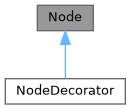
Public Member Functions | |
| Node () | |
| Node (Elements children) | |
| Node (const Node &)=delete | |
| Node (const Node &&)=delete | |
| Node & | operator= (const Node &)=delete |
| Node & | operator= (const Node &&)=delete |
| virtual | ~Node () |
| virtual void | ComputeRequirement () |
| 計算元素所需的空間大小。 | |
| Requirement | requirement () |
| virtual void | SetBox (Box box) |
| 為元素分配繪圖位置和尺寸。 | |
| virtual void | Select (Selection &selection) |
| 計算元素的選取範圍。 | |
| virtual void | Render (Screen &screen) |
| virtual std::string | GetSelectedContent (Selection &selection) |
| virtual void | Check (Status *status) |
Protected Attributes | |
| Elements | children_ |
| Requirement | requirement_ |
| Box | box_ |
Constructor & Destructor Documentation
◆ Node() [1/4]
|
default |
◆ Node() [2/4]
◆ Node() [3/4]
◆ Node() [4/4]
◆ ~Node()
|
virtualdefault |
Member Function Documentation
◆ operator=() [1/2]
◆ operator=() [2/2]
◆ ComputeRequirement()
|
virtual |
◆ requirement()
|
inline |
◆ SetBox()
|
virtual |
◆ Select()
◆ Render()
|
virtual |
◆ GetSelectedContent()
|
virtual |
◆ Check()
Member Data Documentation
◆ children_
◆ requirement_
|
protected |
◆ box_
◆ ftxui::Requirement
| struct ftxui::Requirement |
Requirement 是一個結構,定義了終端使用者介面中節點的佈局要求。
它指定了完全繪製元素所需的最小尺寸。
Definition at line 16 of file requirement.hpp.
Public Attributes | |
| int | min_x = 0 |
| int | min_y = 0 |
| int | flex_grow_x = 0 |
| int | flex_grow_y = 0 |
| int | flex_shrink_x = 0 |
| int | flex_shrink_y = 0 |
| Focused | focused |
Member Data Documentation
◆ min_x
| int min_x = 0 |
Definition at line 18 of file requirement.hpp.
◆ min_y
| int min_y = 0 |
Definition at line 19 of file requirement.hpp.
◆ flex_grow_x
| int flex_grow_x = 0 |
Definition at line 22 of file requirement.hpp.
◆ flex_grow_y
| int flex_grow_y = 0 |
Definition at line 23 of file requirement.hpp.
◆ flex_shrink_x
| int flex_shrink_x = 0 |
Definition at line 24 of file requirement.hpp.
◆ flex_shrink_y
| int flex_shrink_y = 0 |
Definition at line 25 of file requirement.hpp.
◆ focused
| Focused focused |
Definition at line 49 of file requirement.hpp.
◆ ftxui::Selection
| class ftxui::Selection |
表示終端機使用者介面中的選取範圍。
Selection 是一個類別,表示終端機使用者介面中選取範圍的兩個端點。
Definition at line 21 of file selection.hpp.
Public Member Functions | |
| Selection () | |
| 建立一個空的選取範圍。 | |
| Selection (int start_x, int start_y, int end_x, int end_y) | |
| 建立一個選取範圍。 | |
| const Box & | GetBox () const |
| 取得選取範圍的方塊。 | |
| Selection | SaturateHorizontal (Box box) |
將選取範圍飽和在方塊內。 這是由 hbox 呼叫,用於將選取範圍傳播到其子元素。 | |
| Selection | SaturateVertical (Box box) |
將選取範圍飽和在方塊內。 這是由 vbox 呼叫,用於將選取範圍傳播到其子元素。 | |
| bool | IsEmpty () const |
| void | AddPart (const std::string &part, int y, int left, int right) |
| std::string | GetParts () |
Constructor & Destructor Documentation
◆ Selection() [1/2]
|
default |
建立一個空的選取範圍。
◆ Selection() [2/2]
| Selection | ( | int | start_x, |
| int | start_y, | ||
| int | end_x, | ||
| int | end_y ) |
建立一個選取範圍。
- Parameters
-
start_x 選取範圍起點的 x 座標。 start_y 選取範圍起點的 y 座標。 end_x 選取範圍終點的 x 座標。 end_y 選取範圍終點的 y 座標。
Definition at line 33 of file src/ftxui/dom/selection.cpp.
Member Function Documentation
◆ GetBox()
| const Box & GetBox | ( | ) | const |
◆ SaturateHorizontal()
將選取範圍飽和在方塊內。 這是由 hbox 呼叫,用於將選取範圍傳播到其子元素。
- Parameters
-
box 用於飽和選取範圍的方塊。
- Returns
- 飽和後的選取範圍。
Definition at line 74 of file src/ftxui/dom/selection.cpp.
◆ SaturateVertical()
將選取範圍飽和在方塊內。 這是由 vbox 呼叫,用於將選取範圍傳播到其子元素。
- Parameters
-
box 用於飽和選取範圍的方塊。
- Returns
- 飽和後的選取範圍。
Definition at line 112 of file src/ftxui/dom/selection.cpp.
◆ IsEmpty()
|
inline |
Definition at line 30 of file selection.hpp.
◆ AddPart()
| void AddPart | ( | const std::string & | part, |
| int | y, | ||
| int | left, | ||
| int | right ) |
Definition at line 145 of file src/ftxui/dom/selection.cpp.
◆ GetParts()
|
inline |
Definition at line 33 of file selection.hpp.
◆ ftxui::Table
| class ftxui::Table |
Table 是一個用於繪製表格的工具。
範例
- Examples
- examples/dom/table.cpp.
Public Member Functions | |
| Table () | |
| 創建一個空表格。 | |
| Table (std::vector< std::vector< std::string > >) | |
| 從一個字串向量的向量創建一個表格。 | |
| Table (std::vector< std::vector< Element > >) | |
| 從一個 Element 向量的向量創建一個表格 | |
| Table (std::initializer_list< std::vector< std::string > > init) | |
| TableSelection | SelectAll () |
| 選取整個表格。 | |
| TableSelection | SelectCell (int column, int row) |
| 選取表格的一個單元格。 | |
| TableSelection | SelectRow (int row_index) |
| 選取表格的某一行。 | |
| TableSelection | SelectRows (int row_min, int row_max) |
| 選取表格的行範圍。 | |
| TableSelection | SelectColumn (int column_index) |
| 選取表格的某一列。 | |
| TableSelection | SelectColumns (int column_min, int column_max) |
| 選取表格的列範圍。 | |
| TableSelection | SelectRectangle (int column_min, int column_max, int row_min, int row_max) |
| 選取表格的一個矩形區域。 | |
| Element | Render () |
| 渲染表格。 | |
Constructor & Destructor Documentation
◆ Table() [1/4]
| Table | ( | ) |
創建一個空表格。
Definition at line 47 of file src/ftxui/dom/table.cpp.
◆ Table() [2/4]
|
explicit |
◆ Table() [3/4]
從一個 Element 向量的向量創建一個表格
- Parameters
-
input 輸入元素。
Definition at line 69 of file src/ftxui/dom/table.cpp.
◆ Table() [4/4]
| Table | ( | std::initializer_list< std::vector< std::string > > | init | ) |
Definition at line 75 of file src/ftxui/dom/table.cpp.
Member Function Documentation
◆ SelectAll()
| TableSelection SelectAll | ( | ) |
◆ SelectCell()
| TableSelection SelectCell | ( | int | column, |
| int | row ) |
選取表格的一個單元格。
- Parameters
-
column 要選取的單元格的列。 row 要選取的單元格的行。
- Note
- 您可以使用負數索引從末尾選取。
Definition at line 169 of file src/ftxui/dom/table.cpp.
◆ SelectRow()
| TableSelection SelectRow | ( | int | index | ) |
選取表格的某一行。
- Parameters
-
index 要選取的行的索引。
- Note
- 您可以使用負數索引從末尾選取。
Definition at line 138 of file src/ftxui/dom/table.cpp.
◆ SelectRows()
| TableSelection SelectRows | ( | int | row_min, |
| int | row_max ) |
選取表格的行範圍。
- Parameters
-
row_min 要選取的第一行。 row_max 要選取的最後一行。
- Note
- 您可以使用負數索引從末尾選取。
Definition at line 146 of file src/ftxui/dom/table.cpp.
◆ SelectColumn()
| TableSelection SelectColumn | ( | int | index | ) |
選取表格的某一列。
- Parameters
-
index 要選取的列的索引。
- Note
- 您可以使用負數索引從末尾選取。
Definition at line 153 of file src/ftxui/dom/table.cpp.
◆ SelectColumns()
| TableSelection SelectColumns | ( | int | column_min, |
| int | column_max ) |
選取表格的列範圍。
- Parameters
-
column_min 要選取的第一列。 column_max 要選取的最後一列。
- Note
- 您可以使用負數索引從末尾選取。
Definition at line 161 of file src/ftxui/dom/table.cpp.
◆ SelectRectangle()
| TableSelection SelectRectangle | ( | int | column_min, |
| int | column_max, | ||
| int | row_min, | ||
| int | row_max ) |
選取表格的一個矩形區域。
- Parameters
-
column_min 要選取的第一列。 column_max 要選取的最後一列。 row_min 要選取的第一行。 row_max 要選取的最後一行。
- Note
- 您可以使用負數索引從末尾選取。
Definition at line 179 of file src/ftxui/dom/table.cpp.
◆ Render()
| Element Render | ( | ) |
Enumeration Type Documentation
◆ Direction
|
strong |
◆ BorderStyle
| enum BorderStyle |
BorderStyle 是一個列舉,表示可以應用於終端機 UI 元素的不同邊框樣式。
BorderStyle 是一個列舉,表示可以應用於終端機 UI 元素的不同邊框樣式。 它用於定義元素周圍邊框的視覺外觀,例如視窗、框架或分隔符。
| Enumerator | |
|---|---|
| LIGHT | |
| DASHED | |
| HEAVY | |
| DOUBLE | |
| ROUNDED | |
| EMPTY | |
Definition at line 32 of file elements.hpp.
Function Documentation
◆ automerge()
啟用字符自動與附近其他字符合併。
Definition at line 17 of file automerge.cpp.
◆ blink()
◆ bold()
◆ border()
在元素周圍繪製邊框。
- See also
- border
- borderLight
- borderDashed
- borderDouble
- borderHeavy
- borderEmpty
- borderRounded
- borderStyled
- borderWith
在元素周圍新增邊框
範例
輸出
Definition at line 227 of file src/ftxui/dom/border.cpp.
◆ borderWith()
◆ borderStyled() [1/3]
| Decorator borderStyled | ( | BorderStyle | style | ) |
◆ borderStyled() [2/3]
◆ borderStyled() [3/3]
| Decorator borderStyled | ( | BorderStyle | style, |
| Color | foreground_color ) |
◆ borderDashed()
在元素周圍繪製虛線邊框。
- See also
- border
- borderLight
- borderDashed
- borderDouble
- borderHeavy
- borderRounded
- borderEmpty
- borderStyled
- borderWith
在元素周圍新增邊框
範例
輸出
Definition at line 300 of file src/ftxui/dom/border.cpp.
◆ borderLight()
在元素周圍繪製細邊框。
- See also
- border
- borderLight
- borderDashed
- borderDouble
- borderHeavy
- borderRounded
- borderEmpty
- borderStyled
- borderWith
在元素周圍新增邊框
範例
輸出
Definition at line 335 of file src/ftxui/dom/border.cpp.
◆ borderHeavy()
在元素周圍繪製粗邊框。
- See also
- border
- borderLight
- borderDashed
- borderDouble
- borderHeavy
- borderRounded
- borderEmpty
- borderStyled
- borderWith
在元素周圍新增邊框
範例
輸出
Definition at line 370 of file src/ftxui/dom/border.cpp.
◆ borderDouble()
在元素周圍繪製雙線邊框。
- See also
- border
- borderLight
- borderDashed
- borderDouble
- borderHeavy
- borderRounded
- borderEmpty
- borderStyled
- borderWith
在元素周圍新增邊框
範例
輸出
Definition at line 405 of file src/ftxui/dom/border.cpp.
◆ borderRounded()
在元素周圍繪製圓角邊框。
- See also
- border
- borderLight
- borderDashed
- borderDouble
- borderHeavy
- borderRounded
- borderEmpty
- borderStyled
- borderWith
在元素周圍新增邊框
範例
輸出
Definition at line 440 of file src/ftxui/dom/border.cpp.
◆ borderEmpty()
在元素周圍繪製空邊框。
- See also
- border
- borderLight
- borderDashed
- borderDouble
- borderHeavy
- borderRounded
- borderEmpty
- borderStyled
- borderWith
在元素周圍新增邊框
範例
輸出
Definition at line 475 of file src/ftxui/dom/border.cpp.
◆ window()
| Element window | ( | Element | title, |
| Element | content, | ||
| BorderStyle | border ) |
繪製帶有標題和邊框的視窗。
- Parameters
-
title 視窗的標題。 content 要包裝的元素。 border 邊框的樣式。預設為 ROUNDED。
- See also
- border
範例
輸出
Definition at line 507 of file src/ftxui/dom/border.cpp.
◆ clear_under()
在繪製 |child| 之前,清除下方的像素。這在與 dbox 結合使用時非常有用。
- See also
- ftxui::dbox
Definition at line 36 of file clear_under.cpp.
◆ color() [1/4]
設定元素的前景顏色。
- Parameters
-
color 輸出元素的顏色。 child 輸入元素。
- Returns
- 著色的輸出元素。
範例
Definition at line 81 of file dom/color.cpp.
◆ bgcolor() [1/4]
設定元素的背景顏色。
- Parameters
-
color 輸出元素的顏色。 child 輸入元素。
- Returns
- 著色的輸出元素。
範例
Definition at line 96 of file dom/color.cpp.
◆ color() [2/4]
◆ bgcolor() [2/4]
使用背景顏色進行裝飾。
- Parameters
-
color 要應用的背景顏色。
- Returns
- 應用顏色的裝飾器。
範例
Definition at line 124 of file dom/color.cpp.
◆ hcenter()
水平置中一個元素。
- Parameters
-
child 被裝飾的元素。
- Returns
- 水平置中的元素。
Definition at line 15 of file composite_decorator.cpp.
◆ vcenter()
垂直置中一個元素。
- Parameters
-
child 被裝飾的元素。
- Returns
- 垂直置中的元素。
Definition at line 23 of file composite_decorator.cpp.
◆ center()
水平與垂直置中一個元素。
- Parameters
-
child 被裝飾的元素。
- Returns
- 置中的元素。
Definition at line 31 of file composite_decorator.cpp.
◆ align_right()
將元素靠右對齊。
- Parameters
-
child 被裝飾的元素。
- Returns
- 靠右對齊的元素。
Definition at line 39 of file composite_decorator.cpp.
◆ dbox()
將多個元素堆疊在一起。
- Parameters
-
children_ 輸入元素。
- Returns
- 向右對齊的元素。
Definition at line 54 of file src/ftxui/dom/dbox.cpp.
◆ dim()
◆ filler()
◆ flex()
使子元素按比例擴展以佔據容器中剩餘的空間。
範例:
~~~cpp hbox({ text("left") | border , text("middle") | border | flex, text("right") | border, }); ~~~
輸出:
~~~bash ┌────┐┌─────────────────────────────────────────────────────────┐┌─────┐ │left││middle ││right│ └────┘└─────────────────────────────────────────────────────────┘└─────┘ ~~~
◆ xflex()
◆ yflex()
◆ flex_grow()
◆ xflex_grow()
◆ yflex_grow()
◆ flex_shrink()
◆ xflex_shrink()
◆ yflex_shrink()
◆ notflex()
◆ focusPositionRelative()
| Decorator focusPositionRelative | ( | float | x, |
| float | y ) |
在 frame 內部使用,這會強制視圖滾動到給定位置。該位置以請求大小的比例表示。
例如:
- (0, 0) 表示視圖滾動到左上方。
- (1, 0) 表示視圖滾動到右上方。
- (0, 1) 表示視圖滾動到左下方。
範例
Definition at line 29 of file src/ftxui/dom/focus.cpp.
◆ focusPosition()
| Decorator focusPosition | ( | int | x, |
| int | y ) |
在 frame 內部使用,這會強制視圖滾動到給定位置。該位置以單元格數表示。
範例
Definition at line 66 of file src/ftxui/dom/focus.cpp.
◆ focus()
◆ focusCursorBlock()
◆ focusCursorBlockBlinking()
◆ focusCursorBar()
◆ focusCursorBarBlinking()
◆ focusCursorUnderline()
◆ focusCursorUnderlineBlinking()
◆ gaugeDirection()
繪製一個指定方向的高解析度進度條。
- Parameters
-
progress 填充區域的比例。範圍為 [0,1]。 direction 進度條的進展方向。
Definition at line 168 of file src/ftxui/dom/gauge.cpp.
◆ gaugeRight()
| Element gaugeRight | ( | float | progress | ) |
繪製一個從左到右進展的高解析度進度條。
- Parameters
-
progress 填充區域的比例。範圍為 [0,1]。
範例
一個儀表。它可以用來表示進度條。
輸出
Definition at line 190 of file src/ftxui/dom/gauge.cpp.
◆ gaugeLeft()
| Element gaugeLeft | ( | float | progress | ) |
繪製一個從右到左進展的高解析度進度條。
- Parameters
-
progress 填充區域的比例。範圍為 [0,1]。
範例
一個儀表。它可以用來表示進度條。
輸出
Definition at line 212 of file src/ftxui/dom/gauge.cpp.
◆ gaugeUp()
| Element gaugeUp | ( | float | progress | ) |
繪製一個從下到上進展的高解析度進度條。
- Parameters
-
progress 填充區域的比例。範圍為 [0,1]。
範例
一個儀表。它可以用來表示進度條。
輸出
Definition at line 241 of file src/ftxui/dom/gauge.cpp.
◆ gaugeDown()
| Element gaugeDown | ( | float | progress | ) |
繪製一個從上到下進展的高解析度進度條。
- Parameters
-
progress 填充區域的比例。範圍為 [0,1]。
範例
一個儀表。它可以用來表示進度條。
輸出
Definition at line 270 of file src/ftxui/dom/gauge.cpp.
◆ gauge()
| Element gauge | ( | float | progress | ) |
繪製一個高解析度進度條。
- Parameters
-
progress 填充區域的比例。範圍為 [0,1]。
範例
一個儀表。它可以用來表示進度條。
輸出
Definition at line 292 of file src/ftxui/dom/gauge.cpp.
◆ hyperlink() [1/2]
使渲染區域可點擊並使用網路瀏覽器開啟。 當用戶點擊時,連結將被開啟。 此功能僅在有限的終端模擬器中受支援。 List: https://github.com/Alhadis/OSC8-Adoption/
- Parameters
-
link 連結 child 輸入元素。
- Returns
- 帶有連結的輸出元素。
範例
Definition at line 51 of file hyperlink.cpp.
◆ hyperlink() [2/2]
| Decorator hyperlink | ( | std::string | link | ) |
使用超連結裝飾。 當用戶點擊時,連結將被開啟。 此功能僅在有限的終端模擬器中受支援。 List: https://github.com/Alhadis/OSC8-Adoption/
- Parameters
-
link 用於將用戶重定向到的連結。
- Returns
- 應用超連結的裝飾器。
範例
Definition at line 70 of file hyperlink.cpp.
◆ inverted()
添加一個濾鏡,它將反轉前景和背景 顏色。
Definition at line 34 of file inverted.cpp.
◆ italic()
將文字套用斜體。
Definition at line 16 of file italic.cpp.
◆ color() [3/4]
| Element color | ( | const LinearGradient & | gradient, |
| Element | child ) |
使用線性漸變效果設定元素的前景色。
- Parameters
-
gradient 要應用於輸出元素的漸變效果。 child 輸入元素。
- Returns
- 已著色的輸出元素。
範例
Definition at line 241 of file src/ftxui/dom/linear_gradient.cpp.
◆ bgcolor() [3/4]
| Element bgcolor | ( | const LinearGradient & | gradient, |
| Element | child ) |
使用線性漸變效果設定元素的背景顏色。
- Parameters
-
gradient 要應用於輸出元素的漸變效果。 child 輸入元素。
- Returns
- 已著色的輸出元素。
範例
Definition at line 257 of file src/ftxui/dom/linear_gradient.cpp.
◆ color() [4/4]
| Decorator color | ( | const LinearGradient & | gradient | ) |
使用線性漸變效果裝飾前景色。
- Parameters
-
gradient 要應用於輸出元素的漸變效果。
- Returns
- 應用顏色的 Decorator。
範例
Definition at line 272 of file src/ftxui/dom/linear_gradient.cpp.
◆ bgcolor() [4/4]
| Decorator bgcolor | ( | const LinearGradient & | gradient | ) |
使用線性漸變效果裝飾背景顏色。
- Parameters
-
gradient 要應用於輸出元素的漸變效果。
- Returns
- 應用顏色的 Decorator。
範例
Definition at line 287 of file src/ftxui/dom/linear_gradient.cpp.
◆ Render() [1/2]
| void Render | ( | Screen & | screen, |
| const Element & | element ) |
在 ftxui::Screen 上顯示元素。
- Examples
- examples/dom/border.cpp, examples/dom/border_colored.cpp, examples/dom/border_style.cpp, examples/dom/canvas.cpp, examples/dom/color_gallery.cpp, examples/dom/color_info_palette256.cpp, examples/dom/color_truecolor_HSV.cpp, examples/dom/color_truecolor_RGB.cpp, examples/dom/dbox.cpp, examples/dom/gauge.cpp, examples/dom/gauge_direction.cpp, examples/dom/graph.cpp, examples/dom/gridbox.cpp, examples/dom/hflow.cpp, examples/dom/html_like.cpp, examples/dom/linear_gradient.cpp, examples/dom/package_manager.cpp, examples/dom/paragraph.cpp, examples/dom/separator.cpp, examples/dom/separator_style.cpp, examples/dom/size.cpp, examples/dom/spinner.cpp, examples/dom/style_blink.cpp, examples/dom/style_bold.cpp, examples/dom/style_color.cpp, examples/dom/style_dim.cpp, examples/dom/style_gallery.cpp, examples/dom/style_hyperlink.cpp, examples/dom/style_inverted.cpp, examples/dom/style_italic.cpp, examples/dom/style_strikethrough.cpp, examples/dom/style_underlined.cpp, examples/dom/style_underlined_double.cpp, examples/dom/table.cpp, examples/dom/vbox_hbox.cpp, and examples/dom/vflow.cpp.
◆ Render() [2/2]
| void Render | ( | Screen & | screen, |
| Node * | node ) |
在 ftxui::Screen 上顯示元素。
◆ paragraph()
| Element paragraph | ( | const std::string & | the_text | ) |
◆ paragraphAlignLeft()
| Element paragraphAlignLeft | ( | const std::string & | the_text | ) |
◆ paragraphAlignRight()
| Element paragraphAlignRight | ( | const std::string & | the_text | ) |
◆ paragraphAlignCenter()
| Element paragraphAlignCenter | ( | const std::string & | the_text | ) |
◆ paragraphAlignJustify()
| Element paragraphAlignJustify | ( | const std::string & | the_text | ) |
◆ vscroll_indicator()
在右側顯示一個垂直捲軸。 顏色與內容一致。
Definition at line 21 of file scroll_indicator.cpp.
◆ hscroll_indicator()
在底部顯示一個水平捲軸。 顏色與內容一致。
Definition at line 76 of file scroll_indicator.cpp.
◆ separator() [1/2]
| Element separator | ( | ) |
在兩個元素之間繪製垂直或水平分隔線。
- See also
- separator
- separatorLight
- separatorDashed
- separatorDouble
- separatorHeavy
- separatorEmpty
- separatorRounded
- separatorStyled
- separatorCharacter
在兩個元素之間添加視覺分隔。
範例
輸出
Definition at line 133 of file src/ftxui/dom/separator.cpp.
◆ separatorStyled()
| Element separatorStyled | ( | BorderStyle | style | ) |
在兩個元素之間繪製垂直或水平分隔線。
- Parameters
-
style 分隔線的樣式。
- See also
- separator
- separatorLight
- separatorDashed
- separatorDouble
- separatorHeavy
- separatorEmpty
- separatorRounded
- separatorStyled
- separatorCharacter
在兩個元素之間添加視覺分隔。
範例
輸出
Definition at line 170 of file src/ftxui/dom/separator.cpp.
◆ separatorLight()
| Element separatorLight | ( | ) |
使用 LIGHT 樣式在兩個元素之間繪製垂直或水平分隔線。
- See also
- separator
- separatorLight
- separatorDashed
- separatorDouble
- separatorHeavy
- separatorEmpty
- separatorRounded
- separatorStyled
- separatorCharacter
在兩個元素之間添加視覺分隔。
範例
輸出
Definition at line 206 of file src/ftxui/dom/separator.cpp.
◆ separatorDashed()
| Element separatorDashed | ( | ) |
使用 DASHED 樣式在兩個元素之間繪製垂直或水平分隔線。
- See also
- separator
- separatorLight
- separatorDashed
- separatorDouble
- separatorHeavy
- separatorEmpty
- separatorRounded
- separatorStyled
- separatorCharacter
在兩個元素之間添加視覺分隔。
範例
輸出
Definition at line 242 of file src/ftxui/dom/separator.cpp.
◆ separatorHeavy()
| Element separatorHeavy | ( | ) |
使用 HEAVY 樣式在兩個元素之間繪製垂直或水平分隔線。
- See also
- separator
- separatorLight
- separatorDashed
- separatorDouble
- separatorHeavy
- separatorEmpty
- separatorRounded
- separatorStyled
- separatorCharacter
在兩個元素之間添加視覺分隔。
範例
輸出
Definition at line 278 of file src/ftxui/dom/separator.cpp.
◆ separatorDouble()
| Element separatorDouble | ( | ) |
使用 DOUBLE 樣式在兩個元素之間繪製垂直或水平分隔線。
- See also
- separator
- separatorLight
- separatorDashed
- separatorDouble
- separatorHeavy
- separatorEmpty
- separatorRounded
- separatorStyled
- separatorCharacter
在兩個元素之間添加視覺分隔。
範例
輸出
Definition at line 314 of file src/ftxui/dom/separator.cpp.
◆ separatorEmpty()
| Element separatorEmpty | ( | ) |
使用 EMPTY 樣式在兩個元素之間繪製垂直或水平分隔線。
- See also
- separator
- separatorLight
- separatorDashed
- separatorDouble
- separatorHeavy
- separatorEmpty
- separatorRounded
- separatorStyled
- separatorCharacter
在兩個元素之間添加視覺分隔。
範例
輸出
Definition at line 350 of file src/ftxui/dom/separator.cpp.
◆ separatorCharacter()
| Element separatorCharacter | ( | std::string | value | ) |
在兩個元素之間繪製垂直或水平分隔線。
- Parameters
-
value 用於填充分隔線區域的字元。
- See also
- separator
- separatorLight
- separatorDashed
- separatorDouble
- separatorHeavy
- separatorEmpty
- separatorRounded
- separatorStyled
- separatorCharacter
在兩個元素之間添加視覺分隔。
範例
輸出
Definition at line 387 of file src/ftxui/dom/separator.cpp.
◆ separator() [2/2]
◆ size()
| Decorator size | ( | WidthOrHeight | direction, |
| Constraint | constraint, | ||
| int | value ) |
限制元素的大小。
- Parameters
-
direction 限制元素的寬度 (WIDTH) 或高度 (HEIGHT)。 constraint 限制的類型。 value 該值。
Definition at line 88 of file src/ftxui/dom/size.cpp.
◆ spinner()
| Element spinner | ( | int | charset_index, |
| size_t | image_index ) |
用於表示時間和/或事件的效果。這將顯示 一個 ASCII 藝術「影片」。
- Parameters
-
charset_index 「影片」的類型。 image_index 「影片」的「影格」。您需要針對 每個「步驟」增加此值。
Definition at line 282 of file src/ftxui/dom/spinner.cpp.
◆ strikethrough()
對文字應用刪除線。
Definition at line 16 of file strikethrough.cpp.
◆ text() [1/2]
| Element text | ( | std::string | text | ) |
◆ text() [2/2]
| Element text | ( | std::wstring | text | ) |
◆ vtext() [1/2]
| Element vtext | ( | std::string | text | ) |
◆ vtext() [2/2]
| Element vtext | ( | std::wstring | text | ) |
◆ underlined()
為給定元素加上底線。
Definition at line 32 of file underlined.cpp.
◆ underlinedDouble()
對文字應用雙底線。
Definition at line 17 of file underlined_double.cpp.
◆ nothing()
一個什麼都不做的裝飾器。
Definition at line 28 of file dom/util.cpp.
◆ operator|() [1/3]
◆ operator|() [2/3]
◆ operator|() [3/3]
◆ operator|=()
◆ emptyElement()
| Element emptyElement | ( | ) |
一個 0x0 大小,不繪製任何東西的元素。
Definition at line 140 of file dom/util.cpp.
◆ vbox()
◆ SetColorSupport()
| void SetColorSupport | ( | Color | color | ) |
在自動偵測失敗時覆寫終端機顏色支援
Definition at line 135 of file terminal.cpp.