 3367c3a005
13 KiB
@page module-dom ftxui / dom @tableofcontents

This module defines a hierarchical set of ftxui::Element. An element manages
the layout and can be responsive to the terminal dimension changes. Note the
following example where this module is used to create a simple layout with a
number of operators:
The @subpage module-dom-examples section provides a collection of examples.
Example:
namespace ftxui {
    ...

// Define the document
Element document = vbox({
  text("The window") | bold | color(Color::Blue),
  gauge(0.5)
  text("The footer")
});

// Add a border, by calling the `ftxui::border` decorator function.
document = border(document);

// Add another border, using the pipe operator.
document = document | border.

// Add another border, using the |= operator.
document |= border

...
}
List of elements
The list of all elements are included and can be accessed by including the corresponding header file:
#include <ftxui/dom/elements.hpp>
\include{strip} "ftxui/dom/elements.hpp"
text
The most simple widget. It displays a text.
text("I am a piece of text");
I am a piece of text.
vtext
Identical to ftxui::text, but displayed vertically.
Code:
vtext("HELLO");
Terminal output:
H
E
L
L
O
paragraph
Similar to ftxui::text, but the individual word are wrapped along multiple
lines, depending on the width of its container.
Sample Code:
paragraph("A very long text")
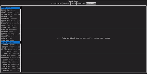
For a more detailed example refer to detailed example. Paragraph also includes a number of other variants as shown below:
namespace ftxui {
    Element paragraph(std::string text);
    Element paragraphAlignLeft(std::string text);
    Element paragraphAlignRight(std::string text);
    Element paragraphAlignCenter(std::string text);
    Element paragraphAlignJustify(std::string text);
}
border
Adds a border around an element.
Code:
border(text("The element"))
Terminal output:
┌───────────┐
│The element│
└───────────┘
Note
You can achieve the same behavior by using the pipe operator.
Code:
text("The element") | border
Border also comes in a variety of styles as shown below:
namespace ftxui {
    Element border(Element);
    Element borderLight(Element);
    Element borderHeavy(Element);
    Element borderDouble(Element);
    Element borderRounded(Element);
    Element borderEmpty(Element);
    Decorator borderStyled(BorderStyle);
    Decorator borderWith(Pixel);
}
window
A ftxui::window is a ftxui::border, but with an additional header. To add a
window around an element, wrap it and specify a string as the header.
Code:
window("The window", text("The element"))
Terminal output:
┌The window─┐
│The element│
└───────────┘
separator
Displays a vertical/horizontal line to visually split the content of a container in two.
Code:
border(
  hbox({
    text("Left"),
    separator(),
    text("Right")
  })
)
Terminal output:
┌────┬─────┐
│left│right│
└────┴─────┘
Separators come in a variety of flavors as shown below:
namespace ftxui {
    Element separator(void);
    Element separatorLight();
    Element separatorHeavy();
    Element separatorDouble();
    Element separatorEmpty();
    Element separatorStyled(BorderStyle);
    Element separator(Pixel);
    Element separatorCharacter(std::string);
    Element separatorHSelector(float left,
                               float right,
                               Color background,
                               Color foreground);
    Element separatorVSelector(float up,
                               float down,
                               Color background,
                               Color foreground);
}
gauge
This is a visual element that represents a ratio of progress.
Code:
border(gauge(0.5))
Terminal output:
┌────────────────────────────────────────────────────────────────────────────┐
│██████████████████████████████████████                                      │
└────────────────────────────────────────────────────────────────────────────┘
Gauges can be displayed in many orientations as shown below:
namespace {
    Element gauge(float ratio);
    Element gaugeLeft(float ratio);
    Element gaugeRight(float ratio);
    Element gaugeUp(float ratio);
    Element gaugeDown(float ratio);
    Element gaugeDirection(float ratio, GaugeDirection);
}
graph
@htmlonly
@endhtmlonly
See:
Element graph(GraphFunction);
Colors
Most terminal consoles can display colored text and colored backgrounds. FTXUI supports every color palette:
Decorator color(Color);
Decorator bgcolor(Color);
Color gallery:
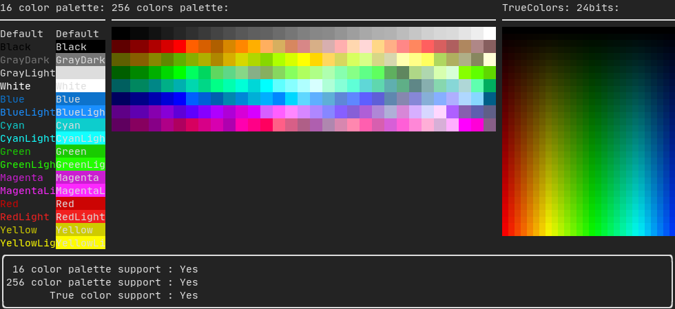
Palette16 #
On most terminals the following colors are supported:
-
Default
-
Black
-
GrayDark
-
GrayLight
-
White
-
Blue
-
BlueLight
-
Cyan
-
CyanLight
-
Green
-
GreenLight
-
Magenta
-
MagentaLight
-
Red
-
RedLight
-
Yellow
-
YellowLight
Example use of the above colors using the pipe operator:
text("Blue foreground") | color(Color::Blue);
text("Blue background") | bgcolor(Color::Blue);
text("Black on white") | color(Color::Black) | bgcolor(Color::White);
Palette256 #
On terminal supporting 256 colors. @htmlonly
@endhtmlonly
text("HotPink") | color(Color::HotPink);
TrueColor
On terminal supporting trueColor, you can directly use the 24bit RGB color space:
Use the constructors below to specify the RGB or HSV values for your color:
There are two constructors:
ftxui::Color::RGB(uint8_t red, uint8_t green, uint8_t blue);
ftxui::Color::HSV(uint8_t hue, uint8_t saturation, uint8_t value);
@htmlonly
@endhtmlonly
LinearGradient
FTXUI supports linear gradient. Either on the foreground or the background.
Decorator color(const LinearGradient&);
Decorator bgcolor(const LinearGradient&);
A ftxui::LinearGradient is defined by an angle in degree, and a list of color
stops.
auto gradient = LinearGradient()
  .Angle(45)
  .AddStop(0.0, Color::Red)
  .AddStop(0.5, Color::Green)
  .AddStop(1.0, Color::Blue);
You can also use simplified constructors:
LinearGradient(Color::Red, Color::Blue);
LinearGradient(45, Color::Red, Color::Blue);
See demo.
Style
In addition to colored text and colored backgrounds. Many terminals support text
effects such as: bold, italic, dim, underlined, inverted, blink.
Element bold(Element);
Element italic(Element);
Element dim(Element);
Element inverted(Element);
Element underlined(Element);
Element underlinedDouble(Element);
Element strikethrough(Element);
Element blink(Element);
Decorator color(Color);
Decorator bgcolor(Color);
Decorator colorgrad(LinearGradient);
Decorator bgcolorgrad(LinearGradient);
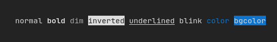
To use these effects, simply wrap your elements with your desired effect:
underlined(bold(text("This text is bold and underlined")))
Alternatively, use the pipe operator to chain it on your element:
text("This text is bold") | bold | underlined
Layout
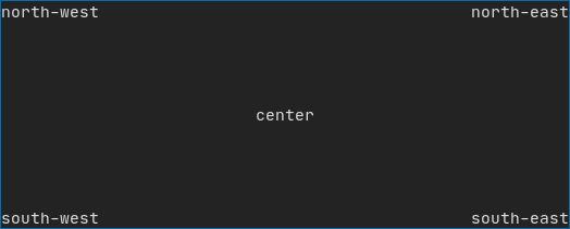
Enables elements to be arranged in the following ways:
- Horizontally with
ftxui::hbox - Vertically with
ftxui::vbox - Inside a grid with
ftxui::gridbox - Wrapped along one direction using the
ftxui::flexbox.
Example using ftxui::hbox, ftxui::vbox and ftxui::filler.
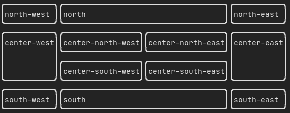
Example
using ftxui::gridbox:
Example using flexbox:
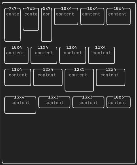
Checkout this example and the associated demo.
Element can also become flexible using the ftxui::flex decorator.
Code:
  hbox({
    text("left") | border ,
    text("middle") | border | flex,
    text("right") | border,
  });
Terminal output:
┌────┐┌─────────────────────────────────────────────────────┐┌─────┐
│left││middle                                               ││right│
└────┘└─────────────────────────────────────────────────────┘└─────┘
Code:
  hbox({
    text("left") | border ,
    text("middle") | border | flex,
    text("right") | border | flex,
  });
Terminal output:
┌────┐┌───────────────────────────────┐┌───────────────────────────────┐
│left││middle                         ││right                          │
└────┘└───────────────────────────────┘└───────────────────────────────┘
Table
Enables easy formatting of data into a neat table like visual form.
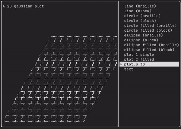
Canvas
See the API <ftxui/dom/canvas.hpp>
  auto c = Canvas(100, 100);
  c.DrawPointLine(10, 10, 80, 10, Color::Red);
  auto element = canvas(c);
Drawing can be performed on a ftxui::Canvas, using braille, block, or simple
characters:
Simple example:
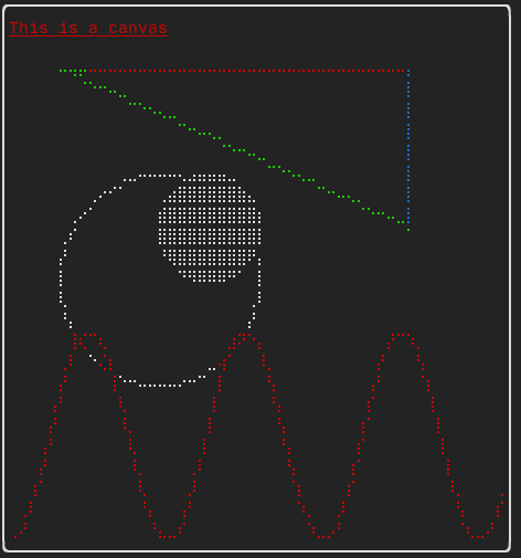
Complex example: