 08b8a3b28f
18 KiB


Documentation ·
Report a Bug ·
Examples .
Request Feature ·
Send a Pull Request
FTXUI
Functional Terminal (X) User interface
A simple cross-platform C++ library for terminal based user interfaces!
Feature
- Functional style. Inspired by 1 and React
- Simple and elegant syntax (in my opinion)
- Keyboard & mouse navigation.
- Support for UTF8 and fullwidth chars (→ 测试)
- Support for animations. Demo 1, Demo 2
- Support for drawing. Demo
- No dependencies
- Cross platform: Linux/MacOS (main target), WebAssembly, Windows (Thanks to contributors!).
- Learn by examples, and tutorials
- Multiple packages:
- CMake FetchContent (preferred)
- Bazel
- vcpkg
- Conan Debian package
- Ubuntu package
- Arch Linux
- OpenSUSE
- Good practices: documentation, tests, fuzzers, performance tests, automated CI, automated packaging, etc...
Documentation
- Starter CMake
- Starter Bazel
- Documentation
- Examples (WebAssembly)
- Build using CMake
- Build using Bazel
Example
    vbox({
      hbox({
        text("one") | border,
        text("two") | border | flex,
        text("three") | border | flex,
      }),

      gauge(0.25) | color(Color::Red),
      gauge(0.50) | color(Color::White),
      gauge(0.75) | color(Color::Blue),
    });
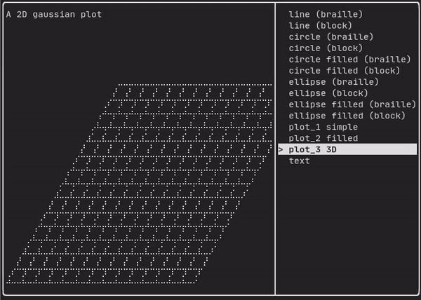
Short gallery
DOM
This module defines a hierarchical set of Element. An Element manages layout and can be responsive to the terminal dimensions.
They are declared in <ftxui/dom/elements.hpp>
Layout
Element can be arranged together:
- horizontally with
hbox - vertically with
vbox - inside a grid with
gridbox - wrap along one direction using the
flexbox.
Element can become flexible using the the flex decorator.
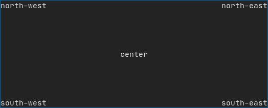
Example using hbox, vbox and filler.
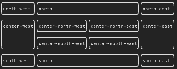
Example using gridbox:
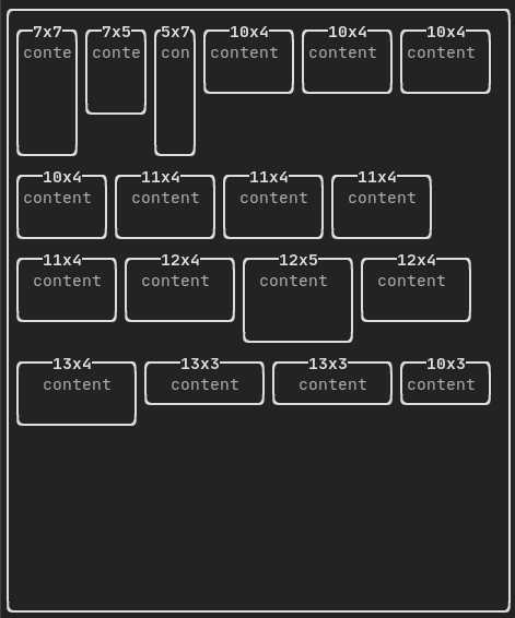
Example using flexbox:
Style
An element can be decorated using the functions:
bolditalicdiminvertedunderlinedunderlinedDoubleblinkstrikethroughcolorbgcolorhyperlink
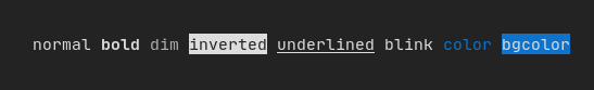
FTXUI supports the pipe operator. It means: decorator1(decorator2(element)) and element | decorator1 | decorator2 can be used.
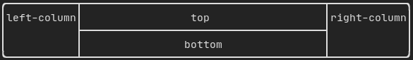
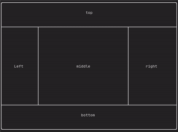
Border and separator
Use decorator border and element separator() to subdivide your UI:
auto document = vbox({
    text("top"),
    separator(),
    text("bottom"),
}) | border;
Demo:
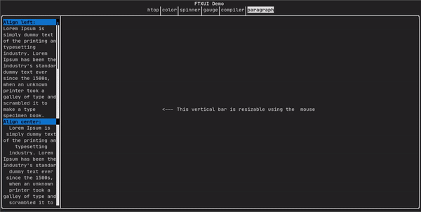
Text and paragraph
A simple piece of text is represented using text("content").
To support text wrapping following spaces the following functions are provided:
Element paragraph(std::string text);
Element paragraphAlignLeft(std::string text);
Element paragraphAlignRight(std::string text);
Element paragraphAlignCenter(std::string text);
Element paragraphAlignJustify(std::string text);
Canvas
Drawing can be made on a Canvas, using braille, block, or simple characters:
Simple example:
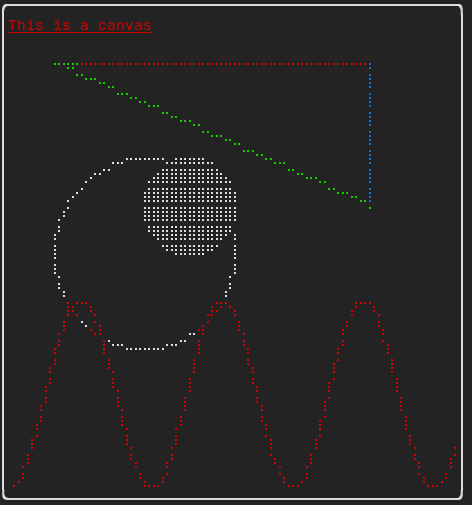
Complex examples:
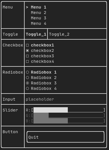
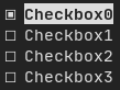
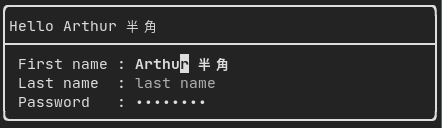
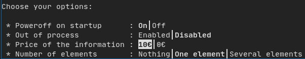
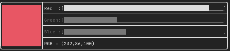
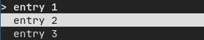
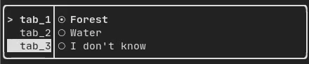
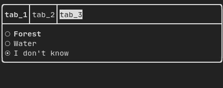
Component
ftxui/component produces dynamic UI, reactive to the user's input. It defines a set of ftxui::Component. A component reacts to Events (keyboard, mouse, resize, ...) and Renders as an Element (see previous section).
Prebuilt components are declared in <ftxui/component/component.hpp>

Libraries for FTXUI
- Want to share a useful Component for FTXUI? Feel free to add yours here
- ftxui-grid-container
- ftxui-ip-input
- ftxui-image-view: For Image Display.
Project using FTXUI
Feel free to add your projects here:
- json-tui
- git-tui
- ostree-tui
- rgb-tui
- chrome-log-beautifier
- x86-64 CPU Architecture Simulation
- ltuiny
- i3-termdialogs
- simpPRU
- Pigeon ROS TUI
- hastur
- CryptoCalculator
- todoman
- TimeAccumulator
- vantage
- tabdeeli
- tiles
- cachyos-cli-installer
- beagle-config
- turing_cmd
- StartUp
- eCAL monitor
- Path Finder
- rw-tui
- resource-monitor
- ftxuiFileReader
- ftxui_CPUMeter
- Captain's log
- FTowerX
- Caravan
- Step-Writer
- XJ music
- UDP chat
- 2048-cpp
- Memory game
- Terminal Animation
- pciex
- Fallout terminal hacking
- Lazylist
- TUISIC
- inLimbo
- BestEdrOfTheMarket
- terminal-rain
- keywords (Play web version ❤️)
- FTB - tertminal file browser
- SHOOT!
cpp-best-practices/game_jam
Several games using the FTXUI have been made during the Game Jam:
- TermBreaker **[Play web version]**
- Minesweeper Marathon **[Play web version]**
- Grand Rounds
- LightsRound
- DanteO
- Sumo
- Drag Me aROUND
- DisarmSelfDestruct
- TheWorld
- smoothlife
- Consu
Build using CMake
It is highly recommended to use CMake FetchContent to depend on FTXUI so you may specify which commit you would like to depend on.
include(FetchContent)
FetchContent_Declare(ftxui
  GIT_REPOSITORY https://github.com/ArthurSonzogni/ftxui
  GIT_TAG v6.1.9
)
FetchContent_MakeAvailable(ftxui)

target_link_libraries(your_target PRIVATE
    # Chose a submodule
    ftxui::component
    ftxui::dom
    ftxui::screen
)
Build using Bazel
MODULE.bazel
bazel_dep(
    name = "ftxui",
    version = "v6.1.9",
)
BUILD.bazel
cc_binary(
    name = "your_target",
    srcs = ["your_source.cc"],
    deps = [
        "@ftxui//:ftxui_component",
        "@ftxui//:ftxui_dom",
        "@ftxui//:ftxui_screen",
    ],
)
Build with something else:
If you don't, FTXUI may be used from the following packages:
- CMake FetchContent (preferred),
- Bazel,
- vcpkg,
- Conan
- Debian package,
- Ubuntu package,
- Arch Linux,
- OpenSUSE,

If you choose to build and link FTXUI yourself, ftxui-component must be first in the linking order relative to the other FTXUI libraries, i.e.
g++ . . . -lftxui-component -lftxui-dom -lftxui-screen . . .