mirror of
https://github.com/ArthurSonzogni/FTXUI.git
synced 2025-06-24 16:21:12 +08:00
 b65bbce9bb
Add experimental C++20 module suppport.
Co-authored-by: ArthurSonzogni <sonzogniarthur@gmail.com>
75 lines
1.5 KiB
Markdown
75 lines
1.5 KiB
Markdown
# ftxui {#ftxui}
|
|
|
|
|
|
|
|
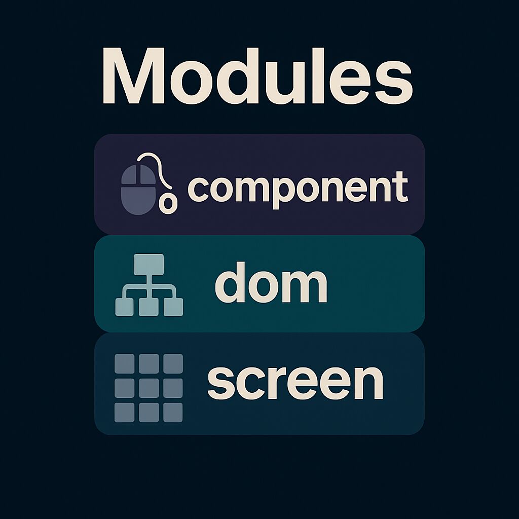
FTXUI is organized into three modules, each building upon the previous:
|
|
|
|
1. [ftxui/screen](#module-screen) - Low-level rendering
|
|
2. [ftxui/dom](#module-dom) - Layout and composition
|
|
3. [ftxui/component](#module-component) - User interaction
|
|
|
|
---
|
|
|
|
# ftxui/screen
|
|
|
|
Defines:
|
|
|
|
- **`ftxui::Screen`**: a 2D grid of styled characters.
|
|
- **`ftxui::Pixel`**: the unit of rendering.
|
|
- Helpers like `ftxui::Color` and `Dimension`.
|
|
|
|
Use for direct terminal drawing and styling.
|
|
|
|
<div class="section_buttons">
|
|
|
|
| Next |
|
|
|--------------------------------------:|
|
|
| [Documentation](module-screen.html) |
|
|
|
|
</div>
|
|
|
|
|
|
---
|
|
|
|
# ftxui/dom
|
|
|
|
Provides:
|
|
|
|
- **`ftxui::Element`**: a tree structure for layout and UI.
|
|
- Composable and responsive elements.
|
|
- `Render()` to draw onto a `Screen`.
|
|
|
|
Ideal for structured, styled UIs.
|
|
|
|
<div class="section_buttons">
|
|
|
|
| Next |
|
|
|--------------------------------------:|
|
|
| [Documentation](module-dom.html) |
|
|
|
|
</div>
|
|
|
|
|
|
---
|
|
# ftxui/component
|
|
|
|
Adds:
|
|
|
|
- **`ftxui::Component`**: stateful, interactive widgets.
|
|
- Built-ins: `Checkbox`, `Input`, `Menu`, `Button`.
|
|
- Supports keyboard/cursor input and composition.
|
|
|
|
Use for interactive apps.
|
|
|
|
<div class="section_buttons">
|
|
|
|
| Next |
|
|
|--------------------------------------:|
|
|
| [Documentation](module-component.html) |
|
|
|
|
</div>
|
|
|
|
---
|
|
|
|
Modules can be used independently, or together: `screen → dom → component`.
|