mirror of
https://github.com/ArthurSonzogni/FTXUI.git
synced 2025-06-24 08:01:13 +08:00
 a8eda59d98
Some checks are pending
Build / Bazel, ${{ matrix.cxx }}, ${{ matrix.os }} (cl, cl, windows-latest) (push) Waiting to run
Build / Bazel, ${{ matrix.cxx }}, ${{ matrix.os }} (clang, clang++, macos-latest) (push) Waiting to run
Build / Bazel, ${{ matrix.cxx }}, ${{ matrix.os }} (clang, clang++, ubuntu-latest) (push) Waiting to run
Build / Bazel, ${{ matrix.cxx }}, ${{ matrix.os }} (gcc, g++, macos-latest) (push) Waiting to run
Build / Bazel, ${{ matrix.cxx }}, ${{ matrix.os }} (gcc, g++, ubuntu-latest) (push) Waiting to run
Build / CMake, ${{ matrix.compiler }}, ${{ matrix.os }} (cl, Windows MSVC, windows-latest) (push) Waiting to run
Build / CMake, ${{ matrix.compiler }}, ${{ matrix.os }} (gcc, Linux GCC, ubuntu-latest) (push) Waiting to run
Build / CMake, ${{ matrix.compiler }}, ${{ matrix.os }} (llvm, llvm-cov gcov, Linux Clang, ubuntu-latest) (push) Waiting to run
Build / CMake, ${{ matrix.compiler }}, ${{ matrix.os }} (llvm, llvm-cov gcov, MacOS clang, macos-latest) (push) Waiting to run
Documentation / documentation (push) Waiting to run
309 lines
9.9 KiB
Markdown
309 lines
9.9 KiB
Markdown
@page module-component ftxui / component
|
||
@tableofcontents
|
||
|
||
|
||
|
||
The `ftxui::component` module defines the logic that produces interactive
|
||
components that respond to user events (keyboard, mouse, etc.).
|
||
|
||
The @subpage module-component-examples section provides a collection of examples.
|
||
|
||
A `ftxui::ScreenInteractive` defines a main loop that renders a component.
|
||
|
||
A `ftxui::Component` is a shared pointer to a `ftxui::ComponentBase`. The latter defines:
|
||
- `ftxui::ComponentBase::Render()`: How to render the interface.
|
||
- `ftxui::ComponentBase::OnEvent()`: How to react to events.
|
||
- `ftxui::ComponentBase::Add()`: Construct a parent/child relationship
|
||
between two components. The tree of component is used to define how to
|
||
navigate using the keyboard.
|
||
|
||
`ftxui::Element` are used to render a single frame.
|
||
|
||
`ftxui::Component` are used to render dynamic user interface, producing multiple
|
||
frame, and updating its state on events.
|
||
|
||
[Gallery](https://arthursonzogni.github.io/FTXUI/examples_2component_2gallery_8cpp-example.html) of multiple components. ([demo](https://arthursonzogni.github.io/FTXUI/examples/?file=component/gallery))
|
||
|
||
|
||
|
||
All predefined components are available in
|
||
["ftxui/dom/component.hpp"](./component_8hpp.html)
|
||
|
||
\include ftxui/component/component.hpp
|
||
|
||
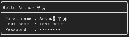
# Input {#component-input}
|
||
|
||
[Example](https://arthursonzogni.github.io/FTXUI/examples_2component_2input_8cpp-example.html):
|
||
|
||
|
||
|
||
Produced by: `ftxui::Input()` from "ftxui/component/component.hpp"
|
||
|
||
@htmlonly
|
||
<script id="asciicast-223719" src="https://asciinema.org/a/223719.js" async></script>
|
||
@endhtmlonly
|
||
|
||
## Filtered input
|
||
|
||
On can filter out the characters received by the input component, using
|
||
`ftxui::CatchEvent`.
|
||
|
||
```cpp
|
||
std::string phone_number;
|
||
Component input = Input(&phone_number, "phone number");
|
||
|
||
// Filter out non-digit characters.
|
||
input |= CatchEvent([&](Event event) {
|
||
return event.is_character() && !std::isdigit(event.character()[0]);
|
||
});
|
||
|
||
// Filter out characters past the 10th one.
|
||
input |= CatchEvent([&](Event event) {
|
||
return event.is_character() && phone_number.size() >= 10;
|
||
});
|
||
```
|
||
|
||
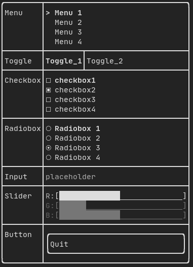
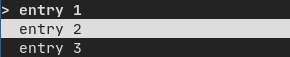
# Menu {#component-menu}
|
||
|
||
Defines a menu object. It contains a list of entries, one of them is selected.
|
||
|
||
[Example](https://arthursonzogni.github.io/FTXUI/examples_2component_2menu_8cpp-example.html):
|
||
|
||
|
||
|
||
|
||
Produced by: `ftxui::Menu()` from "ftxui/component/component.hpp"
|
||
|
||
@htmlonly
|
||
<script id="asciicast-223720" src="https://asciinema.org/a/223720.js" async></script>
|
||
@endhtmlonly
|
||
|
||
# Toggle {#component-toggle}
|
||
|
||
A special kind of menu. The entries are displayed horizontally.
|
||
|
||
[Example](https://arthursonzogni.github.io/FTXUI/examples_2component_2toggle_8cpp-example.html):
|
||
|
||
|
||
|
||
Produced by: `ftxui::Toggle()` from "ftxui/component/component.hpp"
|
||
|
||
@htmlonly
|
||
<script id="asciicast-223722" src="https://asciinema.org/a/223722.js" async></script>
|
||
@endhtmlonly
|
||
|
||
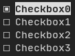
# CheckBox {#component-checkbox}
|
||
|
||
This component defines a checkbox. It is a single entry that can be turned
|
||
on/off.
|
||
|
||
[Example](https://arthursonzogni.github.io/FTXUI/examples_2component_2checkbox_8cpp-example.html):
|
||
|
||
|
||
|
||
Produced by: `ftxui::Checkbox()` from "ftxui/component/component.hpp"
|
||
|
||
@htmlonly
|
||
<script id="asciicast-223724" src="https://asciinema.org/a/223724.js" async></script>
|
||
@endhtmlonly
|
||
|
||
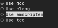
# RadioBox {#component-radiobox}
|
||
|
||
A radiobutton component. This is a list of entries, where one can be turned on.
|
||
|
||
[Example](https://arthursonzogni.github.io/FTXUI/examples_2component_2radiobox_8cpp-example.html):
|
||
|
||
|
||
|
||
Produced by: `ftxui::Radiobox()` from "ftxui/component/component.hpp"
|
||
|
||
@htmlonly
|
||
<script id="asciicast-223725" src="https://asciinema.org/a/223725.js" async></script>
|
||
@endhtmlonly
|
||
|
||
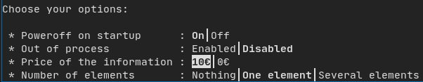
# Dropdown {#component-dropdown}
|
||
|
||
A drop down menu is a component that when checked display a list of element for
|
||
the user to select one.
|
||
|
||
[Example](https://arthursonzogni.github.io/FTXUI/examples_2component_2dropdown_8cpp-example.html):
|
||
|
||

|
||
|
||
Produced by: `ftxui::Dropdown()` from "ftxui/component/component.hpp"
|
||
|
||
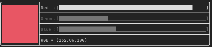
# Slider {#component-slider}
|
||
|
||
Represents a slider object that consists of a range with binned intermediate
|
||
intervals. It can be created by `ftxui::Slider()`.
|
||
|
||
[Example](https://arthursonzogni.github.io/FTXUI/examples_2component_2slider_8cpp-example.html):
|
||
|
||
|
||
|
||
Produced by: `ftxui::Slider()` from "ftxui/component/component.hpp"
|
||
|
||
# Renderer {#component-renderer}
|
||
|
||
Produced by: `ftxui::Renderer()` from \ref ftxui/component/component.hpp. This
|
||
component decorate another one by using a different function to render an
|
||
interface.
|
||
|
||
Example:
|
||
```cpp
|
||
auto inner = [...]
|
||
|
||
auto renderer = Renderer(inner, [&] {
|
||
return inner->Render() | border
|
||
});
|
||
```
|
||
|
||
`ftxui::Renderer` also supports the component decorator pattern:
|
||
```cpp
|
||
auto component = [...]
|
||
component = component
|
||
| Renderer([](Element e) { return e | border))
|
||
| Renderer(bold)
|
||
```
|
||
|
||
As a short hand, you can also compose a component with an element decorator:
|
||
```cpp
|
||
auto component = [...]
|
||
component = component | border | bold;
|
||
```
|
||
|
||
# CatchEvent {#component-catchevent}
|
||
|
||
Produced by: `ftxui::CatchEvent()` from \ref ftxui/component/component.hpp.
|
||
This component decorate others, catching events before the underlying component.
|
||
|
||
Examples:
|
||
```cpp
|
||
auto screen = ScreenInteractive::TerminalOutput();
|
||
auto renderer = Renderer([] {
|
||
return text("My interface");
|
||
});
|
||
auto component = CatchEvent(renderer, [&](Event event) {
|
||
if (event == Event::Character('q')) {
|
||
screen.ExitLoopClosure()();
|
||
return true;
|
||
}
|
||
return false;
|
||
});
|
||
screen.Loop(component);
|
||
```
|
||
|
||
The `ftxui::CatchEvent` can also be used as a decorator:
|
||
```cpp
|
||
component = component
|
||
| CatchEvent(handler_1)
|
||
| CatchEvent(handler_2)
|
||
| CatchEvent(handler_3)
|
||
;
|
||
```
|
||
|
||
# Collapsible {#component-collapsible}
|
||
|
||
Useful for visual elements whose visibility can be toggle on/off by the user.
|
||
Essentially, this the combination of the `ftxui::Checkbox()` and
|
||
`ftxui::Maybe()` components.
|
||
|
||
```cpp
|
||
auto collabsible = Collapsible("Show more", inner_element);
|
||
```
|
||
|
||
# Maybe {#component-maybe}
|
||
|
||
Produced by: `ftxui::Maybe()` from \ref ftxui/component/component.hpp.
|
||
This component can be utilized to show/hide any other component via a boolean or
|
||
a predicate.
|
||
|
||
Example with a boolean:
|
||
```cpp
|
||
bool show = true;
|
||
auto component = Renderer([]{ return "Hello World!"; });
|
||
auto maybe_component = Maybe(component, &show)
|
||
```
|
||
|
||
Example with a predicate:
|
||
```cpp
|
||
auto component = Renderer([]{ return "Hello World!"; });
|
||
auto maybe_component = Maybe(component, [&] { return time > 10; })
|
||
```
|
||
|
||
As usual, `ftxui::Maybe` can also be used as a decorator:
|
||
```cpp
|
||
component = component
|
||
| Maybe(&a_boolean)
|
||
| Maybe([&] { return time > 10; })
|
||
;
|
||
```
|
||
|
||
# Container {#component-container}
|
||
|
||
## Horizontal {#component-horizontal}
|
||
|
||
Produced by: `ftxui::Container::Horizontal()` from
|
||
"ftxui/component/component.hpp". It displays a list of components horizontally
|
||
and handle keyboard/mouse navigation.
|
||
|
||
## Vertical {#component-vertical}
|
||
|
||
Produced by: `ftxui::Container::Vertical()` from
|
||
"ftxui/component/component.hpp". It displays a list of components vertically
|
||
and handles keyboard/mouse navigation.
|
||
|
||
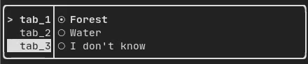
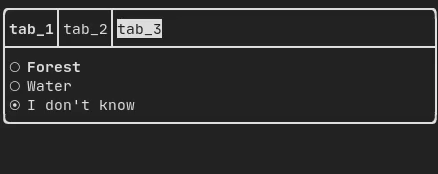
## Tab {#component-tab}
|
||
|
||
Produced by: `ftxui::Container::Tab()` from
|
||
"ftxui/component/component.hpp". It take a list of component and display only
|
||
one of them. This is useful for implementing a tab bar.
|
||
|
||
[Vertical](https://arthursonzogni.github.io/FTXUI/examples_2component_2tab_vertical_8cpp-example.html):
|
||
|
||
|
||
|
||
[Horizontal](https://arthursonzogni.github.io/FTXUI/examples_2component_2tab_horizontal_8cpp-example.html):
|
||
|
||
|
||
|
||
|
||
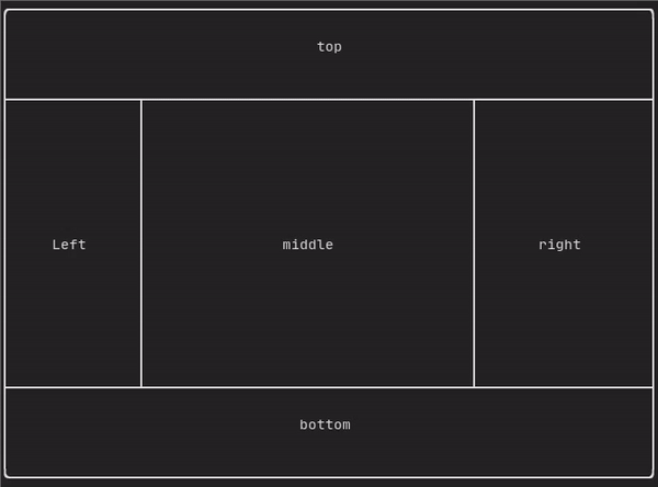
# ResizableSplit {#component-resizable-split}
|
||
|
||
It defines a horizontal or vertical separation between two children components.
|
||
The position of the split is variable and controllable using the mouse.
|
||
There are four possible splits:
|
||
- `ftxui::ResizableSplitLeft()`
|
||
- `ftxui::ResizableSplitRight()`
|
||
- `ftxui::ResizableSplitTop()`
|
||
- `ftxui::ResizableSplitBottom()`
|
||
from "ftxui/component/component.hpp"
|
||
|
||
[Example](https://arthursonzogni.github.io/FTXUI/examples_2component_2resizable_split_8cpp-example.html):
|
||
|
||
|
||
|
||
@htmlonly
|
||
<script id="asciicast-tprMH2EdkUoMb7D2YxgMGgpzx" src="https://asciinema.org/a/tprMH2EdkUoMb7D2YxgMGgpzx.js" async></script>
|
||
@endhtmlonly
|
||
|
||
# Force a frame redraw. {#component-force-redraw}
|
||
|
||
Typically, `ftxui::ScreenInteractive::Loop()` is responsible for drawing a new
|
||
frame whenever a new group of events (e.g keyboard, mouse, window resize, etc.)
|
||
has been processed. However, you might want to react to arbitrary events that
|
||
are unknown to FTXUI. To accomplish this, you must post events using
|
||
`ftxui::ScreenInteractive::PostEvent` (**this is thread safe**) via a thread.
|
||
You will have to post the event `ftxui::Event::Custom`.
|
||
|
||
Example:
|
||
```cpp
|
||
screen->PostEvent(Event::Custom);
|
||
```
|
||
|
||
If you don't need to process a new Event, you can use:
|
||
```cpp
|
||
screen->RequestAnimationFrame();
|
||
```
|
||
instead.
|